Premium
🛬 Landing Page
Button Motion Set
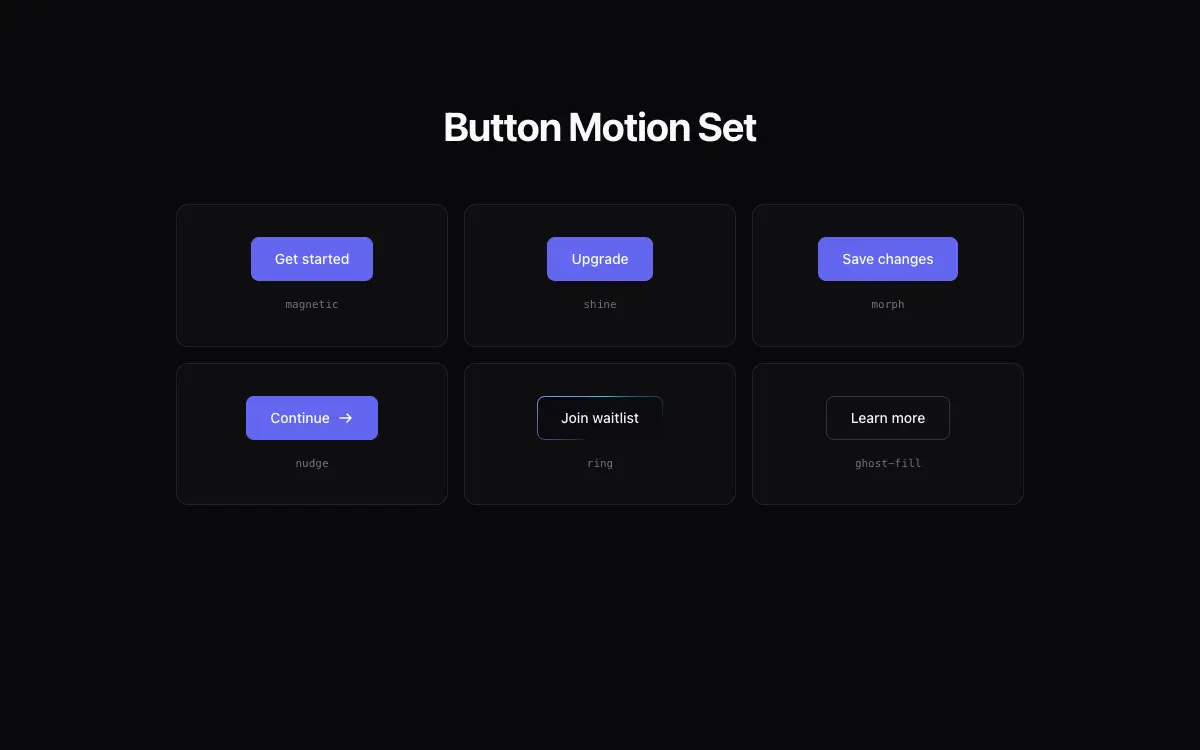
A cohesive set of 6 animated buttons: magnetic, shine-sweep, morph-to-loader, icon-nudge, gradient-ring, ghost-fill.
3.5k views 371 copies 296 words
The Prompt
# Button Motion Set — UI Component Set

## Goal
Build six production-grade animated button variants sharing one base API, presented in a small demo grid. It must drop cleanly into an existing Next.js + Tailwind project as a self-contained component.

## Design Spec
- Shared base: h-11 px-6 rounded-lg font-medium text-sm, focus-visible ring, disabled 50% + no animations; sizes sm/md/lg via prop.
- 1 **Magnetic** — button translates up to 6px toward cursor within a 40px proximity field, springs back on leave.
- 2 **Shine sweep** — a 60% width diagonal white/20 gradient sweeps across on hover (50
Unlock the full 296-word prompt with one-time Lifetime access.
Unlock Full PromptYou may also like
Free
Featured
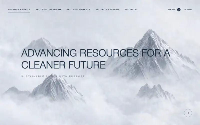
Vectrus Energy
🛬 Landing Page
Scroll-tied cinematic section: a 500vh track scrubs an aerial clip frame by frame through a WebCodecs frame bank, with three sequential copy blocks.
4.9k 535CursorClaude CodeLovable
Free
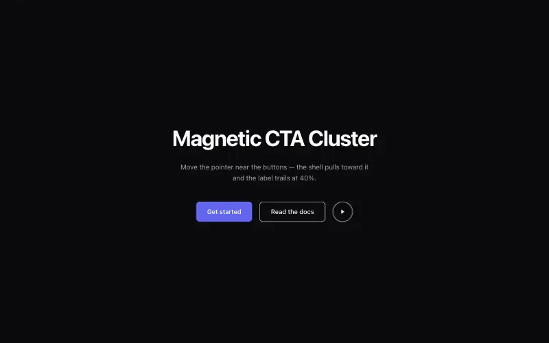
Magnetic CTA Cluster
✨ Creative
Buttons that pull toward the cursor within a radius, with the label lagging behind the shell for weight.
3.9k 710CursorClaude CodeLovable
Free
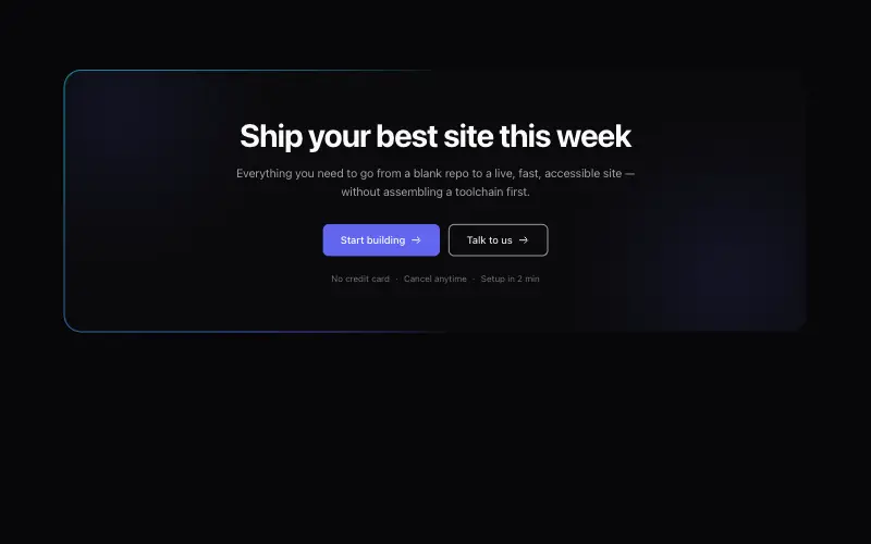
Conversion CTA Banner
🛬 Landing Page
Pre-footer CTA banner with animated gradient border, urgency-free copy structure and dual action hierarchy.
4.3k 827CursorClaude CodeLovable
Free
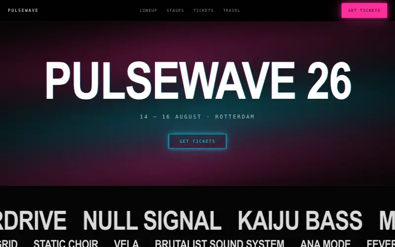
Pulsewave Festival
🛬 Landing Page
Electronic music festival site with neon glow, chromatic display type, lineup marquees and a ticket-tier countdown.
3.6k 653CursorClaude CodeLovable



