Free
✈️ Travel
Asia Moments
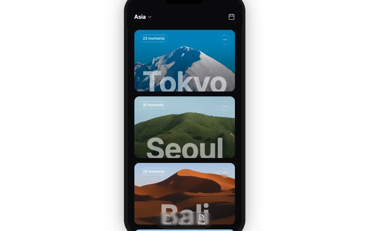
Dark travel-app mockup in an iPhone-style bezel: a blurred Asia header, four photo destination cards with liquid-glass moment pills and huge clipped city names that stagger in, and a floating glass tab bar.
1.5k views 580 copies 1.2k Wörter
Der Prompt
# Asia Moments — Glass Travel App Mockup

Create a mobile travel app UI mockup displayed inside a realistic iPhone-style phone frame, centered on a white webpage. Tech stack: React + TypeScript, Tailwind CSS, Lucide React icons, Vite. Font: Google Fonts "Inter" (weights 300-900).

---

**PAGE WRAPPER:**

Full viewport (`h-screen w-screen`), solid white background, flexbox centered, overflow hidden.

---

**PHONE FRAME:**

- Dimensions: 375px x 780px
- Background: `#0a0a0c`
- Border-radius: 52px
- Overflow: hidden
- Box-shadow (layered bezel effect):
  ```
  inset 0 0 0 2px rgba(255, 255, 255, 0.08),
  0 0 0 1px rgba(0, 0, 0, 0.6),
  0 0 0 10px #1a1a1e,
  0 0 0 11px rgba(255, 255, 255, 0.06),
  0 0 60px rgba(0, 0, 0, 0.5)
  ```

**Dynamic Island notch:** Absolute, top-0, centered horizontally, 120px wide, 28px tall, solid black, `rounded-b-2xl`, z-50.

---

**HEADER (absolute, top):**

- Z-index: 30
- `backdrop-filter: blur(12px)` with `background-color: rgba(10, 10, 12, 0.75)`
- Padding: `px-6 pt-14 pb-4`
- Left side: Button with "Asia" text (text-lg, font-semibold, white) + ChevronDown icon (size 18, text-white/70)
- Right side: Calendar icon button (size 22, text-white/70)

---

**SCROLLABLE CONTENT:**

- `overflow-y-auto` with hidden scrollbar
- Padding: `px-6 pt-28 pb-24`
- Vertical spacing: `space-y-4` (16px gap)

---

**DESTINATION CARDS (4 total):**

Each card:
- Full width, height 200px, rounded-2xl, overflow hidden, position relative
- Full-bleed background image (`absolute inset-0, object-cover`)
- Gradient overlay: `bg-gradient-to-t from-black/20 to-transparent`
- **Top-left:** liquid-glass pill (`rounded-full px-3 py-1`) with "{N} moments" text (text-white/90, text-xs, font-normal)
- **Top-right:** liquid-glass circle (w-8 h-8, rounded-full) with MoreHorizontal icon (size 16, text-white/80)
- **Bottom:** Destination name in 96px bold font, centered horizontally, clipped in an 80px tall container with `overflow: hidden`. Color: `rgba(255, 255, 255, 0.55)`, tracking-tight, leading-none, margin-top 2px

**Card data with exact image URLs:**

1. **Tokyo** - 23 moments
   `https://images.higgs.ai/?default=1&output=webp&url=https%3A%2F%2Fd8j0ntlcm91z4.cloudfront.net%2Fuser_38xzZboKViGWJOttwIXH07lWA1P%2Fhf_20260704_101902_e8f0f37b-18b7-4c14-bb5c-99f0724d2646.png&w=1280&q=85`

2. **Seoul** - 18 moments
   `https://images.higgs.ai/?default=1&output=webp&url=https%3A%2F%2Fd8j0ntlcm91z4.cloudfront.net%2Fuser_38xzZboKViGWJOttwIXH07lWA1P%2Fhf_20260704_101935_4b17f250-8ddb-4ff2-b63d-dfd3497d4428.png&w=1280&q=85`

3. **Bali** - 29 moments
   `https://images.higgs.ai/?default=1&output=webp&url=https%3A%2F%2Fd8j0ntlcm91z4.cloudfront.net%2Fuser_38xzZboKViGWJOttwIXH07lWA1P%2Fhf_20260704_101958_7116d6bf-fd6f-496f-b3cf-007688cd5123.png&w=1280&q=85`

4. **Rome** - 15 moments
   `https://images.higgs.ai/?default=1&output=webp&url=https%3A%2F%2Fd8j0ntlcm91z4.cloudfront.net%2Fuser_38xzZboKViGWJOttwIXH07lWA1P%2Fhf_20260704_143008_72ee7299-04a8-474c-ae73-220d45b24a20.png&w=1280&q=85`

---

**FLOATING BOTTOM NAV BAR:**

- Absolute, bottom-6, centered horizontally, z-30
- liquid-glass pill (`rounded-full, flex, gap-6, px-6 py-2`)
- 3 nav items (flex-col, items-center, gap-0.5):
  - "Feed" + Home icon (size 20) -- inactive (`text-white/50`)
  - "Account" + User icon (size 20) -- inactive (`text-white/50`)
  - "Trips" + FileText icon (size 20) -- active (`text-white`)
- Label style: `text-[10px] font-medium`

---

**LIQUID-GLASS CSS:**

```css
.liquid-glass {
  background: rgba(255, 255, 255, 0.01);
  background-blend-mode: luminosity;
  backdrop-filter: blur(4px);
  -webkit-backdrop-filter: blur(4px);
  border: none;
  box-shadow: inset 0 1px 1px rgba(255, 255, 255, 0.1);
  position: relative;
  overflow: hidden;
}

.liquid-glass::before {
  content: '';
  position: absolute;
  inset: 0;
  border-radius: inherit;
  padding: 1.4px;
  background: linear-gradient(180deg,
    rgba(255,255,255,0.45) 0%, rgba(255,255,255,0.15) 20%,
    rgba(255,255,255,0) 40%, rgba(255,255,255,0) 60%,
    rgba(255,255,255,0.15) 80%, rgba(255,255,255,0.45) 100%);
  -webkit-mask: linear-gradient(#fff 0 0) content-box, linear-gradient(#fff 0 0);
  -webkit-mask-composite: xor;
  mask-composite: exclude;
  pointer-events: none;
}
```

---

**STAGGERED ENTRANCE ANIMATION:**

Each card starts at `opacity: 0` and `transform: translateY(24px)`. On component mount, a `setTimeout` triggers a state change that transitions to `opacity: 1` and `translateY(0)`. Transition: `transition-all duration-700 ease-out`. Stagger delay: first card 150ms, each subsequent +120ms (150, 270, 390, 510ms). Implemented with React `useState` + `useEffect`.

---

**SCROLLBAR HIDING:**

```css
.scrollbar-hide::-webkit-scrollbar { display: none; }
.scrollbar-hide { -ms-overflow-style: none; scrollbar-width: none; }
```

---

**GLOBAL:**

```css
* { font-family: 'Inter', sans-serif; }
```

Load in HTML head:
```html
<link rel="preconnect" href="https://fonts.googleapis.com" />
<link rel="preconnect" href="https://fonts.gstatic.com" crossorigin />
<link href="https://fonts.googleapis.com/css2?family=Inter:wght@300;400;500;600;700;800;900&display=swap" rel="stylesheet" />
```

## Quality Bar

- **The mockup lands on its stated geometry.** Driven in headless Chrome 153 at 1440×900, the phone measures exactly **375×780**, centred, with the five-layer bezel shadow. The notch is 120×28 at the top edge and the blurred header is 100px tall (`blur(12px)`, `rgba(10,10,12,.75)`). Cards are **327×200**, 16px apart, starting 112px down. The top-right button is 32×32. City names render at 96px / 700 in `rgba(255,255,255,.55)` inside an 80px clip. The glass `::before` stroke is generated (`content:""`, 1.4px padding, `mask-composite: exclude`). The scroller reports `scrollbar-width: none`, with `clientWidth` equal to `offsetWidth`. The only font loaded is Inter 300–900. There are no console errors, and — once the media is served locally — no external requests.
- **The text classes have to sit on the pill itself.** "liquid-glass pill (`rounded-full px-3 py-1`) with '{N} moments' text (`text-xs`…)" reads naturally as a `div` wrapping a styled `span`. That version measured **32px** tall, because the `div` keeps the 16px body font's 24px line box and the `span`'s 12px size doesn't shrink it. Putting `text-white/90 text-xs font-normal` on the pill element gives the intended **24px**, and that is what this build does.
- **The entrance staggers as specified.** Cards first become visible at 246, 381, 479 and 595ms after navigation. That is the 150 / 270 / 390 / 510ms timers plus roughly 90ms of script start-up, each followed by the 700ms `ease-out` transition.
- **Scrolling clears the nav, but only just.** The content is 1056px tall in a 780px phone, so it scrolls 276px. At the bottom, the last card ends at y=**684** inside the phone and the floating nav starts at **703**, a 19px gap. The nav itself is 183.5×53. Its 10px labels have no `leading-*`, so they inherit a 15px line height.
- **The glass text is nearly invisible over the bright photos.** Contrast was measured over the pixels under each text box, with the text hidden and the glass kept (5th percentile / median). The "moments" pill (white at 90%, 12px) scored **1.30 / 1.69** on Seoul, **1.30 / 1.63** on Bali and **1.30 / 1.97** on Rome, because those pills sit on pale sky, against the 4.5:1 needed at that size. The city names (white at 55%) scored **2.04 / 3.08** over Tokyo's snowfield. The inactive nav labels (white at 50%) scored **1.25–1.41** whenever a sky-topped card passes under the bar (scroll offset 60), and even the active "Trips" label fell to **1.54**.
- **The page has no fallback for screens smaller than the phone.** The wrapper is `h-screen w-screen … overflow-hidden` around a fixed 780px frame. At **1280×720** the phone overflows by 30px top and bottom: the Dynamic Island is cut off and the nav loses its bottom 6px. At **320×568** the flex row also squeezes the 375px frame to **320px** wide, and 106px of the top is clipped, taking the whole header with it. "Tokyo" (275px) no longer fits its 272px clip. At 390×844 the frame fits, but its 11px bezel ring is clipped at both sides, since only 7.5px of margin remains.
- **The photographs don't show the places named.** The four supplied images are a snow-covered peak (Tokyo), green grassland hills (Seoul), orange sand dunes (Bali) and purple heather hills (Rome). All are 1280×956 WebP, 45–198 KB.
- **Choices this build makes where the spec is silent.** The pill and the ⋯ button sit 16px (`top-4`, `left-4` / `right-4`) from the card edges. The "Asia" label and chevron are 4px apart (`gap-1`). The city-name clip is anchored to the card's bottom edge. The images are served from `./assets` using the exact bytes the `images.higgs.ai` URLs returned (those URLs answer with a 302 redirect first). Inter is self-hosted as the single Latin variable file Google Fonts serves for weights 300–900 (48,432 B), because the site's demo pages make no external requests.
Das könnte dir auch gefallen
Free
Wanderful
✈️ Travel
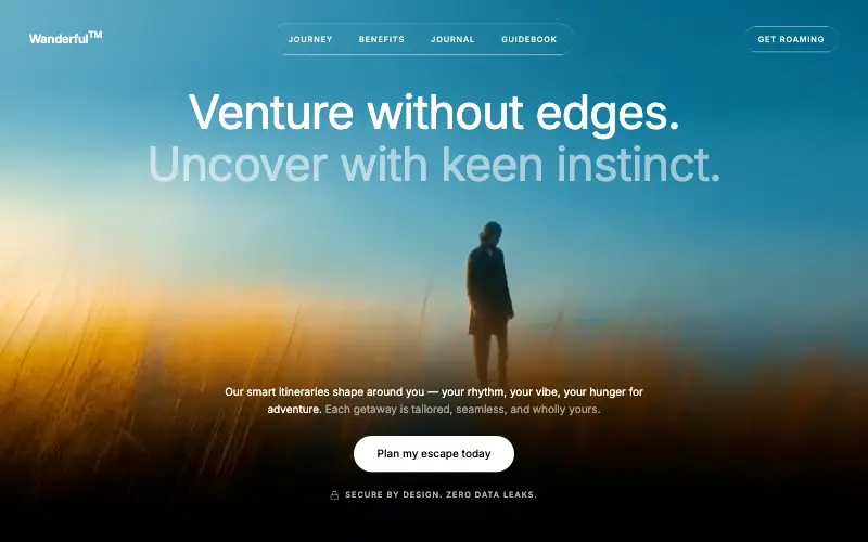
Cinematic travel hero: a full-bleed loop drifting under a GSAP mouse parallax, with a liquid-glass pill navbar and two fade-up copy blocks.
4.8k 445CursorClaude CodeLovable
Free
Wandor
✈️ Travel
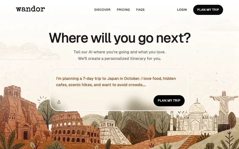
Travel-app hero on an illustrated loop: a white top fade, a typewriter wordmark and a 701px frosted prompt card with upload and CTA.
1.7k 554CursorClaude CodeLovable
Free
Cartful Shopper
🛒 Ecommerce
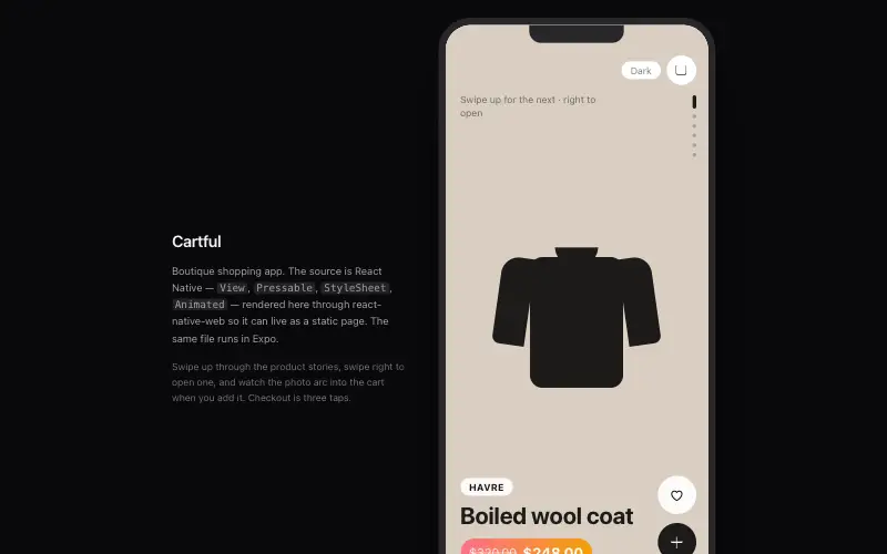
Mobile shopping app with story-style product discovery, slick cart drawer and checkout in three taps.
4.4k 752CursorBoltReplit
Premium
Ember Meditation
🧘 Wellness
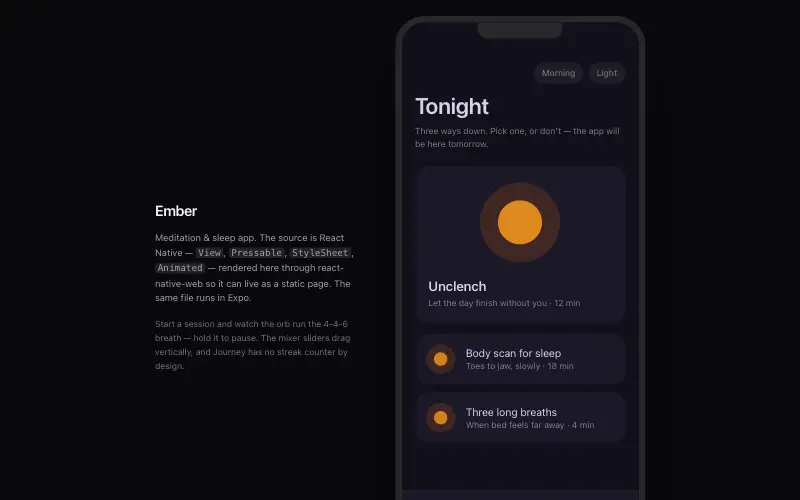
Meditation & sleep app with breathing orb, ambient soundscape mixer and gentle streak-free habit design.
3.5k 839CursorLovableReplit



