Pricing Card Trio
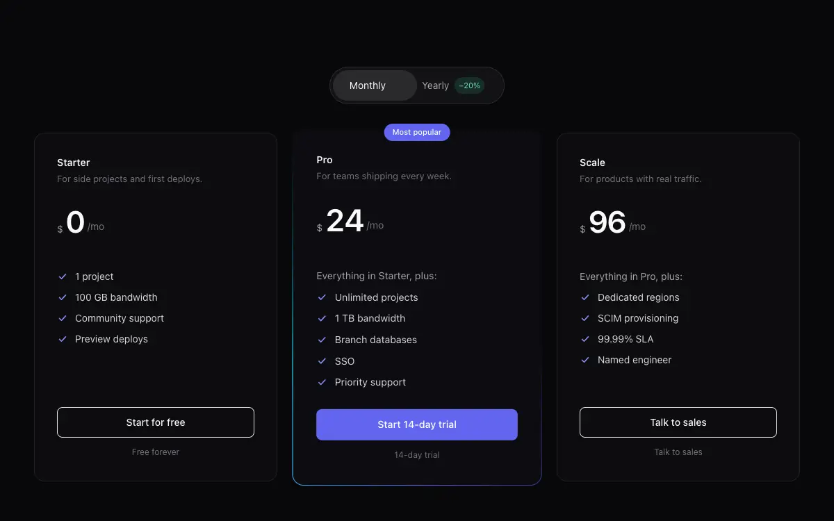
Three-tier pricing cards with billing toggle, feature diff logic and a properly celebrated popular tier.
Le prompt
# Pricing Card Trio — UI Component

## Goal
Build a complete pricing component: monthly/yearly toggle, three tier cards, feature lists with diff logic, popular-tier treatment. It must drop cleanly into an existing Next.js + Tailwind project as a self-contained component.

## Design Spec
- Toggle: pill switch with sliding thumb; yearly side shows a '−20%' mini-chip; prices crossfade+slide on change (old up-out, new up-in).
- Cards: Starter / Pro / Scale; rounded-2xl, border, p-8; Pro elevated: gradient border, slight scale-[1.02], 'Most popular' floating chip, its CTA solid while others are outline.
- Price block: currency small, amount 44px semibold tabular, '/mo' muted; yearly shows small 'billed $190 yearly' line.
- Features: checklist where items new-in-this-tier are prefixed 'Everything in Starter, plus:' — write the diff logic, don't repeat all rows.
- Under CTAs: tiny reassurance line per tier ('Free forever' / '14-day trial' / 'Talk to sales').

## Motion Spec
- Price number transition: 250ms, old value translates -8px fading, new value enters from +8px — direction flips when toggling back.
- Pro card's gradient border rotates slowly (12s); pauses under reduced-motion.
- Cards reveal on scroll: side cards 0ms/120ms, Pro last at 200ms with a slightly springier curve — hierarchy via choreography.
- Respect `prefers-reduced-motion` — provide a static fallback that still looks intentional.

## Component API
- `<PricingTrio tiers={Tier[]} defaultPeriod?: 'mo'|'yr' onSelect={(tierId,period)=>void} />`
- `Tier = { id, name, priceMo, priceYr, blurb, features: string[], inherits?: string, popular?: boolean, cta: string }`

## Quality Bar
- TypeScript strict, zero `any`. Tailwind only — no external CSS files.
- Works on mobile: touch targets ≥ 44px, no hover-only affordances.
- 60fps: animate only `transform` and `opacity`; use `will-change` sparingly.
- Accessible: correct roles/aria, keyboard operable, focus-visible styles.
Vous aimerez aussi
Signal
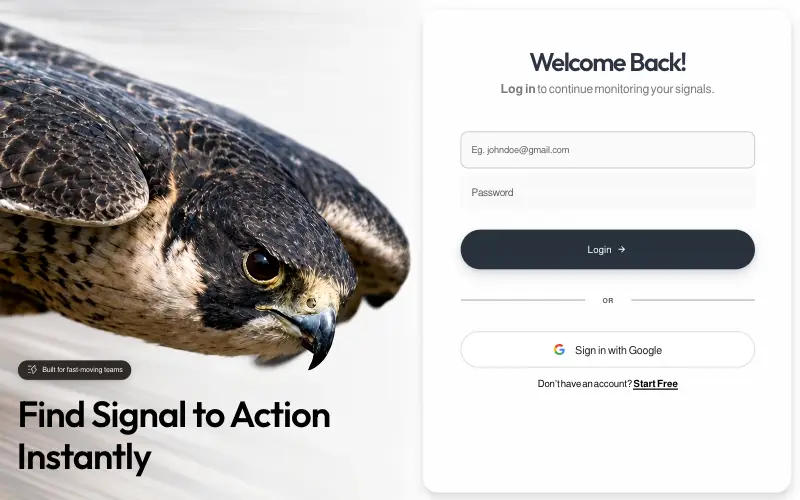
Pixel-locked single-file login page: a looping peregrine-falcon dive beside a frosted card, with embedded fonts, a JS layout engine that switches between desktop, tablet-portrait and phone compositions, and a once-only WAAPI entrance.

Magnetic CTA Cluster
Buttons that pull toward the cursor within a radius, with the label lagging behind the shell for weight.

LinkFlow
Full-bleed hero whose clip is captured frame by frame and replayed forward-then-reverse on canvas, under a frosted pill nav, a two-tone green headline and a slide-in mobile drawer built entirely from CSS transitions.

Vesper.ai
Single-viewport AI-infrastructure landing on pure black: a liquid-metal pill nav, a serif-italic mixed headline over a full-bleed hero still, and three stats locked to the bottom of one non-scrolling frame.



