Free
✈️ Travel
Wandor
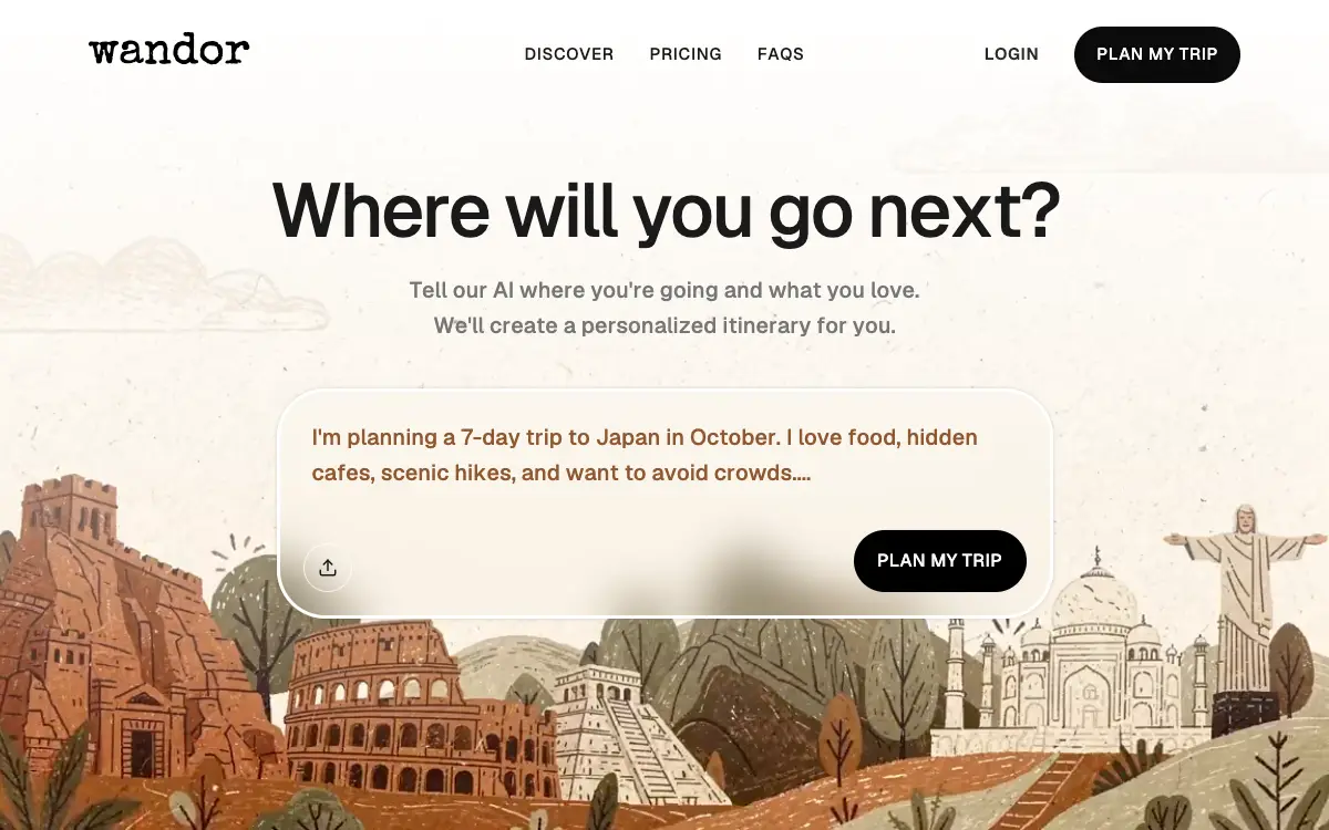
Travel-app hero on an illustrated loop: a white top fade, a typewriter wordmark and a 701px frosted prompt card with upload and CTA.
1.7k views 554 copies 1.5k mots
Le prompt
# Wandor — Pixel-Exact Travel Hero

Build a single-page React + TypeScript landing page for a travel app called **"Wandor"** with Vite, Tailwind CSS and `lucide-react`. The whole page is one full-viewport hero: a looping background video, a frosted-glass prompt card, and a navigation bar.

Follow every specification below literally — exact hex values, exact pixel numbers, exact class names, exact copy. Do not substitute, round, simplify, or "improve" any value. Where a bracketed Tailwind arbitrary value is given (e.g. `text-[15px]`), use that arbitrary value verbatim rather than the nearest preset.

---

## 1. Stack & project setup

**Vite** + **React** + **TypeScript** + **Tailwind CSS**. Icons from **`lucide-react`** — only `Upload` is used.

The `@/` path alias maps to `src/`, configured in `vite.config.ts` via `resolve.alias`:

```ts
import { defineConfig } from 'vite';
import react from '@vitejs/plugin-react';
import { fileURLToPath, URL } from 'node:url';

export default defineConfig({
  plugins: [react()],
  resolve: {
    alias: { '@': fileURLToPath(new URL('./src', import.meta.url)) },
  },
});
```

**File structure:**

```
index.html
src/main.tsx
src/App.tsx
src/index.css
src/components/Hero.tsx
```

`src/App.tsx` imports `Hero` from `@/components/Hero` and renders it inside a wrapping `<div>`. `Hero.tsx` holds all the markup below plus a `NavButton` helper component for the centred links.

---

## 2. `index.html` — head

Page title: **`Wandor — Where will you go next?`**

Fonts, loaded in `<head>` with preconnect to both Google hosts (`fonts.gstatic.com` `crossorigin`):

```html
<link rel="preconnect" href="https://fonts.googleapis.com">
<link rel="preconnect" href="https://fonts.gstatic.com" crossorigin>
<link href="https://fonts.googleapis.com/css2?family=Special+Elite&family=Geist:wght@400;500;600;700&display=swap" rel="stylesheet">
```

- Body / UI font: **Geist** (sans-serif), weights 400 / 500 / 600 / 700.
- Logo font: **Special Elite** (typewriter serif) — used only for the wordmark, nowhere else.

---

## 3. `tailwind.config.js` — theme extensions

```js
extend: {
  fontFamily: {
    sans: ['Geist', 'sans-serif'],
    display: ['Special Elite', 'serif'],
  },
  colors: {
    wandor: {
      dark: '#0a0a0a',
      text: '#1a1a1a',
      muted: '#767676',
      prompt: '#905831',
    },
  },
}
```

---

## 4. `src/index.css`

Tailwind's three directives (base / components / utilities), then:

```css
body {
  font-family: 'Geist', sans-serif;
  overflow-x: hidden;
  background: #fff;
}
```

---

## 5. Layout

One `<section>` filling the viewport: `relative min-h-svh w-full overflow-hidden`.

### 5.1 Background video (`z-0`)

`<video>`, absolutely positioned: `absolute inset-0 w-full h-full object-cover z-0`.

Exact `src`:

```
https://pollen-batch-41236914.figma.site/_components/v2/f0ee2dae7671c170c34f12e31c4cb41418976c98/769c564298c132f7919405cd9f17c1b1231f341d.769c5642.mp4
```

Attributes: `autoPlay muted loop playsInline`. It is decoration — give it `aria-hidden`.

### 5.2 Top gradient overlay (`z-[1]`)

`absolute inset-x-0 top-0 h-[687px] pointer-events-none z-[1]`, with the gradient as an inline style:

```
linear-gradient(180deg, rgba(255,255,255,1) 0%, rgba(255,255,255,0) 100%)
```

A white-to-transparent vertical fade over the top 687px, so the nav and headline read clearly over the video.

### 5.3 Content wrapper (`z-[2]`)

`relative z-[2] max-w-[1360px] mx-auto`.

---

## 6. Navigation bar

`<nav>`: `relative flex items-center justify-between px-20 pt-6 pb-4` (mobile: `max-md:px-6 max-md:pt-5`). It is `relative` because the centre group is positioned against it.

- **Left** — the wordmark:
  `<span className="font-display text-[40px] max-md:text-[32px] text-black leading-none select-none">wandor</span>`
- **Centre** — an absolutely centred group, `absolute left-1/2 -translate-x-1/2 flex gap-8 max-md:hidden`, holding three `NavButton`s: "Discover", "Pricing", "FAQs". Each button:
  `bg-transparent border-none cursor-pointer font-sans text-[15px] font-medium uppercase text-wandor-text tracking-[0.04em] transition-opacity hover:opacity-55`
- **Right** — `flex items-center gap-8`:
  - "Login", hidden on mobile: `bg-transparent border-none cursor-pointer font-sans text-[15px] font-semibold uppercase text-[#292929] tracking-[0.04em] transition-opacity hover:opacity-55 max-md:hidden`
  - "Plan My Trip": `bg-wandor-dark text-[#fafafa] border-none cursor-pointer font-sans text-[15px] font-medium uppercase tracking-[0.04em] px-5 py-3.5 rounded-full transition-all hover:bg-[#333] active:scale-95`

---

## 7. Hero body

Container: `flex flex-col items-center px-6 pt-16 pb-24 text-center`.

- `<h1>`: `font-sans text-[clamp(40px,6vw,68px)] font-medium text-wandor-text leading-[1.05] tracking-[-0.04em] max-w-[820px] mb-5` — "Where will you go next?"
- `<p>`: `font-sans text-xl font-medium text-wandor-muted leading-relaxed max-w-[500px] mb-10` — "Tell our AI where you're going and what you love. We'll create a personalized itinerary for you."

---

## 8. Liquid-glass prompt card

Wrapper `<div>`:

```
relative w-[701px] max-md:w-[calc(100vw-48px)] min-h-[208px]
bg-white/[0.06] border-[3px] border-white rounded-[44px]
shadow-[0_0_4px_0_rgba(0,0,0,0.15)] overflow-hidden backdrop-blur-[20px]
```

That combination *is* the liquid-glass effect: a very low-opacity white fill, a thick white border, a heavy backdrop blur, a soft shadow and a large pill radius.

Three children, all absolutely positioned:

1. **Prompt text** `<p>`: `absolute left-[29px] top-[57px] -translate-y-1/2 w-[609px] max-md:w-[calc(100%-58px)] font-sans text-xl max-md:text-[17px] font-medium text-wandor-prompt leading-relaxed break-words text-left`. Copy: "I'm planning a 7-day trip to Japan in October. I love food, hidden cafes, scenic hikes, and want to avoid crowds...." — including the trailing four dots. `text-left` is explicit: the hero container is `text-center`, and without it this ragged block centres inside its 609px box.
2. **Upload control** — a hidden file input plus the button that opens it:
   `<input ref={fileInputRef} type="file" accept="image/*,.pdf" className="hidden" />`
   Button: `absolute left-[21px] top-[137px] w-11 h-11 bg-transparent border border-white/70 rounded-full cursor-pointer flex items-center justify-center backdrop-blur-[14px] transition-transform hover:scale-105 focus-visible:outline-2 focus-visible:outline-white focus-visible:outline-offset-2`, `aria-label="Upload inspiration"`, clicking it calls `fileInputRef.current?.click()`. Inside: `<Upload className="w-[18px] h-[18px] text-wandor-text flex-shrink-0" />`.
3. **CTA button**: `absolute bottom-[21px] right-[21px] w-[156px] h-14 bg-black border-none rounded-[44px] shadow-[0_0_2px_0_rgba(0,0,0,0.05)] cursor-pointer flex items-center justify-center font-sans text-base font-medium text-[#fafafa] uppercase tracking-[0.02em] transition-all hover:bg-[#333] active:scale-95` — "Plan My Trip".

---

## 9. Motion

- Buttons use `transition-opacity` / `transition-all` / `transition-transform` with `hover:opacity-55`, `hover:bg-[#333]`, `hover:scale-105` and `active:scale-95`.
- The card and the upload button carry `backdrop-blur-[20px]` / `backdrop-blur-[14px]` — the frosted layer over the video.
- The video autoplays muted and loops for ambient motion.
- The top white-to-transparent fade keeps the nav and headline legible over the footage.

---

## 10. Responsive

At `max-md`: nav padding drops to `px-6 pt-5`, the wordmark to 32px, the centre links and Login hide, and the card becomes `calc(100vw-48px)` wide with its prompt text at 17px and `calc(100%-58px)` wide.

---

## Quality Bar

- TypeScript strict, zero `any`. Tailwind only — no CSS beyond `index.css`.
- Autoplay only survives while the element is genuinely `muted` and `playsInline`; keep both, and keep `aria-hidden` on it — the clip is decoration and never the only carrier of meaning.
- Respect `prefers-reduced-motion`: this spec has no entrance animation, but a permanently looping full-bleed video is exactly what that setting asks you to stop. Pause it and hold a frame — the still is a complete illustration on its own — and drop the hover/active transition durations. Read the query inside an effect and re-read it on `change`, not in a `useState` initialiser, which is client-only and would disagree with hydration in Next.js.
- `max-md` is Tailwind's `md` breakpoint negated — `(max-width: 767.98px)`, not 760px. If 760 is the number you actually want, move `screens.md` in the config; do not assume the two agree.
- The centre nav group is `absolute left-1/2`, so it does not participate in the flex row and nothing stops it running into its siblings. Measured: the three links and the Login/CTA cluster overlap on every viewport below 874px, by 53px at 768px — "FAQs" printing straight through "Login" for the whole 768–873 band, which is iPad portrait and a half-screen laptop window. The pill hides at `max-md` (767.98px) and the collision starts one pixel later, so the breakpoint that was meant to solve this misses it entirely. Either give the centre group a flex slot instead of absolute centring, or raise the hide threshold past 874px.
- The card is a fixed `w-[701px]` right up to that breakpoint. At a 768px viewport it plus the hero's `px-6` comes to 749px — about 4px of slack once a classic scrollbar is showing, and none at all if the wrapper ever gains horizontal padding. It fits, but nothing in the markup is defending it.
- Everything inside the card is absolutely positioned against a fixed `min-h-[208px]`, and the prompt paragraph is centred on `top-[57px]` rather than flowed. At 344px the copy wraps to five lines, the block runs 9px past the top edge, and `overflow-hidden` silently crops the first one; 360px still clears it, by 5px. Either let the card grow from static content plus padding, or keep the placeholder short enough for the narrowest width you support.
- `text-wandor-muted` (`#767676`) at 20px on this footage measures 4.26:1 against the gradient-lightened cream sky — under AA for anything below 24px. `#905831` in the card clears it at 5.33:1, and `#1a1a1a` is never in doubt at 16.6:1. The subtitle is the one line to darken, and all three numbers are properties of this specific clip: re-measure before swapping the source.
- The nav's three centre items and both CTAs are `<button>`s with no handler. If they are navigation, make them anchors; a control that takes focus and does nothing is worse than a link.
- The upload button has a real `focus-visible` ring; the other four controls inherit the browser default over a light, busy background. Give them the same treatment before shipping.
- Watch the payload: the source clip is 4K HEVC and dominates page weight on its own. Downscale to what actually renders, drop the audio track muted playback never uses, and serve a compressed derivative.
- Fonts from a `<link>` are a third-party request on the critical path. Both faces here are freely redistributable — Geist under OFL 1.1, Special Elite under Apache 2.0 — so self-host and subset them if the page must run without external requests; the wordmark needs six glyphs.
Vous aimerez aussi
Free
Featured
Vectrus Energy
🛬 Landing Page
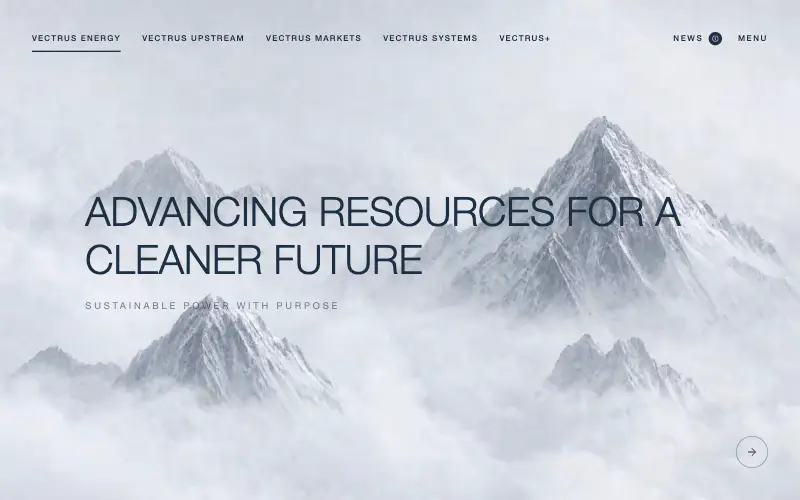
Scroll-tied cinematic section: a 500vh track scrubs an aerial clip frame by frame through a WebCodecs frame bank, with three sequential copy blocks.
4.9k 535CursorClaude CodeLovable
Free
Wanderful
✈️ Travel
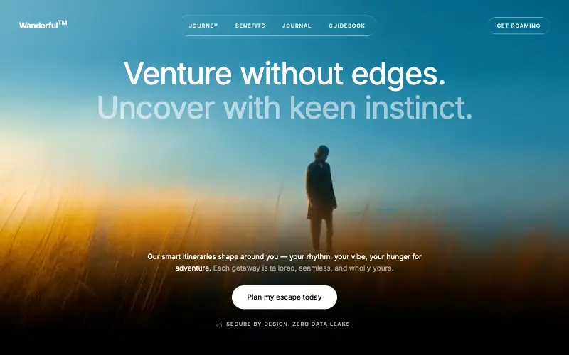
Cinematic travel hero: a full-bleed loop drifting under a GSAP mouse parallax, with a liquid-glass pill navbar and two fade-up copy blocks.
4.8k 445CursorClaude CodeLovable
Free
Featured
Aurora Weather Dashboard
📊 Dashboard
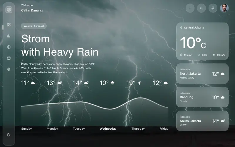
Liquid-glass weather dashboard on a 1357x871 unit grid: frosted panels over a storm photo and a chart that draws itself, then fills.
4.5k 527CursorClaude CodeLovable
Free
Featured
Fastshot Landing
🤖 AI
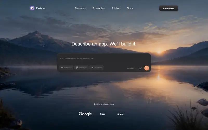
Single-screen AI app-builder landing: full-bleed dawn video, glass composer card and a pixel-specified absolute toolbar.
4.0k 639CursorClaude CodeLovable



