Free
🤖 AI
Palomar
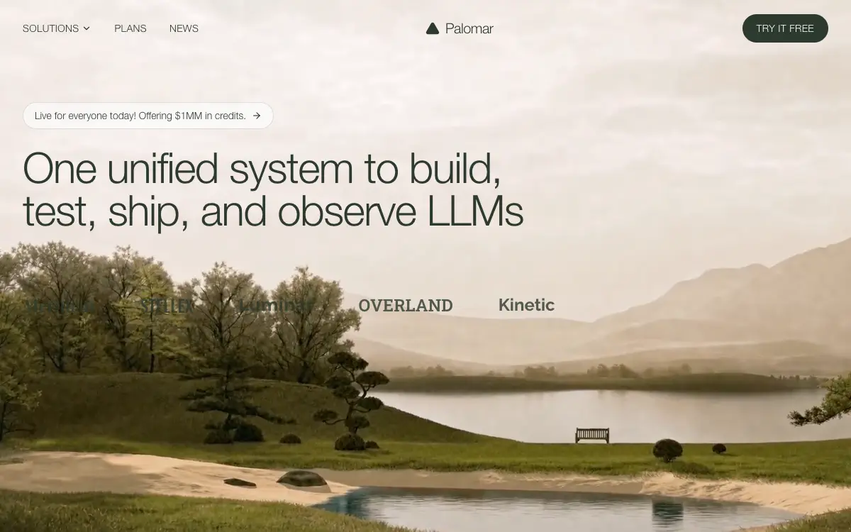
Quiet editorial landing hero for an LLM platform: cream-and-forest palette, frosted pill over a full-bleed landscape video, wordmarks set in five display faces.
2.9k views 245 copies 1.1k kata
Prompt-nya
# Palomar — Marketing Landing Hero

## Goal
Build a standalone, pixel-accurate marketing landing page for "Palomar": **fixed navbar + full-viewport video hero only**. No other sections. Match this spec exactly — do not invent extra copy, buttons, gradients, overlays, or decorative blobs.

## Stack
- React + TypeScript + Vite, Tailwind CSS.
- `lucide-react` icons: `ChevronDown`, `ArrowRight`, `Triangle`.
- A single `App.tsx` holding `Navbar`, `Hero`, `TrustedBy`.

## Exact assets and URLs (do not change)
- Background video: `https://d8j0ntlcm91z4.cloudfront.net/user_38xzZboKViGWJOttwIXH07lWA1P/hf_20260820_010308_b1636845-4c15-4ab6-b0c9-9a29bfb0c6e3.mp4`
- Fonts in `index.html`:
  `<link href="https://db.onlinewebfonts.com/c/0e6de1ec911a2e267ff136bbdd384a44?family=Helvetica+Neue+Light" rel="stylesheet">`
  `<link href="https://fonts.googleapis.com/css2?family=Playfair+Display:wght@700&family=Oswald:wght@500&family=Montserrat:wght@700&family=Roboto+Slab:wght@600&family=Raleway:wght@700&display=swap" rel="stylesheet">`
- Page title: `Palomar - One Unified System for LLMs`

## Design tokens
`theme.extend.colors.brand`: `dark #2d3a2e`, `green #3d5a3e`, `light #f5f3ef`, `cream #faf8f5`.

`theme.extend.fontFamily`:
- `helvetica-neue`: `"Helvetica Neue Light", Helvetica, Arial, sans-serif`
- `playfair`: `"Playfair Display", serif`
- `oswald`: `"Oswald", sans-serif`
- `montserrat`: `"Montserrat", sans-serif`
- `roboto-slab`: `"Roboto Slab", serif`
- `raleway`: `"Raleway", sans-serif`

Globals: `* { margin:0; padding:0; box-sizing:border-box; }`, `html { scroll-behavior: smooth; }`, body font `'Helvetica Neue Light', Helvetica, Arial, sans-serif` with antialiasing. Root app wrapper carries `font-helvetica-neue`. Hero background `bg-brand-cream`.

## Animations (global CSS, exact)
```css
@keyframes fade-up   { from { opacity: 0; transform: translateY(20px); }  to { opacity: 1; transform: translateY(0); } }
@keyframes fade-down { from { opacity: 0; transform: translateY(-12px); } to { opacity: 1; transform: translateY(0); } }
.animate-fade-up   { animation: fade-up 0.8s cubic-bezier(0.16, 1, 0.3, 1) both; }
.animate-fade-down { animation: fade-down 0.7s cubic-bezier(0.16, 1, 0.3, 1) both; }
.stagger-1 { animation-delay: 0ms; }
.stagger-2 { animation-delay: 120ms; }
.stagger-3 { animation-delay: 240ms; }
.stagger-4 { animation-delay: 360ms; }
.stagger-5 { animation-delay: 480ms; }
.stagger-6 { animation-delay: 600ms; }
```

## 1) Navbar
`fixed top-0 left-0 right-0 z-50`, `transition duration-300`. When `window.scrollY > 20`: `bg-brand-cream/90 backdrop-blur-md shadow-sm`; otherwise `bg-transparent`.
Container `max-w-7xl mx-auto px-6 lg:px-8`; bar `relative flex items-center h-16 md:h-20`.

- **Desktop left links** — `hidden md:flex items-center gap-8 animate-fade-down stagger-1`. Every item: `text-sm text-brand-dark tracking-wide uppercase hover:opacity-70 transition-opacity`. A button "Solutions" with `ChevronDown w-3.5 h-3.5` (`flex items-center gap-1`), then anchors "Plans" and "News".
- **Center logo** — `absolute left-1/2 -translate-x-1/2 flex items-center gap-2 animate-fade-down stagger-2`: lucide `Triangle` at `w-5 h-5 text-brand-dark fill-brand-dark`, then "Palomar" at `text-xl text-brand-dark tracking-tight font-helvetica-neue`.
- **Desktop CTA** — `hidden md:inline-flex items-center ml-auto px-5 py-2.5 bg-brand-dark text-white text-sm tracking-wide uppercase rounded-full hover:bg-brand-green transition-colors animate-fade-down stagger-3`, label "Try It Free".
- **Mobile hamburger** — `md:hidden ml-auto z-50 w-10 h-10`, `aria-label="Toggle menu"`. Two bars `w-6 h-[2px] bg-brand-dark rounded` with `transition-all duration-300 ease-[cubic-bezier(0.68,-0.6,0.32,1.6)]`; top bar at `top-[6px]` → open `rotate-45 translate-y-[5px]`, bottom bar at `top-[13px]` → open `-rotate-45`. While open, set `document.body.style.overflow = 'hidden'`.
- **Mobile overlay** — `md:hidden fixed inset-0 bg-brand-cream z-40`, `transition duration-500 ease-[cubic-bezier(0.22,1,0.36,1)]`; open `opacity-100 pointer-events-auto`, closed `opacity-0 pointer-events-none`. Inner column `flex flex-col items-center justify-center h-full gap-8` with the same 500ms ease plus `delay-100`; open `translate-y-0 opacity-100`, closed `-translate-y-8 opacity-0`. Links "Solutions", "Plans", "News" at `text-3xl text-brand-dark tracking-tight`; CTA `mt-4 inline-flex items-center px-8 py-3.5 bg-brand-dark text-white text-lg tracking-wide rounded-full` → "Try It Free". Clicking any item closes the menu.

No dropdown panel for Solutions — a button on desktop, a plain link on mobile.

## 2) Hero
`section.relative.w-full.h-screen.min-h-[700px].overflow-hidden.bg-brand-cream`.

- **Video layer**: `div.absolute.inset-0` wrapping a `<video>` with the CloudFront src above, `autoPlay muted loop playsInline`, class `w-full h-full object-cover object-bottom`. No dark overlay, no gradient, no poster image.
- **Content column** (on top of the video, left-aligned, *not* vertically centred): `relative z-10 flex flex-col items-start max-w-7xl mx-auto pt-28 md:pt-36 px-6 lg:px-8`.
- **Announcement pill**: an anchor, `inline-flex items-center gap-2 px-4 py-2 rounded-full border border-brand-dark/15 bg-white/60 backdrop-blur-sm hover:bg-white/80 transition-colors mb-5 md:mb-6 animate-fade-up stagger-3`. Text at `text-sm text-brand-dark`: "Live for everyone today! Offering $1MM in credits." followed by `ArrowRight w-3.5 h-3.5 text-brand-dark`.
- **Headline**: `text-left text-3xl sm:text-4xl md:text-5xl lg:text-6xl text-brand-dark leading-[1.05] tracking-tight max-w-4xl font-helvetica-neue animate-fade-up stagger-4`. Copy, with a line break only from `sm` up:
  "One unified system to build," then `<br className="hidden sm:block" />`, then a space, then "test, ship, and observe LLMs". Below 640px it wraps naturally as one block.

No subtitle, no primary CTA in the hero body.

## 3) Trusted by (inside the hero, under the headline)
Wrapper `w-full mt-8 md:mt-10 animate-fade-up stagger-5`. Label `text-left text-xs tracking-[0.25em] uppercase text-brand-dark/50 mb-6 md:mb-8 font-helvetica-neue` → "Backed by". Logo row `flex flex-wrap items-center justify-start gap-6 md:gap-12 lg:gap-16 animate-fade-up stagger-6`, five wordmarks set as text (not images), each `text-lg md:text-xl lg:text-2xl text-brand-dark/80 whitespace-nowrap`:

| Wordmark | Class | Face |
| --- | --- | --- |
| Meridian | `font-playfair` | Playfair Display 700 |
| STELLEX | `font-oswald uppercase` | Oswald 500 |
| Luminar | `font-montserrat` | Montserrat 700 |
| OVERLAND | `font-roboto-slab uppercase` | Roboto Slab 600 |
| Kinetic | `font-raleway` | Raleway 700 |

## Responsive rules (must match)
- **< 768px**: hamburger + full-screen cream overlay, desktop links and CTA hidden, nav `h-16`, hero `pt-28 px-6`, logo gaps `gap-6`, headline `text-3xl` then `sm:text-4xl`.
- **md+**: three left links, centred logo, right pill CTA, nav `h-20`, hero `pt-36`, logo gaps `md:gap-12`.
- **lg+**: container `px-8`, headline `lg:text-6xl`, logo gaps `lg:gap-16`.
- The hero is always `h-screen` with `min-h-[700px]`; content stays left-aligned (`items-start`, `text-left`, `justify-start`); the video is always `object-cover object-bottom` so the bottom of the footage stays framed.

## Visual character
Quiet, editorial, cream and forest. Light Helvetica Neue — not heavy Inter or SF. A centred triangle beside the Palomar wordmark. A frosted white pill floating over full-bleed landscape footage. The "logos" are wordmarks in mixed display faces, not SVG brand files. Entrance: the nav fades down at 0 / 120 / 240ms; pill, headline and Backed-by fade up at 240 / 360 / 480 / 600ms.

## Do not add
Footer, extra sections, search, language switcher, social icons, video controls, mute button, overlay scrim, a second headline, a hero "Get started" button, Solutions mega-menu content, or any other video URL.

## Quality Bar
- TypeScript strict, zero `any`. Tailwind only — no external CSS files beyond the global block above.
- Give the background video `aria-hidden`; it is decoration and never the only carrier of meaning. Keep every foreground control reachable by keyboard with a visible focus ring, and put `aria-expanded` on the hamburger.
- Autoplay only works while the element is genuinely `muted` and `playsInline` — keep both.
- Watch the payload: a full-resolution source video will dominate page weight. Downscale to the rendered size, drop the audio track that muted playback never uses, and serve a compressed derivative.
- Respect `prefers-reduced-motion`: pause the loop and hold a still frame instead of looping video behind the copy.
- Dark type sits directly on the footage with no scrim — this composition only holds because the top of the frame is pale sky. Check contrast against the actual video before swapping the source.
Kamu mungkin juga suka
Free
Featured
Vectrus Energy
🛬 Landing Page
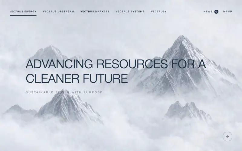
Scroll-tied cinematic section: a 500vh track scrubs an aerial clip frame by frame through a WebCodecs frame bank, with three sequential copy blocks.
4.9k 535CursorClaude CodeLovable
Free
Wanderful
✈️ Travel
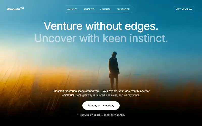
Cinematic travel hero: a full-bleed loop drifting under a GSAP mouse parallax, with a liquid-glass pill navbar and two fade-up copy blocks.
4.8k 445CursorClaude CodeLovable
Free
Featured
Aurora Weather Dashboard
📊 Dashboard
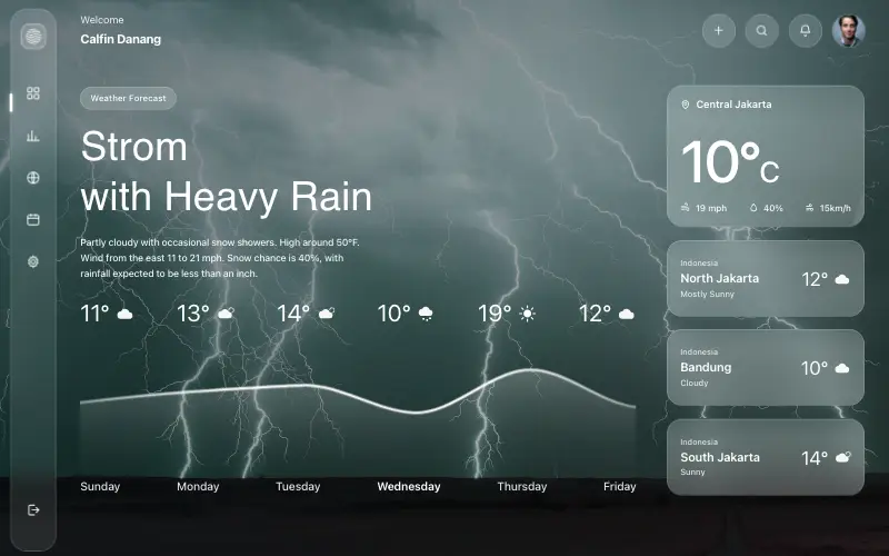
Liquid-glass weather dashboard on a 1357x871 unit grid: frosted panels over a storm photo and a chart that draws itself, then fills.
4.5k 527CursorClaude CodeLovable
Free
Featured
Fastshot Landing
🤖 AI
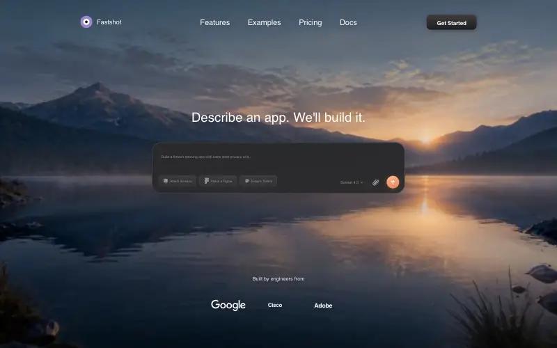
Single-screen AI app-builder landing: full-bleed dawn video, glass composer card and a pixel-specified absolute toolbar.
4.0k 639CursorClaude CodeLovable



