Free
🎨 Portfolio
Velorah
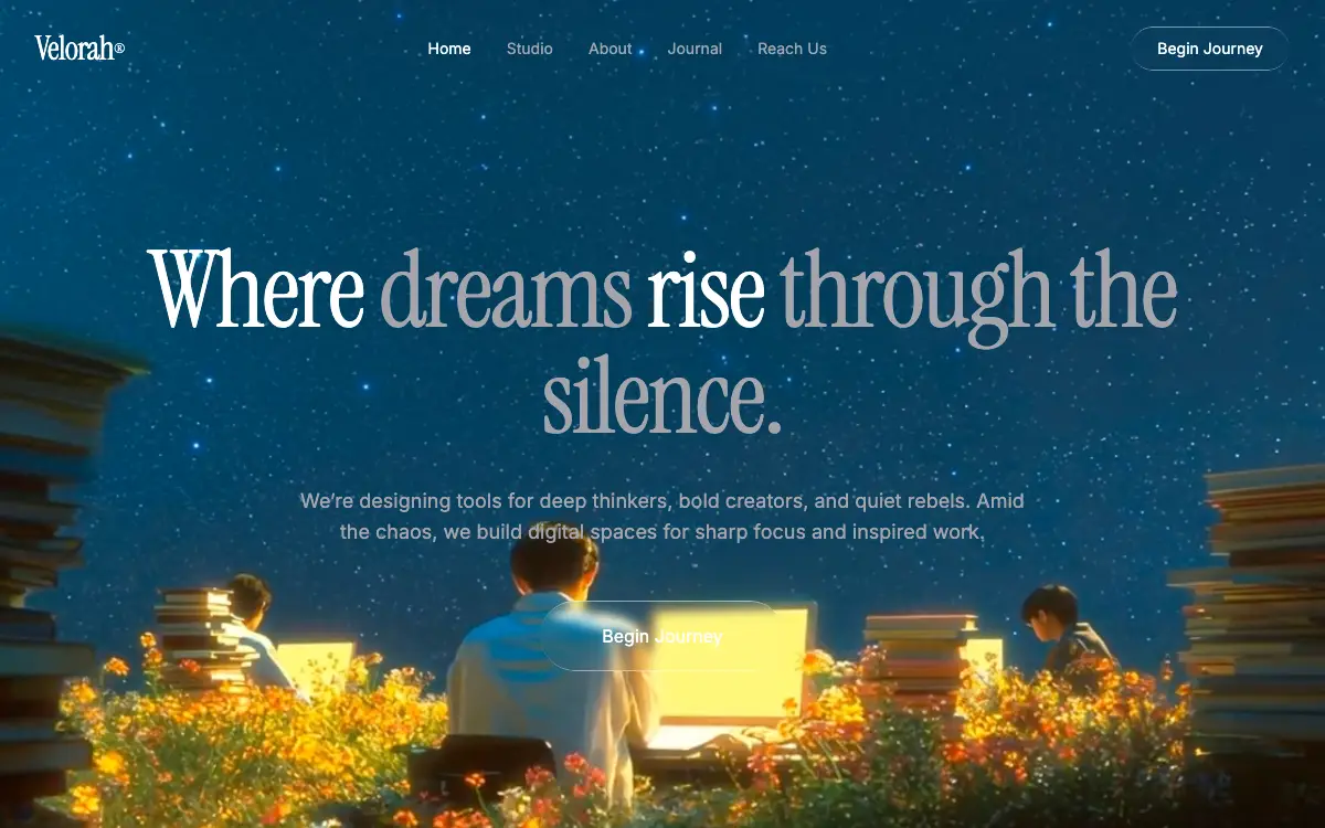
Cinematic single-screen hero on a looping night-sky film: a liquid-glass pill nav, an Instrument Serif headline that fades two of its phrases into muted grey, and three staggered rise-ins.
2.9k views 126 copies 1.8k kata
Prompt-nya
# Velorah — Cinematic Single-Screen Hero

Build a single-page hero section for **Velorah®** on a fullscreen looping background video, with a glassmorphic navigation bar and cinematic display typography. One screen, nothing below it.

Reproduce this exactly — same copy, same HSL tokens, same class strings, same CSS. Do not add decorative blobs, radial gradients, scrims, or any overlay on top of the video: the film provides all of the visual depth. No extra sections, no footer, no cards.

## 1. Stack

- **Vite + React + TypeScript + Tailwind CSS**, with **shadcn/ui** initialised
- One `App`. No routing.

## 2. Video background

```
https://d8j0ntlcm91z4.cloudfront.net/user_38xzZboKViGWJOttwIXH07lWA1P/hf_20260314_131748_f2ca2a28-fed7-44c8-b9a9-bd9acdd5ec31.mp4
```

A `<video>` with `autoPlay`, `loop`, `muted`, `playsInline`, positioned `absolute inset-0 w-full h-full object-cover z-0`.

The clip is a night scene: a deep navy star field filling the upper two thirds, and along the bottom a warm, brightly lit band — a figure at a glowing laptop, stacks of books, and a bed of orange and yellow flowers. Everything else on the page sits at `z-10` directly on top of it.

## 3. Fonts

Import from Google Fonts: **Instrument Serif** (display) and **Inter** at weights 400 and 500 (body).

```css
:root {
  --font-display: 'Instrument Serif', serif;
  --font-body: 'Inter', sans-serif;
}
body { font-family: var(--font-body); }
```

Headings and the wordmark take the display face through an inline `style={{ fontFamily: "'Instrument Serif', serif" }}`.

## 4. Colour theme (dark, HSL channel values for CSS variables)

```css
--background: 201 100% 13%;        /* deep navy blue */
--foreground: 0 0% 100%;           /* white */
--muted-foreground: 240 4% 66%;    /* muted gray */
--primary: 0 0% 100%;
--primary-foreground: 0 0% 4%;
--secondary: 0 0% 10%;
--muted: 0 0% 10%;
--accent: 0 0% 10%;
--border: 0 0% 18%;
--input: 0 0% 18%;
```

## 5. Navigation bar

`relative z-10`, flex row, `justify-between`, `px-8 py-6`, `max-w-7xl mx-auto`.

- **Logo:** `Velorah®` with the ® as `<sup className="text-xs">`. `text-3xl tracking-tight text-foreground`, Instrument Serif.
- **Nav links**, hidden on mobile (`md:flex`): **Home** (active, `text-foreground`), **Studio**, **About**, **Journal**, **Reach Us** — the rest `text-sm text-muted-foreground` with `hover:text-foreground transition-colors`.
- **CTA:** `Begin Journey` — `liquid-glass rounded-full px-6 py-2.5 text-sm text-foreground`, `hover:scale-[1.03]`.

## 6. Hero

`relative z-10`, flex column, centred, `text-center`, `px-6 pt-32 pb-40 py-[90px]`.

- **H1:** `Where dreams rise through the silence.`
  `text-5xl sm:text-7xl md:text-8xl leading-[0.95] tracking-[-2.46px] max-w-7xl font-normal`, Instrument Serif.
  The words `dreams` and `through the silence.` are each wrapped in `<em className="not-italic text-muted-foreground">` so they drop to the muted grey while the rest stays white.
- **Subtext:** `text-muted-foreground text-base sm:text-lg max-w-2xl mt-8 leading-relaxed`

  > We're designing tools for deep thinkers, bold creators, and quiet rebels. Amid the chaos, we build digital spaces for sharp focus and inspired work.

- **CTA:** `Begin Journey` — `liquid-glass rounded-full px-14 py-5 text-base text-foreground mt-12`, `cursor-pointer`, `hover:scale-[1.03]`.

## 7. Liquid glass

```css
.liquid-glass {
  background: rgba(255, 255, 255, 0.01);
  background-blend-mode: luminosity;
  backdrop-filter: blur(4px);
  -webkit-backdrop-filter: blur(4px);
  border: none;
  box-shadow: inset 0 1px 1px rgba(255, 255, 255, 0.1);
  position: relative;
  overflow: hidden;
}
.liquid-glass::before {
  content: '';
  position: absolute;
  inset: 0;
  border-radius: inherit;
  padding: 1.4px;
  background: linear-gradient(180deg,
    rgba(255,255,255,0.45) 0%, rgba(255,255,255,0.15) 20%,
    rgba(255,255,255,0) 40%, rgba(255,255,255,0) 60%,
    rgba(255,255,255,0.15) 80%, rgba(255,255,255,0.45) 100%);
  -webkit-mask: linear-gradient(#fff 0 0) content-box, linear-gradient(#fff 0 0);
  -webkit-mask-composite: xor;
  mask-composite: exclude;
  pointer-events: none;
}
```

## 8. Animations

```css
@keyframes fade-rise {
  from { opacity: 0; transform: translateY(24px); }
  to   { opacity: 1; transform: translateY(0); }
}
.animate-fade-rise         { animation: fade-rise 0.8s ease-out both; }
.animate-fade-rise-delay   { animation: fade-rise 0.8s ease-out 0.2s both; }
.animate-fade-rise-delay-2 { animation: fade-rise 0.8s ease-out 0.4s both; }
```

- H1 → `animate-fade-rise`
- Subtext → `animate-fade-rise-delay`
- Hero CTA → `animate-fade-rise-delay-2`

## Deliver

A working Vite + React + TS app: `index.html`, `src/App.tsx`, `src/index.css`, `tailwind.config.js`. Minimalist, cinematic, vertically centred. The video carries the whole composition.

## Quality Bar

- **"Instrumental Serif" is not a font.** The import line names it; every other reference — the `--font-display` variable, the inline `fontFamily` — says `Instrument Serif`, which is the real Google family. Requesting the name as written returns **HTTP 400** from `fonts.googleapis.com`, so copying this literally loads nothing and every heading and the wordmark silently fall back to the generic `serif`. The whole page is display type; this is the one typo that costs the most.
- **The muted grey does not survive the star field, and the spec forbids the one thing that would fix it.** `--muted-foreground` resolves to `rgb(165,165,172)`, and it carries the subtext, four of the five nav links, and two of the four phrases in the H1 — sat directly on the film with no scrim, because "no overlays" is an explicit instruction. Measured against all 289 frames at 1440×900: the **18px subtext** hits a worst case of **1.00:1** with **3.08% of the band below 4.5:1**, and every one of the 289 frames fails somewhere; the **14px nav links** are the same 1.00:1 worst case with **2.07%** below 4.5:1. Even the white type is not clean — the hero CTA's 16px label bottoms out at **1.71:1** (0.17% of pixels, 286 of 289 frames) and the 96px H1 at **1.12:1**. The stars are the culprit: small specular points land exactly on the grey's luminance. Only the 30px wordmark is safe throughout, at 4.29:1 minimum.
- **A flat scrim will not rescue this, and it is worth knowing before reaching for one.** Measured over the same 289 frames, a uniform black overlay behind the subtext takes it from 1.00:1 / 3.08% of pixels failing, to 1.03:1 / 0.57% at 25%, 1.35:1 / 0.25% at 40%, and 2.21:1 / 0.09% at 55% — the failing *area* collapses, but the worst case never reaches 4.5:1, and 55% black would erase the film this page is built on. The reason is structural: `rgb(165,165,172)` sits in the middle of the luminance range, so it has no safe side — it fails against the star highlights above and would fail against the shadows below. White is no escape either (measured 1.12:1 on the H1 band, 1.71:1 on the CTA label) because the bottom third holds a blown-out laptop glow. The dependable fix is a surface local to the copy, or moving the copy into the calm part of the frame — not a global overlay.
- **`py-[90px]` never applies.** In `px-6 pt-32 pb-40 py-[90px]`, Tailwind emits `.py-[90px]` *before* `.pb-40` and `.pt-32` in the stylesheet, and class order in the attribute has no bearing on which wins. Measured computed padding: **128px top, 160px bottom** — `pt-32` and `pb-40`, exactly as if `py-[90px]` were not there. Decide which pair you meant and delete the other.
- **`leading-[0.95]` is overridden at every size where it would matter.** `text-5xl`, `sm:text-7xl` and `md:text-8xl` each bundle their own `line-height: 1`, and the responsive ones sit inside later `@media` blocks, so they beat the unprefixed `leading-[0.95]`. Measured: at 500px wide the line-height is **45.6px** (0.95 × 48, correct); at 800px and at 1440px it is **96px** where the spec asks for 91.2px. Tight display leading is a large-type device, and this is the one place it does not survive. Write it as `text-8xl/[0.95]`, or add the responsive `leading-` variants.
- **`background-blend-mode: luminosity` does nothing here.** It blends a box's own background *layers* against each other; `.liquid-glass` has a single colour layer and no image, so there is nothing to blend. If the intent was to blend against the video behind, that is `mix-blend-mode` — and it would fight `backdrop-filter`. Delete the line or write the one you meant.
- **The glass border only renders in WebKit.** `.liquid-glass::before` declares `-webkit-mask` and `-webkit-mask-composite: xor`, then finishes with the standard `mask-composite: exclude` — but never declares a standard `mask`. In engines that implement the unprefixed properties and not the WebKit pair, `mask-composite` has no mask to composite and the 1.4px gradient hairline renders as a filled gradient block covering the whole pill. Declare both `mask` and `-webkit-mask`.
- **Seven controls, no destinations and no focus ring.** The five nav links are given no `href`, both `Begin Journey` buttons no handler, and the spec defines `hover:` states throughout without a single `:focus-visible` rule. Everything sits on a moving film, so a keyboard user gets an invisible cursor over a page where nothing responds anyway.
- **Three staggered entrances and a permanently looping fullscreen video, and no `prefers-reduced-motion` branch.** The text half is easy — land the `.animate-fade-rise*` elements on their end state, never their start state, or the whole hero stays at `opacity: 0`. The video half cannot be done in CSS: `animation-play-state` does not touch media playback, so read the query in an effect, `pause()` the element, and re-read it on `change`.
- **`<em class="not-italic">` is a colour device wearing a semantic element.** `<em>` tells assistive technology to stress the words; here it exists only to tint `dreams` and `through the silence.` grey, and `not-italic` then cancels the one visual thing `<em>` would have done. Use `<span>`.
- **Seven of the ten colour tokens are declared and never referenced.** The page renders `--background`, `--foreground` and `--muted-foreground` and nothing else; `--primary`, `--primary-foreground`, `--secondary`, `--muted`, `--accent`, `--border` and `--input` appear only in `:root`. They are also all neutral greys (`0 0%`) sitting under a `201 100%` navy, so if they ever are used they will not belong to this palette.
- **shadcn/ui is in the stack and no shadcn component is in the design.** Both CTAs are described as bare elements carrying `liquid-glass` classes, the nav is a plain flex row, and there is no dialog, sheet or menu. Initialising shadcn here adds `components.json`, the `cn` helper and a CVA dependency for zero components — either use `Button` for the two CTAs or drop it from the stack.
- **14.1 MB of video on the critical path, with no poster.** The source is 1924×1076, H.264, 24fps, 12.04s, 14,142,575 bytes, and `autoPlay` + `loop` means it starts downloading immediately and never stops looping. There is no `poster`, so the first paint is the bare `--background` navy until the first frame decodes — which is the one moment that navy is visible at all. The same clip re-encoded to 1280×716 is **1,013,155 bytes, 7.2% of the original**, and at `object-cover` on a 1440×900 viewport nothing above 1609px wide is ever sampled.
- **Inter is loaded at 400 and 500 and the page never sets a weight.** No `font-medium`, no `font-semibold` — the only weight utility anywhere is `font-normal`, and that is on the H1, which is the serif. Weight 500 is downloaded and never drawn. Google's latin slices for the two families come to 15,040 + 48,432 = **63,472 bytes**; self-hosted and subset to the characters this page actually sets, with Inter's variable axis pinned, the same rendering is 2,664 + 5,004 = **7,668 bytes (12.1%)**, without the blocking cross-origin round trip.
Kamu mungkin juga suka
Free
Featured
Vectrus Energy
🛬 Landing Page
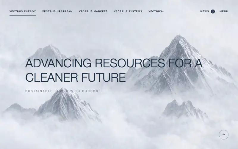
Scroll-tied cinematic section: a 500vh track scrubs an aerial clip frame by frame through a WebCodecs frame bank, with three sequential copy blocks.
4.9k 535CursorClaude CodeLovable
Free
Wanderful
✈️ Travel
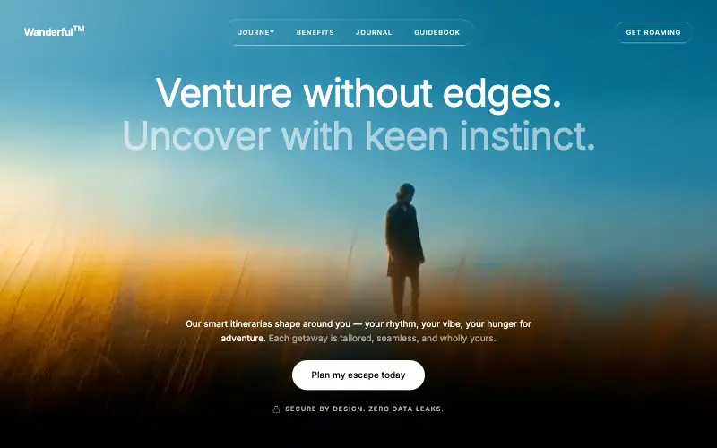
Cinematic travel hero: a full-bleed loop drifting under a GSAP mouse parallax, with a liquid-glass pill navbar and two fade-up copy blocks.
4.8k 445CursorClaude CodeLovable
Free
Featured
Aurora Weather Dashboard
📊 Dashboard
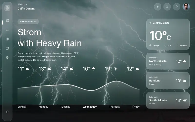
Liquid-glass weather dashboard on a 1357x871 unit grid: frosted panels over a storm photo and a chart that draws itself, then fills.
4.5k 527CursorClaude CodeLovable
Free
Featured
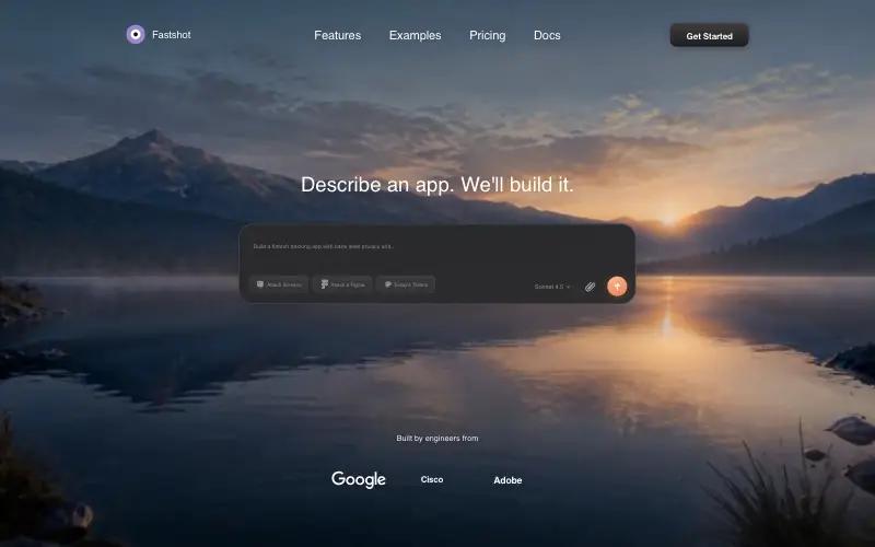
Fastshot Landing
🤖 AI
Single-screen AI app-builder landing: full-bleed dawn video, glass composer card and a pixel-specified absolute toolbar.
4.0k 639CursorClaude CodeLovable



