Free
🛒 Ecommerce
Loomcraft Home
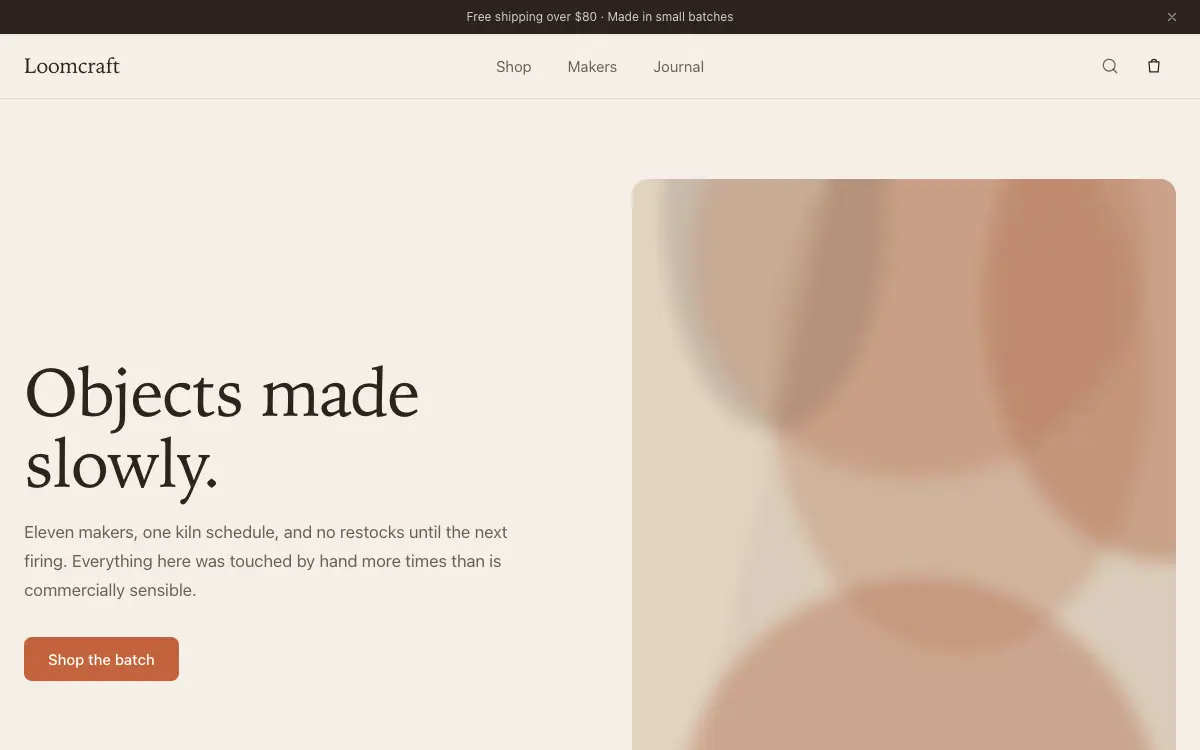
Artisan home-goods storefront with warm textile palette, tactile product cards and a story-driven maker section.
7 views 0 copies 484 語
プロンプト本文
# Loomcraft — Artisan Home Goods Storefront

## Goal
Build a production-ready artisan home goods storefront called "Loomcraft". Overall vibe: warm, handmade, honest — a linen-and-clay aesthetic that makes products feel touchable. It should look hand-crafted by a senior product designer — not like a generic template.

## Design System
- **Palette**: warm linen #F4EFE8 background, espresso #2B2320 text, terracotta #C4633C accent used only on CTAs and sale chips
- **Typography**: low-contrast serif (e.g. Fraunces soft) for headings, humanist sans for body; prices in tabular figures
- **Grid & spacing**: 12-col grid, 8px base unit. Desktop sections 112-128px vertical padding, mobile 56-64px.
- **Corners & borders**: cards 16px radius, buttons 10px, inputs 10px. 1px borders at 8-12% white (dark) or 8% black (light).
- **Shadows**: layered, soft (0 1px 2px + 0 8px 24px), never harsh.

## Page Structure
1. **Announcement bar** — 'Free shipping over $80 · Made in small batches' in 12px, dismissible.
2. **Navbar** — logo left, Shop / Makers / Journal center, search + bag right; bag icon shows a springy count badge.
3. **Hero** — split: left headline 'Objects made slowly.' with CTA, right a 4:5 photo of ceramics on linen; a small 'New: Autumn kiln batch' tag link floats on the photo.
4. **Category tiles** — 4 tiles (Ceramics / Textiles / Wood / Glass) with photos desaturated 20%, warming to full color on hover.
5. **Product grid** — 8 cards: image on linen backdrop, name, price, tiny 'x left in batch' scarcity line; hover lifts card 4px and swaps to a lifestyle shot.
6. **Maker story** — split section: portrait photo left, right a short interview excerpt with pull-quote and 'Meet the makers' link.
7. **Reviews strip** — 3 review cards with star rows and verified-buyer chips.
8. **Footer** — newsletter signup ('First batch alerts'), care-guide links, payment icons.

## Motion
- Product card image crossfades to lifestyle shot over 250ms; price nudges 2px right as an underline draws under the name.
- Category tiles reveal with 60ms stagger and a slight clip-path inset that opens outward.
- Bag badge pops with a spring (scale 0→1.15→1) whenever count changes.
- All entrances use IntersectionObserver-triggered reveals; never animate on every scroll tick.
- Respect `prefers-reduced-motion`: disable transforms, keep opacity fades under 150ms.

## Details That Matter
- Quick-view modal per product: image gallery dots, size selector, add-to-bag — trap focus, close on Esc.
- Scarcity lines under 5 items render in terracotta; otherwise muted — implement as a tiny logic helper.

## Tech & Quality Bar
- Next.js App Router + TypeScript + Tailwind CSS. No UI kit — style from scratch.
- Fully responsive at 375 / 768 / 1024 / 1440px. Mobile nav becomes a full-screen overlay with staggered link reveal.
- Semantic landmarks (header/main/section/footer), WCAG AA contrast, focus-visible rings on all interactive elements.
- Optimize LCP: hero media preloaded, fonts `display: swap`, zero layout shift.
こちらもおすすめ
Free
Featured
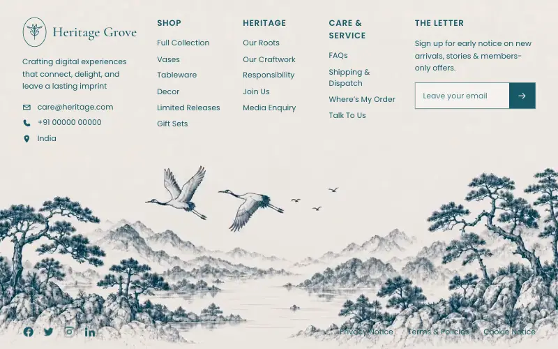
Heritage Grove Footer
🛒 Ecommerce
Full-viewport footer laid straight onto a hand-drawn ink landscape loop — five columns on the paper sky, and below 1100px the clip leaves the background and becomes a flow item under the copy.
4.5k 562CursorClaude CodeLovable
Free
Featured
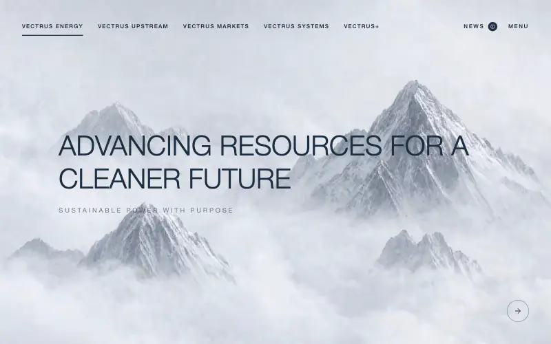
Vectrus Energy
🛬 Landing Page
Scroll-tied cinematic section: a 500vh track scrubs an aerial clip frame by frame through a WebCodecs frame bank, with three sequential copy blocks.
4.9k 535CursorClaude CodeLovable
Free
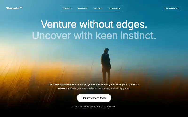
Wanderful
✈️ Travel
Cinematic travel hero: a full-bleed loop drifting under a GSAP mouse parallax, with a liquid-glass pill navbar and two fade-up copy blocks.
4.8k 445CursorClaude CodeLovable
Free
Featured
Aurora Weather Dashboard
📊 Dashboard
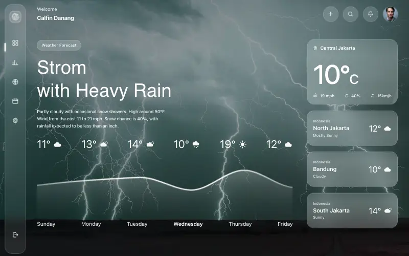
Liquid-glass weather dashboard on a 1357x871 unit grid: frosted panels over a storm photo and a chart that draws itself, then fills.
4.5k 527CursorClaude CodeLovable