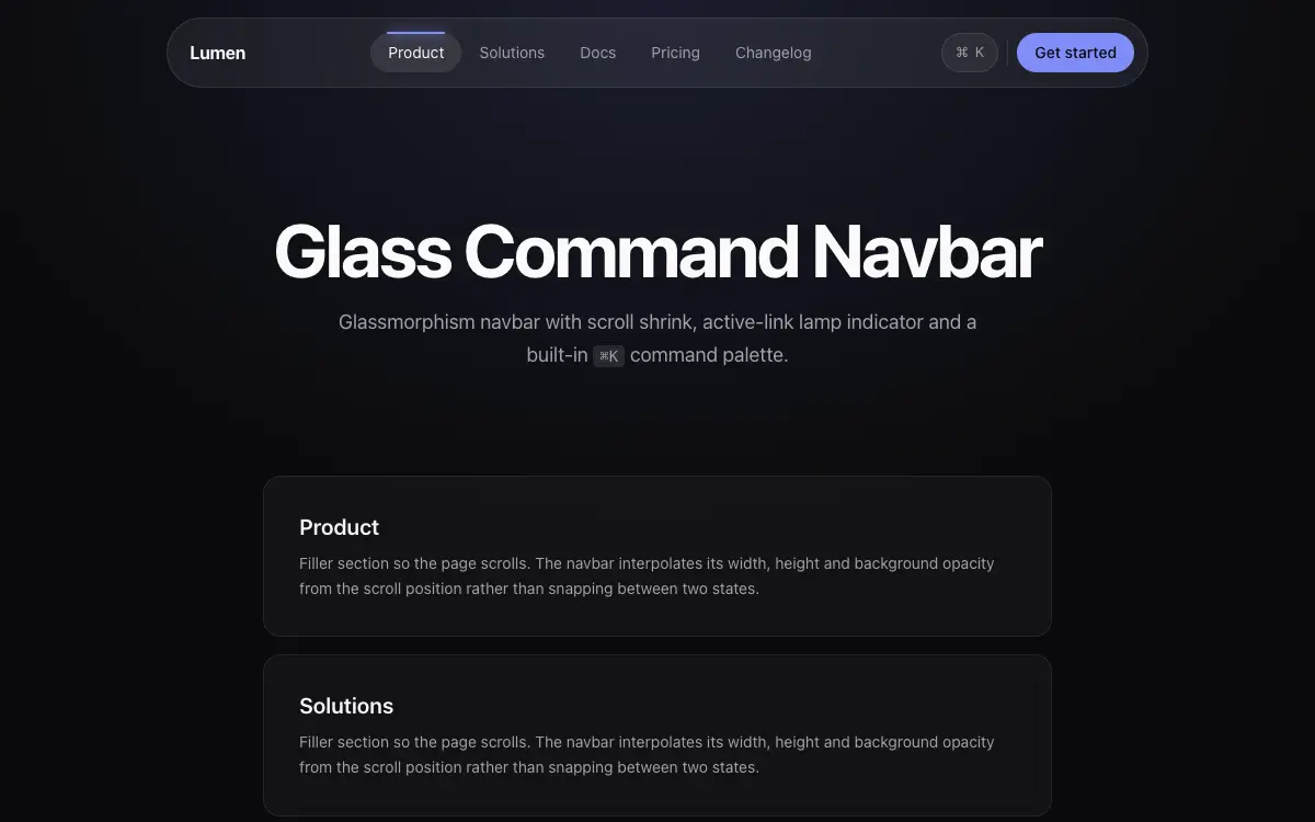
Glass Command Navbar
Glassmorphism navbar with scroll shrink, active-link lamp indicator and a built-in ⌘K command palette stub.
프롬프트
# Glass Command Navbar — UI Component

## Goal
Build a premium glass navbar: blur shell, lamp-style active indicator, scroll behavior, mobile overlay, and a ⌘K palette stub. It must drop cleanly into an existing Next.js + Tailwind project as a self-contained component.

## Design Spec
- Shell: fixed top, inner container rounded-full mt-4 px-2 with bg-white/[0.06] backdrop-blur-xl border-white/[0.1] — floating pill style, not full-width bar.
- Links: 5 items px-4 py-2; active link gets a 'lamp': a pill highlight behind it plus a 2px glow line on top edge — the highlight is one shared element th
1회 결제 평생 이용권으로 289단어 전체 프롬프트를 열어 보세요.
Unlock Full Prompt이런 프롬프트도 있어요
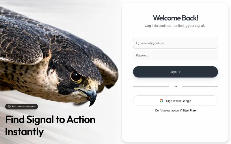
Signal
Pixel-locked single-file login page: a looping peregrine-falcon dive beside a frosted card, with embedded fonts, a JS layout engine that switches between desktop, tablet-portrait and phone compositions, and a once-only WAAPI entrance.
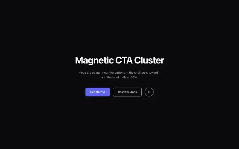
Magnetic CTA Cluster
Buttons that pull toward the cursor within a radius, with the label lagging behind the shell for weight.

LinkFlow
Full-bleed hero whose clip is captured frame by frame and replayed forward-then-reverse on canvas, under a frosted pill nav, a two-tone green headline and a slide-in mobile drawer built entirely from CSS transitions.
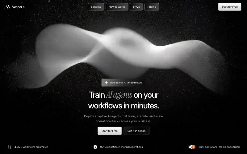
Vesper.ai
Single-viewport AI-infrastructure landing on pure black: a liquid-metal pill nav, a serif-italic mixed headline over a full-bleed hero still, and three stats locked to the bottom of one non-scrolling frame.



