Free
☁️ SaaS
Apogee
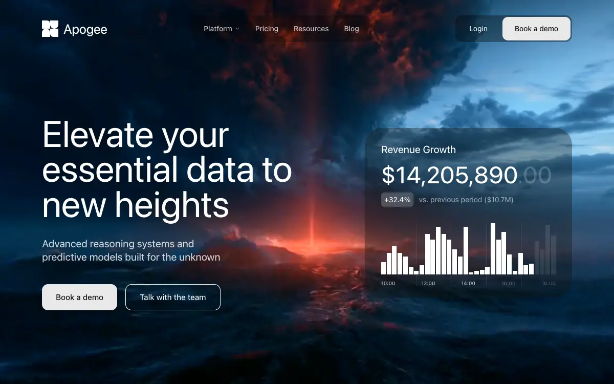
Data-platform hero on a nebula loop: glass nav pills, a 72px headline and a Revenue Growth card whose 32 bars grow in on a 30ms stagger.
767 views 438 copies 4.6k 단어
프롬프트
# Apogee — Pixel-Exact Hero Section

Build a pixel-exact, fully mobile-responsive hero landing section called **"Apogee"**. Follow every specification below literally — exact hex values, exact pixel numbers, exact class names, exact animation delays, exact copy. Do not substitute, round, simplify, or "improve" any value. Where a bracketed Tailwind arbitrary value is given (e.g. `text-[15.5px]`), use that arbitrary value verbatim rather than the nearest Tailwind preset.

---

## 1. Stack & project setup

- **Vite 5** + **React 18.3** + **TypeScript 5.5** + **Tailwind CSS 3.4** + **PostCSS/Autoprefixer**
- Icons: **`lucide-react`** (v0.446) — use only `ChevronDown`, `Menu`, `X`
- `package.json` type: `"module"`. Scripts: `dev: vite`, `build: vite build`, `lint: eslint .`, `preview: vite preview`, `typecheck: tsc --noEmit -p tsconfig.app.json`

**`vite.config.ts`:**
```ts
import { defineConfig } from 'vite';
import react from '@vitejs/plugin-react';
import { fileURLToPath, URL } from 'node:url';

export default defineConfig({
  plugins: [react()],
  resolve: {
    alias: {
      '@': fileURLToPath(new URL('./src', import.meta.url)),
    },
  },
  optimizeDeps: {
    exclude: ['lucide-react'],
  },
});
```

**`tsconfig.app.json`** must include the matching path alias so `@/foo` resolves to `src/foo`:
```json
"baseUrl": ".",
"paths": { "@/*": ["src/*"] }
```

**`tailwind.config.js`** — stock, no theme extensions (all styling uses arbitrary values):
```js
/** @type {import('tailwindcss').Config} */
export default {
  content: ['./index.html', './src/**/*.{js,ts,jsx,tsx}'],
  theme: { extend: {} },
  plugins: [],
};
```

**File structure:**
```
index.html
src/main.tsx
src/App.tsx
src/index.css
src/components/Hero.tsx
```

`src/App.tsx` renders nothing but the hero:
```tsx
import Hero from '@/components/Hero';

function App() {
  return <Hero />;
}

export default App;
```

`src/main.tsx` uses `createRoot` + `<StrictMode>`, importing `./App.tsx` and `./index.css`.

---

## 2. `index.html` — font & head

Page title: **`Apogee`**. Viewport meta: `width=device-width, initial-scale=1.0`.

Load the **Suisse Intl** webfont with this exact stylesheet link in `<head>`:
```html
<link href="https://db.onlinewebfonts.com/c/13ab13418f633c1b0516fed6e30bedbc?family=Suisse+Int%27l" rel="stylesheet">
```

Root div id is `root`; module script is `/src/main.tsx`.

---

## 3. `src/index.css` — global CSS & keyframes

Exactly this file, in this order:

```css
@tailwind base;
@tailwind components;
@tailwind utilities;

* {
  margin: 0;
  padding: 0;
  box-sizing: border-box;
}

body {
  font-family: 'Suisse Intl', -apple-system, BlinkMacSystemFont, sans-serif;
  -webkit-font-smoothing: antialiased;
  -moz-osx-font-smoothing: grayscale;
}

@keyframes fade-up {
  from { opacity: 0; transform: translateY(24px); }
  to   { opacity: 1; transform: translateY(0); }
}

@keyframes fade-down {
  from { opacity: 0; transform: translateY(-16px); }
  to   { opacity: 1; transform: translateY(0); }
}

@keyframes fade-left {
  from { opacity: 0; transform: translateX(-20px); }
  to   { opacity: 1; transform: translateX(0); }
}

@keyframes fade-right {
  from { opacity: 0; transform: translateX(20px); }
  to   { opacity: 1; transform: translateX(0); }
}

@keyframes fade-scale {
  from { opacity: 0; transform: scale(0.92); }
  to   { opacity: 1; transform: scale(1); }
}

@keyframes bar-grow {
  from { transform: scaleY(0); opacity: 0; }
  to   { transform: scaleY(1); opacity: 1; }
}

.animate-fade-up    { animation: fade-up    0.8s cubic-bezier(0.16, 1, 0.3, 1) forwards; }
.animate-fade-down  { animation: fade-down  0.7s cubic-bezier(0.16, 1, 0.3, 1) forwards; }
.animate-fade-left  { animation: fade-left  0.8s cubic-bezier(0.16, 1, 0.3, 1) forwards; }
.animate-fade-right { animation: fade-right 0.8s cubic-bezier(0.16, 1, 0.3, 1) forwards; }
.animate-fade-scale { animation: fade-scale 0.9s cubic-bezier(0.16, 1, 0.3, 1) forwards; }

.animate-bar-grow {
  animation: bar-grow 0.6s cubic-bezier(0.16, 1, 0.3, 1) forwards;
  opacity: 0;
}
```

**Critical:** every animation uses `forwards` fill mode and the easing `cubic-bezier(0.16, 1, 0.3, 1)`. Elements start at `opacity-0` in markup and are revealed by the animation — never by JS state or IntersectionObserver.

---

## 4. `src/components/Hero.tsx`

Single file containing four things in this order: the `BAR_HEIGHTS` constant, the `Animate` helper, the `RevenueCard` component, the default-exported `Hero`, then the `Nav` component (function declarations, so hoisting allows `Nav` to be defined after `Hero`).

### 4.1 The `BAR_HEIGHTS` constant — use these 32 numbers exactly, in this order

```ts
const BAR_HEIGHTS = [
  23, 40, 53, 40, 33, 14, 7, 17, 75, 65,
  88, 75, 65, 47, 33, 88, 4, 7, 9, 14,
  95, 65, 79, 37, 7, 40, 17, 20, 62, 47,
  92, 72,
];
```

### 4.2 `Animate` — the reusable entrance-animation wrapper

Props: `children: React.ReactNode`, `delay?: number` (default `0`), `className?: string` (default `''`), `direction?: 'up' | 'down' | 'left' | 'right' | 'scale'` (default `'up'`).

It maps direction → class via a lookup object (`up: 'animate-fade-up'`, `down: 'animate-fade-down'`, `left: 'animate-fade-left'`, `right: 'animate-fade-right'`, `scale: 'animate-fade-scale'`) and renders:

```tsx
<div
  className={`opacity-0 ${directionClass} ${className}`}
  style={{ animationDelay: `${delay}ms` }}
>
  {children}
</div>
```

### 4.3 `Hero` — the outer section (default export)

```
<section class="relative w-full h-screen overflow-hidden bg-[#080A19]">
```

**Background video** — first child, absolutely positioned, covering, with this EXACT source URL:

```
https://d8j0ntlcm91z4.cloudfront.net/user_38xzZboKViGWJOttwIXH07lWA1P/hf_20260813_092641_de52eb87-daf2-41db-92cb-7a56eae012a5.mp4
```

```tsx
<video
  className="absolute inset-0 w-full h-full object-cover"
  src="https://d8j0ntlcm91z4.cloudfront.net/user_38xzZboKViGWJOttwIXH07lWA1P/hf_20260813_092641_de52eb87-daf2-41db-92cb-7a56eae012a5.mp4"
  autoPlay
  loop
  muted
  playsInline
/>
```
(It is a dark deep-blue/red nebula clip. There is **no** dark gradient overlay — the `#080A19` section background only shows while the video loads.)

**Content wrapper:** `<div className="relative z-10 h-full flex flex-col">` containing `<Nav />`, then:

```
<div class="flex-1 flex items-center py-8">
  <div class="w-full max-w-[1800px] mx-auto px-5 sm:px-8 md:px-[82px] flex flex-col lg:flex-row lg:items-center lg:justify-between gap-10 lg:gap-12">
    <div class="max-w-[593px]"> …copy block… </div>
    <RevenueCard />
  </div>
</div>
```

**Copy block (left column), in order:**

1. `<Animate delay={300} direction="up">` wrapping an `<h1>`:
   - classes: `text-white text-[36px] sm:text-[52px] md:text-[64px] lg:text-[72px] font-normal leading-[0.95] mb-5 sm:mb-8`
   - text: **`Elevate your essential data to new heights`**

2. `<Animate delay={500} direction="up">` wrapping a `<p>`:
   - classes: `text-white/80 text-[16px] sm:text-[18px] md:text-[20px] font-[450] leading-[1.3] max-w-[370px] mb-7 sm:mb-10`
   - text: **`Advanced reasoning systems and predictive models built for the unknown`**

3. `<Animate delay={700} direction="up">` wrapping `<div className="flex flex-wrap gap-3 sm:gap-4">` with two buttons:
   - **`Book a demo`** — `h-[46px] sm:h-[51px] px-5 sm:px-[27px] bg-[#E9E9E9] rounded-[12px] text-[#0A0707] text-[14px] sm:text-[15.5px] font-[450] leading-[15.5px] transition-opacity hover:opacity-90`
   - **`Talk with the team`** — `h-[46px] sm:h-[51px] px-5 sm:px-[27px] rounded-[12px] border border-white text-white text-[14px] sm:text-[15.5px] font-[450] leading-[15.5px] transition-opacity hover:opacity-80`

### 4.4 `RevenueCard` — the glassmorphic stat card (right column)

Wrapper: `<Animate delay={900} direction="scale" className="w-full max-w-[405px] mx-auto lg:mx-0">`
(so it is **centered on mobile, left-aligned in its column on `lg`**).

Card shell:
```
w-full rounded-[24px] sm:rounded-[33px] bg-[rgba(17,16,15,0.35)] backdrop-blur-[20px] p-5 sm:p-8 pb-5 sm:pb-6
```

**Contents, in order:**

1. Label `<p>`: **`Revenue Growth`** — `text-white text-[16px] sm:text-[20px] font-[450] leading-[20px] mb-3 sm:mb-4`

2. Amount `<p className="mb-2 sm:mb-3">` containing **two spans**, so the cents are dimmed:
   - `<span class="text-white text-[28px] sm:text-[46px] font-[450] leading-[1]">$14,205,890</span>`
   - `<span class="text-white/20 text-[28px] sm:text-[46px] font-[450] leading-[1]">.00</span>`

3. Delta row `<div className="flex items-center gap-[10px] mb-6 sm:mb-8">`:
   - badge span **`+32.4%`** — `px-[6px] py-[7px] bg-white/20 rounded-[6px] text-white text-[12px] sm:text-[14px] font-[450] leading-[14px]`
   - caption span **`vs. previous period ($10.7M)`** — `text-white/80 text-[12px] sm:text-[14px] font-[450] leading-[14px] opacity-70`

4. Chart block `<div className="relative">` with three children:

   **(a) Bars** — `<div className="flex items-end gap-[1.5px] h-[80px] sm:h-[100px]">`, mapping `BAR_HEIGHTS`. Compute `const maxHeight = Math.max(...BAR_HEIGHTS);` once at the top of the component (= `95`). For each bar at index `i`:
   - `const isProjected = i >= 28;`  ← the **last 4 bars** are the dimmed "projected" ones
   - `const heightPercent = (h / maxHeight) * 100;`
   - className: `flex-1 rounded-[0.5px] animate-bar-grow origin-bottom`
   - inline style:
     ```ts
     {
       height: `${heightPercent}%`,
       backgroundColor: isProjected ? 'rgba(255,255,255,0.1)' : 'white',
       animationDelay: `${1100 + i * 30}ms`,
     }
     ```
   - So bars stagger from **1100ms** to **2030ms** (`1100 + 31*30`), each growing from `scaleY(0)` about its bottom origin over 600ms.

   **(b) Vertical gridlines** — `<div className="absolute inset-0 pointer-events-none">` containing `[0,1,2,3,4].map(i => …)`:
   - className `absolute top-0 bottom-0 w-px bg-white/10`
   - style `{ left: `${((i + 1) / 5) * 100}%` }` → 20%, 40%, 60%, 80%, 100%

   **(c) Time axis** — `<div className="flex justify-between mt-3">` over `['10:00', '12:00', '14:00', '16:00', '16:00']` (yes, `16:00` is repeated as the final label — reproduce it):
   - className `text-[9px] sm:text-[10px] font-[450] leading-[10px] text-white/80`
   - style `{ opacity: i >= 3 ? 0.4 : 1 }` → the last two labels are dimmed

### 4.5 `Nav` — header + mobile menu

Holds `const [isOpen, setIsOpen] = useState(false);` and a `useEffect` that **locks body scroll** while the menu is open:

```tsx
useEffect(() => {
  if (isOpen) {
    document.body.style.overflow = 'hidden';
  } else {
    document.body.style.overflow = '';
  }
  return () => { document.body.style.overflow = ''; };
}, [isOpen]);
```

Returns a fragment `<>…</>` with the `<nav>` bar and the mobile overlay as siblings.

**Nav bar:**
```
<nav class="w-full max-w-[1800px] mx-auto px-5 sm:px-8 md:px-[82px] pt-[20px] sm:pt-[30px] flex items-center justify-between relative z-50">
```
(Note: the nav uses the same `max-w-[1800px]` + `px-5 sm:px-8 md:px-[82px]` rhythm as the hero body so the logo aligns with the headline.)

**(i) Logo** — `<Animate delay={0} direction="down">` → `<div className="flex items-center gap-2.5">`:

Inline SVG, `width="28" height="28" viewBox="0 0 256 256" fill="none" className="sm:w-[32px] sm:h-[32px]"`, single white path — use this exact `d`:

```
M 256 256 L 178 256 C 150.386 256 128 233.614 128 206 L 128 256 L 0 256 L 0 192 C 0 156.654 28.654 128 64 128 C 99.346 128 128 156.654 128 192 L 128 128 L 256 128 Z M 78 0 C 105.614 0 128 22.386 128 50 L 128 0 L 256 0 L 256 64 C 256 99.346 227.346 128 192 128 C 156.654 128 128 99.346 128 64 L 128 128 L 0 128 L 0 0 Z
```

Wordmark span: **`Apogee`** — `text-white text-[22px] sm:text-[26px] font-[450] leading-none tracking-[-0.02em]`

**(ii) Center nav pill** — `<Animate delay={100} direction="down" className="hidden lg:block">` → glass pill:
```
h-[52px] px-6 flex items-center gap-[30px] bg-[rgba(10,7,7,0.35)] rounded-[11px] backdrop-blur-[17px]
```
Items (all `text-white/80 text-[14px] font-[450] leading-[14px] hover:text-white transition-colors`):
- **`Platform`** — a `<button className="flex items-center gap-[5px] …">` with a trailing `<ChevronDown className="w-[10px] h-[10px] opacity-80" />`
- **`Pricing`**, **`Resources`**, **`Blog`** — plain `<span>`s with `cursor-pointer`

**(iii) Right auth pill** — `<Animate delay={200} direction="down" className="hidden lg:block">`:
```
h-[52px] p-[3px] bg-[rgba(0,0,0,0.35)] rounded-[13px] backdrop-blur-[17px] flex items-center gap-[5px]
```
- **`Login`** — `h-[46px] px-6 rounded-[11px] text-white text-[14px] font-[450] leading-[14px] hover:bg-white/5 transition-colors`
- **`Book a demo`** — `h-[46px] px-6 bg-[#E9E9E9] rounded-[11px] text-[#0A0707] text-[14px] font-[450] leading-[14px] hover:bg-white transition-colors`

**(iv) Mobile hamburger** — `<Animate delay={100} direction="down" className="lg:hidden">`:

Button: `w-[44px] h-[44px] flex items-center justify-center rounded-[11px] bg-[rgba(10,7,7,0.35)] backdrop-blur-[17px] transition-colors hover:bg-white/10`, `onClick={() => setIsOpen(!isOpen)}`, `aria-label="Toggle menu"`.

Inside, a `<div className="relative w-5 h-5">` with **both icons stacked absolutely** and cross-faded (never conditionally unmounted):
- `<Menu className={`w-5 h-5 text-white absolute inset-0 transition-all duration-300 ease-out ${isOpen ? 'opacity-0 rotate-90 scale-75' : 'opacity-100 rotate-0 scale-100'}`} />`
- `<X className={`w-5 h-5 text-white absolute inset-0 transition-all duration-300 ease-out ${isOpen ? 'opacity-100 rotate-0 scale-100' : 'opacity-0 -rotate-90 scale-75'}`} />`

**(v) Mobile menu overlay** (sibling of `<nav>`):

Container — visibility-toggled, never unmounted, so transitions play both ways:
```
lg:hidden fixed inset-0 z-40 transition-all duration-500 ease-[cubic-bezier(0.32,0.72,0,1)] + (isOpen ? 'visible' : 'invisible')
```

Backdrop (click closes the menu):
```
absolute inset-0 bg-[#080A19]/90 backdrop-blur-[24px] transition-opacity duration-500 + (isOpen ? 'opacity-100' : 'opacity-0')
```

Panel:
```
absolute top-[76px] sm:top-[86px] left-4 right-4 sm:left-6 sm:right-6
bg-[rgba(17,16,15,0.6)] backdrop-blur-[30px] rounded-[20px] border border-white/[0.06]
p-6 sm:p-8 transition-all duration-500 ease-[cubic-bezier(0.32,0.72,0,1)] origin-top
+ (isOpen ? 'opacity-100 translate-y-0 scale-100' : 'opacity-0 -translate-y-4 scale-[0.97]')
```

Panel links — `<div className="flex flex-col gap-1">` over `['Platform', 'Pricing', 'Resources', 'Blog']`, each an `<a href="#">`:
```
flex items-center justify-between px-4 py-4 rounded-[12px] text-white/90 text-[18px] font-[450]
hover:bg-white/[0.06] transition-all duration-300
+ (isOpen ? 'opacity-100 translate-x-0' : 'opacity-0 -translate-x-3')
```
with staggered `style={{ transitionDelay: isOpen ? `${100 + i * 50}ms` : '0ms' }}` (→ 100/150/200/250ms), and only the `Platform` item gets a trailing `<ChevronDown className="w-4 h-4 opacity-50" />`.

Divider: `<div className="h-px bg-white/10 my-5" />`

Panel CTAs — `<div className="flex flex-col gap-3 transition-all duration-300" style={{ transitionDelay: isOpen ? '350ms' : '0ms' }}>` with `isOpen ? 'opacity-100 translate-y-0' : 'opacity-0 translate-y-2'`:
- **`Book a demo`** — `w-full h-[50px] bg-[#E9E9E9] rounded-[12px] text-[#0A0707] text-[15px] font-[450] transition-colors hover:bg-white`
- **`Login`** — `w-full h-[50px] rounded-[12px] border border-white/30 text-white text-[15px] font-[450] transition-colors hover:bg-white/5`

---

## 5. Exact spacing / box-model table — critical, do not estimate

**Read this before building.** Every number below is a literal pixel value taken from the source code. Do not eyeball proportions from the screenshot, do not round to "looks about right," and do not let auto-layout/AI defaults substitute their own padding. If a cell says `24px` padding, the rendered element must have 24px of empty space between its border and its text/icon on that side — verify by measuring, not by glancing. The most common failure mode when this gets rebuilt is buttons and pills getting little or no internal padding (text touching the edges) — every button/pill row below exists specifically to prevent that.

Format: **Property — base (<640px) → sm (≥640px) → md (≥768px) → lg (≥1024px)**. A dash (`—`) means "unchanged from the last stated breakpoint."

### 5.1 Page-level containers

| Element | Property | base | sm | md | lg |
|---|---|---|---|---|---|
| `<nav>` and hero content row | horizontal padding | `20px` | `32px` | `82px` | — |
| `<nav>` | top padding | `20px` | `30px` | — | — |
| `<nav>` | bottom padding | `0` (none — spacing to hero content comes from the `flex-1 items-center` centering below it, not nav padding) | | | |
| Hero content row (`flex-1`) | vertical padding | `32px` top and bottom (`py-8`) | — | — | — |
| Nav / content row | max width | `1800px`, centered (`mx-auto`) | — | — | — |
| Copy column ↔ Revenue card | gap between them | `40px` (stacked vertically, so this is vertical gap) | — | — | `48px` (horizontal gap, side by side) |
| Copy column | max width | `593px` | — | — | — |
| Revenue card wrapper | max width | `405px`, horizontally centered (`mx-auto`) | — | — | left-aligned (`mx-0`, no longer centered) |

### 5.2 Logo (top-left)

| Property | base | sm |
|---|---|---|
| Icon size | `28×28px` | `32×32px` |
| Gap between icon and "Apogee" text | `10px` | — |

### 5.3 Center nav pill ("Platform · Pricing · Resources · Blog") — desktop only, `≥1024px`

| Property | Value |
|---|---|
| Height | `52px` (fixed) |
| Horizontal padding (left + right) | `24px` each side |
| Vertical padding | none set — height is fixed at 52px and content is vertically centered via `flex items-center` |
| Gap between each nav item | `30px` |
| Gap between "Platform" text and its chevron | `5px` |
| Chevron icon size | `10×10px` |
| Border radius | `11px` |

**This pill must be wide enough that "Platform / Pricing / Resources / Blog" plus three 30px gaps plus 24px of padding on each side all fit on one line without wrapping or touching the rounded corners.**

### 5.4 Right auth pill ("Login / Book a demo") — desktop only, `≥1024px`

| Property | Value |
|---|---|
| Outer pill height | `52px` |
| Outer pill padding (all 4 sides) | `3px` — this is the thin gap between the outer pill edge and the two inner buttons |
| Gap between "Login" button and "Book a demo" button | `5px` |
| Outer pill border radius | `13px` |
| **Login button** height | `46px` (fills the 52px pill minus the 3px+3px padding) |
| **Login button** horizontal padding | `24px` each side |
| **Login button** border radius | `11px` |
| **Book a demo button** height | `46px` |
| **Book a demo button** horizontal padding | `24px` each side |
| **Book a demo button** border radius | `11px` |

### 5.5 Mobile hamburger button — `<1024px` only

| Property | Value |
|---|---|
| Button size | `44×44px` square |
| Icon size (Menu/X) | `20×20px`, centered in the button |
| Border radius | `11px` |

### 5.6 Headline, subhead, CTA row (left column)

| Element | Property | base | sm |
|---|---|---|---|
| `<h1>` | margin-bottom (space to subhead) | `20px` | `32px` |
| Subhead `<p>` | margin-bottom (space to CTA row) | `28px` | `40px` |
| Subhead `<p>` | max width (forces the line wrap seen in the mock) | `370px` | — |
| CTA button row | gap between the two buttons | `12px` | `16px` |

### 5.7 CTA buttons ("Book a demo" / "Talk with the team") — the two large hero buttons, NOT the nav ones

| Property | base | sm |
|---|---|---|
| Height | `46px` | `51px` |
| Horizontal padding (left + right) | `20px` each side | `27px` each side |
| Vertical padding | none set — height is fixed and text is vertically centered | — |
| Border radius | `12px` | — |
| "Talk with the team" border width | `1px` solid white | — |

**At 20–27px of horizontal padding there must be a visibly comfortable margin of empty space between the button's rounded edge and the first/last letter of the label — not text kissing the border.**

### 5.8 Revenue card shell

| Property | base | sm |
|---|---|---|
| Border radius | `24px` | `33px` |
| Padding — top | `20px` | `32px` |
| Padding — right | `20px` | `32px` |
| Padding — left | `20px` | `32px` |
| Padding — bottom (overridden, shallower than the other 3 sides) | `20px` | `24px` |

### 5.9 Revenue card internal spacing (top to bottom, in flow order)

| Property | base | sm |
|---|---|---|
| "Revenue Growth" label → margin-bottom | `12px` | `16px` |
| Amount line → margin-bottom | `8px` | `12px` |
| Delta row (badge + caption) → margin-bottom | `24px` | `32px` |
| Gap between badge and caption text, inside the delta row | `10px` | — |
| Badge ("+32.4%") internal padding — horizontal | `6px` each side | — |
| Badge ("+32.4%") internal padding — vertical | `7px` top and bottom | — |
| Badge border radius | `6px` | — |
| Chart height (bars) | `80px` | `100px` |
| Gap between individual bars | `1.5px` | — |
| Bar border radius | `0.5px` (barely rounded — near-square tops) | — |
| Time-axis row → margin-top (space above it, below the bars) | `12px` | — |

### 5.10 Mobile menu overlay panel — `<1024px` only, when hamburger is open

| Property | base | sm |
|---|---|---|
| Panel offset from top of screen | `76px` | `86px` |
| Panel offset from left/right screen edges | `16px` | `24px` |
| Panel internal padding (all 4 sides) | `24px` | `32px` |
| Panel border radius | `20px` | — |
| Panel border width | `1px`, color `white` at 6% opacity | — |
| Each nav link row — internal padding | `16px` all 4 sides | — |
| Each nav link row — border radius | `12px` | — |
| Gap between stacked nav link rows | `4px` (`gap-1`) | — |
| Divider line → vertical margin (above and below) | `20px` | — |
| Gap between the two bottom CTA buttons (stacked) | `12px` | — |
| Bottom CTA buttons — height | `50px` | — |

---

## 6. Complete colour reference

| Token | Value | Used for |
|---|---|---|
| Section background | `#080A19` | Hero `<section>`, mobile backdrop at 90% |
| Light button fill | `#E9E9E9` | "Book a demo" (all instances) |
| Light button text | `#0A0707` | Text on `#E9E9E9` buttons |
| Nav pill glass | `rgba(10,7,7,0.35)` | Center nav pill, hamburger button |
| Auth pill glass | `rgba(0,0,0,0.35)` | Right auth pill |
| Card / panel glass | `rgba(17,16,15,0.35)` card · `rgba(17,16,15,0.6)` mobile panel | Revenue card, mobile menu panel |
| Projected bar | `rgba(255,255,255,0.1)` | Bars at index ≥ 28 |
| Active bar | `white` | Bars at index < 28 |
| Gridlines | `white/10` | 5 vertical chart lines |
| Panel border | `white/[0.06]` | Mobile menu panel |
| Cents dim | `white/20` | The `.00` span |
| Body/secondary text | `white/80` | Subhead, nav links, axis labels |

**Backdrop-blur scale:** `17px` (nav pills) · `20px` (revenue card) · `24px` (mobile backdrop) · `30px` (mobile panel).

---

## 7. Complete animation timeline (page load, ms)

| Delay | Element | Animation |
|---|---|---|
| 0 | Logo + wordmark | `fade-down` 700ms |
| 100 | Center nav pill (desktop) / hamburger (mobile) | `fade-down` 700ms |
| 200 | Right auth pill (desktop) | `fade-down` 700ms |
| 300 | `<h1>` headline | `fade-up` 800ms |
| 500 | Subheadline `<p>` | `fade-up` 800ms |
| 700 | CTA button row | `fade-up` 800ms |
| 900 | Revenue card | `fade-scale` 900ms |
| 1100 + i×30 | Chart bar `i` (0–31) | `bar-grow` 600ms, `origin-bottom` |

All use `cubic-bezier(0.16, 1, 0.3, 1)` with `forwards`. Total sequence resolves at ~2630ms.

---

## 8. Responsive behaviour (Tailwind defaults: `sm`=640px, `md`=768px, `lg`=1024px)

**Layout**
- `< lg`: single column — copy block stacked above the revenue card, `gap-10`; card is `mx-auto` (centered), capped at `405px`
- `≥ lg`: `flex-row`, `items-center`, `justify-between`, `gap-12`; card becomes `mx-0`
- Horizontal padding ramps `px-5` → `sm:px-8` → `md:px-[82px]`; content capped at `max-w-[1800px] mx-auto`
- Section is always `h-screen` with `overflow-hidden`; the inner row is `flex-1 flex items-center py-8` (vertically centered)

**Navigation**
- `≥ lg`: center nav pill + right auth pill visible, hamburger hidden
- `< lg`: both pills hidden (`hidden lg:block`), 44×44 hamburger shown, full overlay menu available; body scroll locks while open

**Typography scale**

| Element | base | sm | md | lg |
|---|---|---|---|---|
| h1 | 36px | 52px | 64px | 72px |
| Subhead | 16px | 18px | 20px | — |
| CTA buttons | 14px | 15.5px | — | — |
| Wordmark | 22px | 26px | — | — |
| Card label | 16px | 20px | — | — |
| Card amount | 28px | 46px | — | — |
| Delta row | 12px | 14px | — | — |
| Axis labels | 9px | 10px | — | — |

**Sizing shifts**

| Element | base | sm |
|---|---|---|
| Logo SVG | 28×28 | 32×32 |
| CTA height | 46px | 51px |
| CTA h-padding | 20px (`px-5`) | 27px |
| Card radius | 24px | 33px |
| Card padding | 20px (`p-5`, `pb-5`) | 32px (`p-8`), 24px bottom (`pb-6`) |
| Chart height | 80px | 100px |
| Nav top padding | 20px | 30px |
| Mobile panel top | 76px | 86px |
| Mobile panel insets | `left-4 right-4` | `left-6 right-6` |
| Mobile panel padding | 24px | 32px |

---

## 9. Non-negotiables checklist

- [ ] Video `src` is the CloudFront URL above, character for character, with `autoPlay loop muted playsInline` (muted+playsInline are required for iOS autoplay)
- [ ] `BAR_HEIGHTS` has all 32 values in the given order; `maxHeight` derived with `Math.max(...)`, not hardcoded
- [ ] Bars 28–31 are `rgba(255,255,255,0.1)`; bars 0–27 are solid `white`
- [ ] The final time-axis label is `16:00` (duplicated), and labels at index ≥ 3 render at `opacity: 0.4`
- [ ] The `.00` in the amount is a separate `white/20` span
- [ ] `font-[450]` is used throughout (not `font-normal`/`font-medium`) except the `<h1>`, which is `font-normal`
- [ ] Mobile menu is visibility-toggled, not conditionally rendered, so close transitions animate
- [ ] Menu/X icons cross-fade with rotate+scale; they are never swapped by unmounting
- [ ] Body scroll lock on menu open, with cleanup on unmount
- [ ] Every animated element carries `opacity-0` in markup and is revealed only by the CSS animation's `forwards` fill
- [ ] No scroll-triggered animation, no IntersectionObserver, no animation library — pure CSS keyframes + `animationDelay`
- [ ] Both hero CTA buttons have 20–27px of horizontal breathing room between their border and their label text — never text touching the edge (see §5.7)
- [ ] The center desktop nav pill is sized to its content plus 24px of padding on each side, with the full 52px height — not a cramped box that clips or crowds the four nav links (see §5.3)
- [ ] The right auth pill has a visible 3px gap of outer padding between its rounded edge and the Login/Book-a-demo buttons inside it, not the buttons flush against the pill's border (see §5.4)
- [ ] Revenue card padding is 20px (mobile) / 32px (desktop) on top/right/left, with the bottom intentionally shallower at 20px / 24px — verify this asymmetry, don't make all four sides equal (see §5.8)
- [ ] Re-check every value in §5 against the rendered output before calling this done — if any padding number doesn't match, fix that value, don't approximate

## Quality Bar
- Autoplay only survives while the element is genuinely `muted` and `playsInline` — keep both. The video carries no meaning, so give it `aria-hidden`; it is decoration behind live text.
- Watch the payload: the source clip is 1920×1080 and multiple megabytes. Downscale it to what actually renders, drop the audio track that muted playback never uses, and serve a compressed derivative — this is the single heaviest thing on the page.
- Suisse Intl is a commercial typeface and the URL above is a third-party mirror, not a licence. Do not ship that link; buy the licence and self-host, or fall back to the system stack the CSS already names. The fallback matters more than usual here because `font-[450]` is a weight only a variable font can hit — everything else rounds it to 400 or 500, and the whole page is set in 450.
- The entrance is `forwards`-filled CSS with `opacity-0` in the markup, so anything that stops the animation from running leaves the page permanently blank — a failed hydration, a `content` glob that misses the file and drops `.animate-*` from the build, a mid-load navigation. Verify that every `opacity-0` element has a matching animation class in the built CSS before shipping.
- `prefers-reduced-motion` has no handling anywhere in this spec: 32 bars scaling up plus seven translate/scale entrances is exactly the motion that query exists to suppress. Add a reduced-motion block that lands every element at its final state (`opacity:1; transform:none`) instead of animating.
- The bar chart is a decorative fingerprint, not data. Give the block a text alternative — or `aria-hidden` it and let the amount and delta carry the meaning — rather than leaving 32 unlabelled `<div>`s in the accessibility tree.
- `gap-[1.5px]` between 32 `flex-1` bars means the browser distributes fractional pixels: at narrow widths bars snap to different rendered widths. That is fine visually, but do not build anything (labels, ticks) that assumes uniform bar width.
- The nav is `z-50` and the overlay `z-40`, so the hamburger stays clickable above its own menu — keep that ordering if either z-index is touched, or the close button ends up under the backdrop.
- Body scroll lock writes `document.body.style.overflow` directly. It is cleaned up on unmount here, but if this hero ever ships alongside another scroll-locking component, the last one to run wins and the other silently leaks the lock.
- The section is `h-screen` — on mobile browsers whose toolbars change the viewport, that is the pre-collapse height, so the card can sit under the URL bar. `100dvh` is the fix if the composition must stay whole.
- White text sits directly on the footage with no scrim, and the spec deliberately has no overlay. It holds against this clip because the nebula stays dark under the headline and the card; re-check the `white/80` subhead and the axis labels against any replacement video before swapping it.
이런 프롬프트도 있어요

Free
Featured
Vectrus Energy
🛬 Landing Page
Scroll-tied cinematic section: a 500vh track scrubs an aerial clip frame by frame through a WebCodecs frame bank, with three sequential copy blocks.
4.9k 535CursorClaude CodeLovable
Free
Wanderful
✈️ Travel
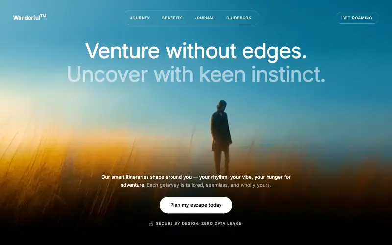
Cinematic travel hero: a full-bleed loop drifting under a GSAP mouse parallax, with a liquid-glass pill navbar and two fade-up copy blocks.
4.8k 445CursorClaude CodeLovable
Free
Featured
Aurora Weather Dashboard
📊 Dashboard
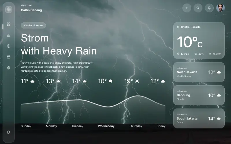
Liquid-glass weather dashboard on a 1357x871 unit grid: frosted panels over a storm photo and a chart that draws itself, then fills.
4.5k 527CursorClaude CodeLovable
Free
Featured
Fastshot Landing
🤖 AI
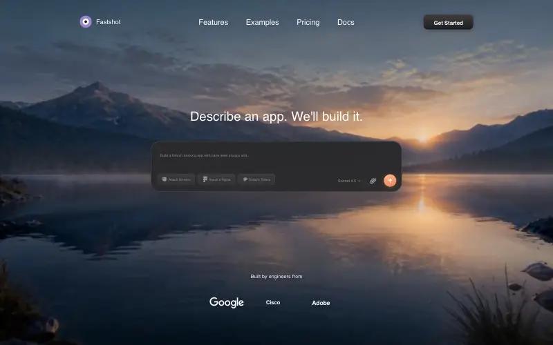
Single-screen AI app-builder landing: full-bleed dawn video, glass composer card and a pixel-specified absolute toolbar.
4.0k 639CursorClaude CodeLovable



