Heritage Grove Footer
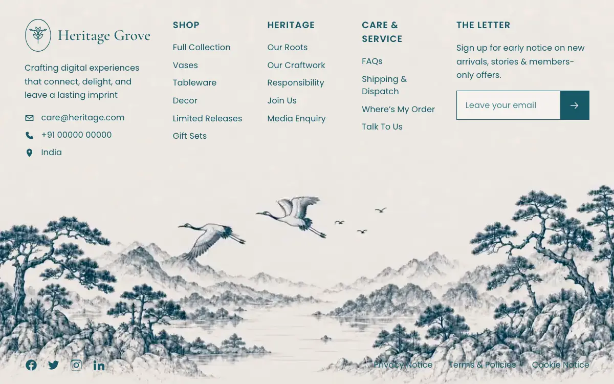
Full-viewport footer laid straight onto a hand-drawn ink landscape loop — five columns on the paper sky, and below 1100px the clip leaves the background and becomes a flow item under the copy.
O prompt
# Heritage Grove — Footer
Create exactly ONE file, named `index.html`, in the project root. Do not create any other file: no footer.html, no styles.css, no script.js, no assets folder, no README, no config. Everything — markup, CSS, SVG icons — lives inside `index.html`. If `index.html` already exists, overwrite it.
Build a single, self-contained, full-viewport website footer section. No build step, no frameworks, no external JS. Only external resource allowed: Google Fonts. Set the document title to "Heritage Grove — Footer".
## Background video — use these exact URLs verbatim, do not download or substitute
Video (MP4):
`https://d8j0ntlcm91z4.cloudfront.net/user_38xzZboKViGWJOttwIXH07lWA1P/hf_20260901_122529_931c22c8-8d2d-47c0-ad51-b97f56a91e42.mp4`
Poster / reduced-motion still (PNG):
`https://d2ol7oe51mr4n9.cloudfront.net/user_38xzZboKViGWJOttwIXH07lWA1P/4f690bd1-881a-4192-82f2-d714d34c8fb9.png`
The clip is a 10s, 1080p, 16:9 loop of a hand-drawn teal ink landscape — misty layered mountains, a still lake, pine-covered rocky outcrops on both edges, two cranes gliding across a cream paper sky. Static camera. It is the section's only imagery.
## Fonts
```html
<link rel="preconnect" href="https://fonts.googleapis.com">
<link rel="preconnect" href="https://fonts.gstatic.com" crossorigin>
```
`https://fonts.googleapis.com/css2?family=Cormorant+Garamond:wght@400;500;600&family=Poppins:wght@300;400;500;600&display=swap`
- Body/UI: Poppins, fallback `"Helvetica Neue", Arial, sans-serif`
- Brand wordmark only: Cormorant Garamond 500, fallback `Georgia, serif`
## Color tokens (`:root`)
- `--ink: #175A67` — all text, icons, borders, button fill
- `--ink-soft: #2A707C` — input placeholder, at .85 opacity
- `--cream: #EAE3DE` — page + section background; set on `html` AND `body` AND `.site-footer`
- `--max: 1440px`
- `--fs-nav: clamp(.9rem, .55vw + .75rem, 1.02rem)`
- Button hover fill: `#0F454F`
## DOM structure
```html
<footer class="site-footer">
<div class="footer-media" aria-hidden="true">
<video class="footer-bg" autoplay muted loop playsinline preload="auto" poster="[POSTER URL]">
<source src="[VIDEO URL]" type="video/mp4">
</video>
</div>
<div class="footer-inner">
<div class="footer-grid">
<div class="brand">…</div>
<nav class="col" aria-label="Shop">…</nav>
<nav class="col" aria-label="Heritage">…</nav>
<nav class="col" aria-label="Care and service">…</nav>
<div class="newsletter">…</div>
</div>
<div class="footer-bottom">
<div class="socials">…</div>
<nav class="legal" aria-label="Legal">…</nav>
</div>
</div>
</footer>
```
## Exact copy
Brand wordmark: **Heritage Grove**
Blurb: Crafting digital experiences that connect, delight, and leave a lasting imprint
Contacts (icon + text rows, in order):
- envelope icon → care@heritage.com (`mailto:care@heritage.com`)
- phone icon → +91 00000 00000 (`tel:+910000000000`)
- map-pin icon → India (plain `<span>`, not a link)
Column 1 heading "Shop": Full Collection / Vases / Tableware / Decor / Limited Releases / Gift Sets
Column 2 heading "Heritage": Our Roots / Our Craftwork / Responsibility / Join Us / Media Enquiry
Column 3 heading "Care & Service": FAQs / Shipping & Dispatch / Where's My Order / Talk To Us (use `’` for the apostrophe in Where's)
Column 4 heading "The Letter":
- paragraph: Sign up for early notice on new arrivals, stories & members-only offers.
- form with visually-hidden `<label for="nl-email">Email address</label>`, `<input id="nl-email" type="email" name="email" placeholder="Leave your email" autocomplete="email" required>`, and a submit button `aria-label="Subscribe"` containing a right-arrow SVG.
Bottom bar left: Facebook, Twitter, Instagram, LinkedIn links (aria-labels, `href="#"`)
Bottom bar right: Privacy Notice / Terms & Policies / Cookie Notice
All headings are written in title case in the HTML and uppercased via CSS `text-transform`.
## Icons — inline SVG only, no icon fonts, no images
Contact + social + arrow icons: `24x24` viewBox, `fill="currentColor"` (arrow is `fill="none" stroke="currentColor" stroke-width="1.8"`, round caps/joins, path `"M4 12h15M13 6l6 6-6 6"`).
Brand mark: `class="brand-mark"`, `viewBox="0 0 96 120"`, `fill="none"`, `stroke="currentColor"`, `stroke-width="2"` — an upright oval frame containing a small sprig/seedling. Exact paths:
```html
<ellipse cx="48" cy="60" rx="45" ry="57"/>
<path d="M48 88V46" stroke-linecap="round"/>
<path d="M48 58c-8-2-14-8-16-16 9 0 15 5 16 16Zm0 0c8-2 14-8 16-16-9 0-15 5-16 16Z"/>
<path d="M48 74c-9-2-15-8-17-17 10 0 16 6 17 17Zm0 0c9-2 15-8 17-17-10 0-16 6-17 17Z"/>
<path d="M48 46c-6-3-9-9-8-16 6 3 9 9 8 16Zm0 0c6-3 9-9 8-16-6 3-9 9-8 16Z"/>
<path d="M30 44c-5 1-9-1-12-5 5-2 9-1 12 5Zm36 0c5 1 9-1 12-5-5-2-9-1-12 5Z"/>
```
## Desktop layout (>1100px)
`.site-footer`: `position:relative; isolation:isolate; display:flex; flex-direction:column; min-height:100vh` then `min-height:100svh`; `overflow:hidden; overflow-wrap:break-word`; background `#EAE3DE`; padding:
```css
clamp(2.25rem,4.5vh,4rem)
max(clamp(1.25rem,4vw,4.5rem), env(safe-area-inset-right))
max(clamp(1.5rem,3vh,2.75rem), env(safe-area-inset-bottom))
max(clamp(1.25rem,4vw,4.5rem), env(safe-area-inset-left))
```
`.footer-media`: `position:absolute; inset:0; z-index:-2; pointer-events:none`
`.footer-bg` (video): `position:absolute; inset:0; width:100%; height:100%; object-fit:cover; object-position:center bottom; pointer-events:none`. FULL-BLEED — there is NO scrim, veil, tint, blur or gradient over the video on desktop. Text sits directly on the artwork.
`.footer-inner`: `position:relative; width:100%; max-width:1440px; margin:0 auto; flex:1; display:flex; flex-direction:column`
`.footer-grid`: `display:grid; align-items:start; gap:clamp(1.5rem,3vw,3.25rem); grid-template-columns: minmax(240px,1.45fr) repeat(3,minmax(130px,.85fr)) minmax(260px,1.25fr)`
- `.brand-lockup`: flex, `align-items:center`, `gap:clamp(.65rem,1vw,1rem)`
- `.brand-mark`: `width:clamp(52px,4.4vw,74px); height:auto`
- `.brand-name`: Cormorant Garamond 500; `font-size:clamp(1.85rem,2.5vw,2.9rem); line-height:1; margin:0`
- `.brand-blurb`: margin-top `clamp(1.15rem,2.4vh,1.9rem)`; `max-width:24ch`; `line-height:1.62`
- `.contact-list`: `list-style:none`; margin-top `clamp(1.15rem,2.4vh,1.9rem)`; column flex, gap `clamp(.6rem,1.2vh,.95rem)`; each `li` flex/center with `.85rem` gap; icons `19x19`; links no underline, underline on hover with `text-underline-offset:3px`
- `.col-title`: `margin:0 0 clamp(1.15rem,2.4vh,1.85rem)`; `font-size:clamp(.95rem,.5vw + .8rem,1.12rem)`; `font-weight:600`; `letter-spacing:.055em`; `text-transform:uppercase`
- `.link-list`: column flex, gap `clamp(.62rem,1.35vh,1.05rem)`; links `inline-block`, no underline, `transition:opacity .2s ease, transform .2s ease`; hover → `opacity:.62` and `translateX(2px)`
- `.newsletter p`: `margin:0 0 clamp(1rem,2.2vh,1.6rem)`; `max-width:32ch`; `line-height:1.62`
- `.subscribe`: flex row; `width:100%`; `max-width:380px`; `border:1px solid var(--ink)`; `background:rgba(255,255,255,.4)`
- `.subscribe input`: `flex:1; min-width:0; border:0; outline:0; background:transparent; padding:.95rem 1.05rem; font-family:inherit; font-size:var(--fs-nav)`; placeholder color `var(--ink-soft)` at `.85` opacity; `:focus-visible` → `box-shadow:inset 0 0 0 2px rgba(23,90,103,.25)`
- `.subscribe button`: `width:clamp(56px,4vw,66px)`; no border; `background:var(--ink)`; `color:var(--cream)`; `display:grid; place-items:center`; `transition:background .2s ease`; hover `#0F454F`; svg `22x22`
- `.footer-bottom`: `margin-top:auto`; padding-top `clamp(2.5rem,6vh,4.5rem)`; flex row, `align-items:center`, `justify-content:space-between`, `gap:1.25rem 2rem`, `flex-wrap:wrap`
- `.socials`: flex row, gap `clamp(.9rem,1.5vw,1.5rem)`; svg `26x26`; hover → `opacity:.65` and `translateY(-2px)`
- `.legal`: flex row, gap `clamp(1.15rem,2.6vw,3rem)`, `flex-wrap:wrap`; links underline on hover
- `.sr-only`: absolute `1px/1px` clip-rect visually-hidden helper
Also: `*,*::before,*::after{box-sizing:border-box}` and `html{-webkit-text-size-adjust:100%}`
## Responsive — 5 breakpoints, in this order
**`@media (max-width:1100px)`**
- `.footer-grid` → `1fr 1fr 1fr`; row-gap `clamp(2rem,4vh,2.75rem)`
- `.brand` and `.newsletter` → `grid-column: 1 / -1`
- `.brand-blurb` → `max-width:42ch`
**`@media (max-width:720px)`** ← phones
KEY CHANGE: the video stops being an absolute background and becomes a real flex item AFTER the copy, so nothing overlaps and nothing is zoom-cropped.
- `.site-footer` → `height:auto; min-height:100svh`; padding-right/bottom/left `0`; `overflow-x:hidden; overflow-y:visible`
- `.footer-inner` → `order:0`; padding-right/left `max(clamp(1.25rem,4vw,4.5rem), env(safe-area-inset-*))`; padding-bottom `clamp(1.25rem,3vh,2rem)`
- `.footer-media` → `position:relative; inset:auto; order:1; flex-shrink:0; width:100%; height:auto; margin-top:auto; z-index:0`
- `.footer-bg` → `position:relative; inset:auto; width:100%; height:auto; max-width:100%; object-fit:contain; object-position:center bottom; transform:none; display:block`
- `.footer-grid` → `1fr 1fr`; gap `clamp(1.75rem,5vw,2.25rem)`
- `.brand-blurb` → `max-width:34ch`
- `.footer-bottom` → column, `align-items:flex-start`, gap `1.5rem`, padding-top `clamp(2rem,7vh,3rem)`, padding-bottom `clamp(1.25rem,3vh,2rem)`
- `.legal` → gap `1.1rem 1.5rem`
- Touch ergonomics (trade list gap for tap padding, ~40px targets): `.link-list{gap:.2rem} .link-list a{padding:.55rem 0}` / `.contact-list{gap:.25rem} .contact-list a,.contact-list span{padding:.4rem 0}` / `.legal a{padding:.45rem 0}` / `.socials a{padding:.3rem;margin:-.3rem} .socials svg{width:28px;height:28px}`
- `.subscribe input{font-size:16px;padding:1rem 1.05rem}` ← 16px stops iOS focus-zoom
**`@media (max-width:440px)`**
- `:root{--fs-nav:.92rem}`; `.footer-grid{gap:1.35rem 1.25rem}`; `.col-title{margin-bottom:.85rem}`; `.brand-blurb,.newsletter p{max-width:none}`; `.subscribe{max-width:none}`
**`@media (max-width:359px)`**
- `.footer-grid` → single column
**`@media (min-width:721px) and (max-width:1100px)`** ← tablets
Apply the identical bottom-of-page video treatment as the phone block above (`.site-footer`, `.footer-inner`, `.footer-media`, `.footer-bg` rules repeated verbatim), while keeping the 3-column grid and desktop touch/spacing rules.
**`@media (max-width:1100px)`** ← soft seam, mobile + tablet only, never on desktop
`.footer-media::after` — `content:""; position:absolute; left/right/top:0; height:clamp(52px,16vw,120px); pointer-events:none; z-index:1; background:linear-gradient(to bottom,#EAE3DE 0%,rgba(234,227,222,.65) 38%,rgba(234,227,222,0) 100%)` (this only blends the top edge of the clip into the page; it is NOT a scrim over the art)
Requirement: zero horizontal overflow at every width from 320px to 1440px.
## Entrance animations (CSS only, opacity + transform, no layout shift)
```css
@keyframes rise-in { from{opacity:0;transform:translate3d(0,14px,0)} to{opacity:1;transform:translate3d(0,0,0)} }
@keyframes fade-in { from{opacity:0} to{opacity:1} }
```
`.footer-bg` → `animation: fade-in 1.35s ease both`
These all get `animation: rise-in .72s cubic-bezier(.22,1,.36,1) both`: `.brand-lockup`, `.brand-blurb`, `.contact-list li`, `.col .col-title`, `.col .link-list li`, `.newsletter .col-title`, `.newsletter p`, `.subscribe`, `.socials a`, `.legal a`
Delays (exact):
- `.brand-lockup` `.04s` | `.brand-blurb` `.12s`
- `.contact-list li` 1/2/3 → `.2s` / `.28s` / `.36s`
- Per-column stagger token: `.footer-grid > .col:nth-child(2){--col-stagger:.16s}`, `nth-child(3){--col-stagger:.24s}`, `nth-child(4){--col-stagger:.32s}`
- `.col .col-title` → `var(--col-stagger,.2s)`
- `.col .link-list li:nth-child(1..6)` → `calc(var(--col-stagger,.2s) + .08s … + .48s)` in `.08s` steps
- `.newsletter .col-title` `.4s` | `.newsletter p` `.48s` | `.subscribe` `.56s`
- `.socials a` 1–4 → `.64s` / `.7s` / `.76s` / `.82s`
- `.legal a` 1–3 → `.7s` / `.78s` / `.86s`
## Reduced motion
`@media (prefers-reduced-motion:reduce)`
- `.footer-bg` → `display:none; animation:none`
- `.site-footer` → `background-color:#EAE3DE` + `background-image:url([POSTER URL])`; `background-position:center bottom`; `background-size:cover`; `background-repeat:no-repeat`
- nested `@media (max-width:1100px)` inside it → `.site-footer{background-size:100% auto}`
- `.footer-media::after` → `content:none`
- All rise-in elements → `animation:none`; `.link-list a:hover,.socials a:hover` → `transform:none`
## Design intent — do not "improve" these
1. NO overlay of any kind on the video on desktop: no gradient veil, no tint, no blur, no darkening. The copy sits directly on the artwork. This was deliberate.
2. Desktop is full-bleed cover. Portrait viewports (≤1100px) must NOT use cover — the 16:9 clip would zoom ~2.5x and drag the cranes up through the link columns. It becomes a flow item under the copy at its own aspect ratio instead.
3. Everything is one file. No JS. The video is the only motion besides CSS keyframes.
## Quality Bar
- The "no scrim" decision is right for the grid and wrong for the bottom bar, and the artwork says which is which. Sampling the decoded frames under each text box at 1440x900, across all 241 frames of the loop: everything in `.footer-grid` — wordmark, blurb, contacts, column links, the form — sits on the empty paper sky and never drops below 6.0:1 against `--ink` (means 6.12–6.16:1). `.footer-bottom` sits on the pines and rocks that fill the bottom of the frame, and fails: "Terms & Policies" averages 3.88:1 with 62.4% of its pixels under 4.5:1, "Cookie Notice" 4.30:1 / 48.5%, "Privacy Notice" 4.61:1 / 38.2%, the social icons 5.34:1 / 15.4%, and the worst pixels in all four reach 1.00:1 — ink on ink. The composition already gives the top two thirds away as empty sky; the bottom bar is the one row that needs a local treatment, not the whole video.
- The reduced-motion branch undoes the ≤720px reflow. With `.footer-bg{display:none}` the media block collapses to zero height, so `background-size:100% auto` + `background-position:center bottom` paints the still behind the copy instead of after it — exactly the overlap the phone layout exists to prevent. Measured at 390x844: the image occupies the last 221px of a 1265px footer while the bottom bar spans 1024–1240px, so it lands right on the legal links — "Cookie Notice" 61.5% of pixels below 4.5:1 (worst 1.00:1), "Privacy Notice" 18.7%. Give the collapsed media block the clip's aspect ratio, or drop the background-image below 1100px and let the still be an `<img>` in the flow.
- The poster URL ends in `.png` and serves a WebP (VP8, 1920x1086). Browsers sniff the bytes and render it, so this only breaks the things that trust the extension — build steps, image optimizers, `Content-Type` assertions. It is also 1086 tall against the video's 1080, and it is not frame 0 of the clip: the cranes sit in a different place at a different scale, so there is a visible jump the moment the first video frame replaces the poster.
- The five track minimums add up to more than the content box just below the desktop breakpoint. `240 + 130*3 + 260 = 890px` plus four `3vw` gaps needs 1112px of content box, but at 1101px there is 1013px. Measured: the newsletter column ends 9px past the content edge at 1101px, shrinking to 0 at 1112px. The 44px padding absorbs it, so nothing clips and nothing scrolls — the right margin just goes quietly asymmetric across an 11px-wide band of viewport widths. Zero horizontal overflow otherwise, verified at 28 widths from 320 to 1440.
- `overflow-x:hidden` with `overflow-y:visible` is not a combination CSS honours: `visible` is coerced, and the computed value is `hidden auto` (verified). Below 1100px `.site-footer` therefore becomes a scroll container. It never overflows, so nothing visibly changes — but anything `position:sticky` inside the footer would stick to the footer instead of the viewport, and iOS gets a nested scroller for free.
- `env(safe-area-inset-*)` inside `max()` reads as 0 unless the viewport meta carries `viewport-fit=cover`. Without it the phone layout's `padding-right/left:0` is the whole story and the notch padding never arrives.
- Watch the payload. The source clip is 1920x1080 / H.264 / 10s / 4.8MB. Flat ink on cream is cheap footage — downscaled to 1280x720 at CRF 32 with the audio track dropped it is 220KB, with the mist gradients still clean. Measure rather than assume; dense footage does not behave like this.
- Only three of the nine faces that the Google Fonts URL requests ever paint: Poppins 400 for body, Poppins 600 for `.col-title`, Cormorant Garamond 500 for the wordmark. Poppins 300/500 and Cormorant 400/600 have no user anywhere in the page. Drop them, and if the page must run without external requests, self-host — both families are OFL 1.1, and subset to the 61 characters actually rendered (remember `text-transform:uppercase` needs the uppercase glyphs) the three faces are 8.2KB together.
- The form has no handler, and the brief forbids JS: submitting reloads the page with `?email=…` in the URL. Point it at a real endpoint or accept that the field is decoration.
- The seam gradient is sized against the viewport (`clamp(52px,16vw,120px)`) while the clip is sized by its aspect ratio, so the fraction it covers moves with width: at 390px it is 62px over a 219px-tall clip, the top 28%. That is mist and empty sky at every width here, but it is not a fixed proportion of the image.
Você também pode gostar

Figurine Carousel Hero
Full-viewport figurine carousel where background colour, scale, blur and position all crossfade together on one 650ms curve.
Asme
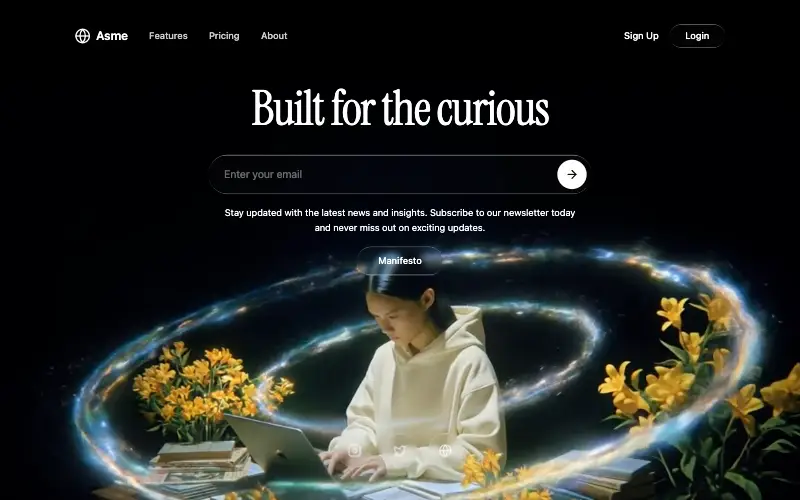
Dark cinematic hero over a looping film whose seam is hand-rolled with 500ms requestAnimationFrame fades: a liquid-glass nav and Login pill, an Instrument Serif headline, a glass email bar and three glass social buttons.
Augment Reveal Hero
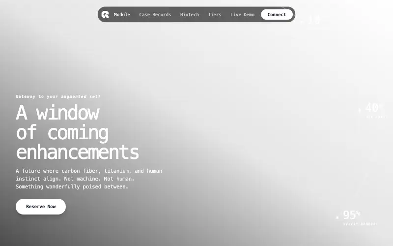
Cyberpunk hero where a cursor spotlight reveals the augmented version of the portrait, with stats drawn on fading circular arcs.
RIVR
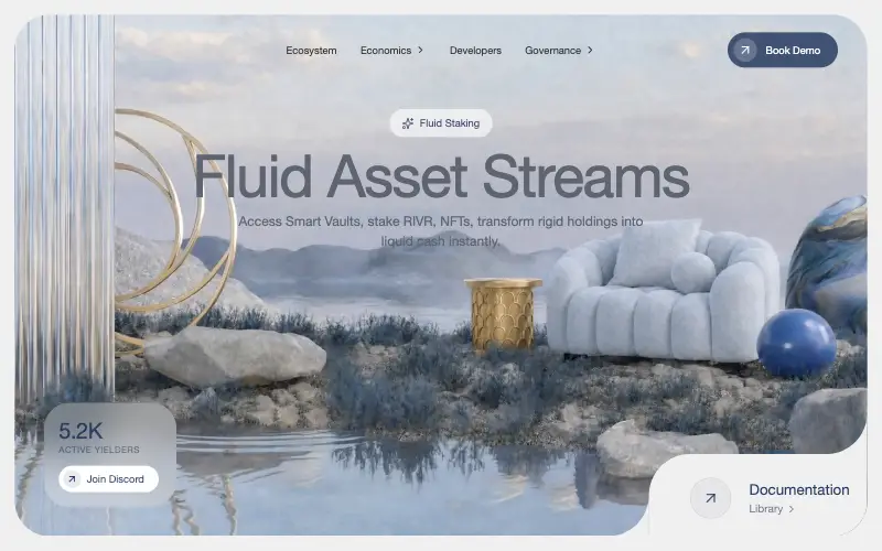
DeFi dashboard hero as an inset rounded video card: a centred glass nav, a Sparkles badge over an 80px slate headline, a frosted stats card and a faux-cutout documentation corner built from two inverse-radius SVGs.



