Free
🎓 Education
DesignPro
Design-school hero on a full-bleed looping video: a pill navbar, a 9xl headline and a ShinyText gradient that sweeps across the second line forever.
1.7k views 694 copies 864 palavras

O prompt
# DesignPro — Fullscreen Course Hero with a Shiny Gradient Headline

## Goal
Build a fullscreen hero section for a product-design education platform called "DesignPro" with React + TypeScript + Tailwind CSS on Vite, Framer Motion for animation and `lucide-react` for icons. One viewport: a full-bleed looping video, a pill-shaped navbar, a two-column intro row, and a centred headline whose second line carries a gradient that sweeps across it forever.

## Background
- Full-screen looping video, URL (exact): `https://d8j0ntlcm91z4.cloudfront.net/user_38xzZboKViGWJOttwIXH07lWA1P/hf_20260328_105406_16f4600d-7a92-4292-b96e-b19156c7830a.mp4`
- `autoPlay loop muted playsInline`, `absolute inset-0`, `object-cover`, behind everything.
- Page background colour: black `#000000`.

## Typography
- Font family: **Inter**, exposed through Tailwind's `fontFamily.sans`.
- Body text is `white/80`; headings and hover states go to full white.

## Layout shell
```
section  relative h-screen w-full overflow-hidden bg-black   ← container
  └ video (absolute inset-0 object-cover)
  └ content (relative z-10, flex column, full height)
       └ navbar · intro row · centred hero block
```
Every row sits in a `max-w-7xl` centred container with horizontal padding.

## Navbar
- **Logo**: a circle with a 2px white border wrapping a smaller filled white dot, then the wordmark "DesignPro".
- **Links** (`hidden lg:flex`): Home, About Us, Courses, Instructors, Testimonials, Blog, and "Contact us" with an `ArrowUpRight` icon — all inside one `rounded-full` pill with a `border-gray-700` border. Each link `text-sm text-white/80`, hovering to full white with a colour transition.
- **Below `lg`**: the pill is replaced by a hamburger button (`Menu` / `X` from lucide-react). It is a real disclosure — it toggles a panel under the bar holding the same seven links, and carries `aria-label`, `aria-expanded` and `aria-controls`.

## Intro row (under the nav)
Two columns from `lg` up, stacked below it.
- **Left**: "We deliver transformative programs that empower emerging product designers with cutting-edge expertise and vision to thrive globally."
- **Right** (`lg:text-right`): "8000+ Talented Designers Launched !"
- Both `text-white/80`, `text-sm` on mobile and `md:text-base` up.

## Hero block (centred, fills the remaining height)
- **Eyebrow**: "Seats for Next Program Opening Soon" — uppercase, `text-white/80`, `text-xs md:text-sm`, `tracking-tight`.
- **Heading** (`<h1>`), two lines, `tracking-tighter`, inline style `lineHeight: 0.85`, sized `text-5xl sm:text-6xl md:text-7xl lg:text-8xl xl:text-9xl`:
  - Line 1: "Become" — white, `font-medium`.
  - Line 2: "Product Leader." — rendered by `<ShinyText>`.
- **CTA**: "Apply for Next Enrollment" with an `ArrowRight` — `rounded-full bg-black px-6 py-3 md:px-8 md:py-4`, hover `bg-gray-900`. The button is a `group`; the arrow translates right on `group-hover`.

## ShinyText component
```ts
interface ShinyTextProps {
  text: string;
  speed?: number;        // seconds per sweep, default 3
  baseColor?: string;    // default '#64CEFB'
  shineColor?: string;   // default '#ffffff'
  spread?: number;       // gradient angle in degrees, default 100
  className?: string;
}
```
- A `motion.span` whose `backgroundImage` is `linear-gradient(${spread}deg, ${baseColor} 35%, ${shineColor} 50%, ${baseColor} 65%)`, painted into the glyphs with `backgroundClip: 'text'` (plus the `-webkit-` prefix) and a transparent text fill.
- `backgroundSize: '200% 100%'`, and Framer Motion animates `backgroundPosition` from `'200% 0%'` to `'0% 0%'`, `ease: 'linear'`, `repeat: Infinity`, `duration: speed` — the highlight travels left to right, continuously.

## Responsive
Mobile-first, with the standard Tailwind breakpoints: `sm` 640, `md` 768, `lg` 1024, `xl` 1280. Smooth transitions on every interactive element.

## Quality Bar
- TypeScript strict, zero `any`. Tailwind only — no CSS files; the font face and the `fontFamily.sans` entry live in the Tailwind config.
- Autoplay only works while the element is genuinely `muted` and `playsInline` — keep both. Give the video `aria-hidden`; it is decoration and never the only carrier of meaning.
- One period of the gradient must equal one period of the travel, or the loop visibly jumps: `200% 0%` → `0% 0%` against a `200%`-wide background moves exactly one tile, and the default `repeat` covers what slides in. Any other pair of endpoints needs the same arithmetic redone.
- `background-clip: text` with a transparent fill means the text has no colour of its own. Anything that fails to paint the background — an unprefixed engine, a screenshot pipeline, forced-colors mode — renders the line invisible rather than plain. Keep the string in the DOM as real text so it is still selectable and readable to assistive tech, and check it in forced-colors before shipping.
- Respect `prefers-reduced-motion`: `useReducedMotion()` drops the sweep to a static gradient, and the video needs a ref and an explicit `pause()` behind the same query — `loop` keeps running no matter what Framer Motion does.
- A hamburger that only renders an icon is a broken control. Wire it to a real panel, label it, and give it `aria-expanded` / `aria-controls`.
- Watch the payload: a full-resolution source video will dominate page weight. Downscale to the rendered size, drop the audio track that muted playback never uses, and serve a compressed derivative.
- The CTA is black-on-dark by design; its white label is what carries it. Keep a visible focus ring on every control — against this footage the default outline is the only thing separating a focused pill from an unfocused one.
- `#64CEFB` on near-black clears AA for large text but not for body copy — it belongs to that one headline line and nowhere else. If the video is swapped for brighter footage, re-check both the headline and the `white/80` copy before shipping.
Você também pode gostar
Free
Featured
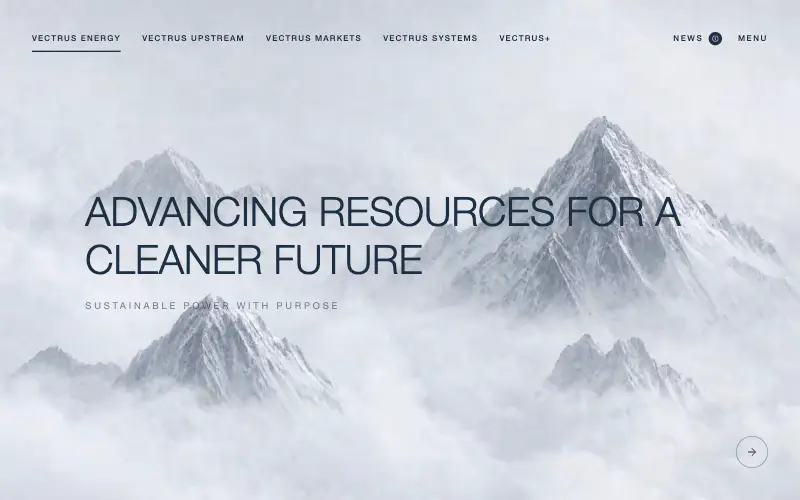
Vectrus Energy
🛬 Landing Page
Scroll-tied cinematic section: a 500vh track scrubs an aerial clip frame by frame through a WebCodecs frame bank, with three sequential copy blocks.
4.9k 535CursorClaude CodeLovable
Free
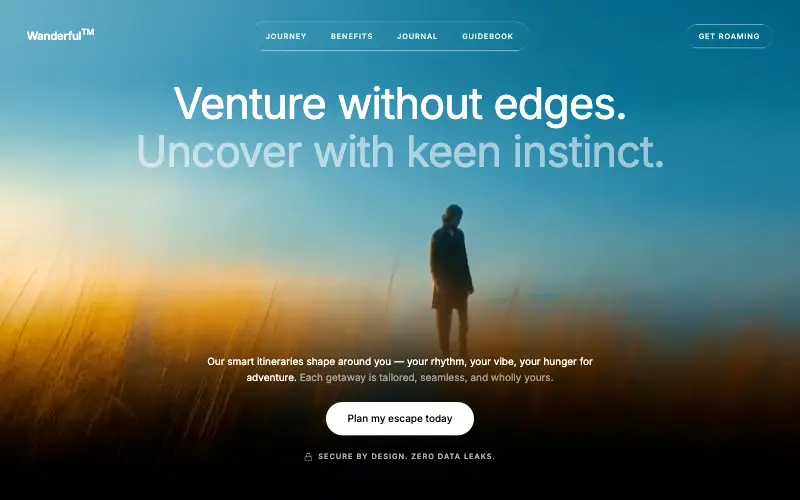
Wanderful
✈️ Travel
Cinematic travel hero: a full-bleed loop drifting under a GSAP mouse parallax, with a liquid-glass pill navbar and two fade-up copy blocks.
4.8k 445CursorClaude CodeLovable
Free
Featured
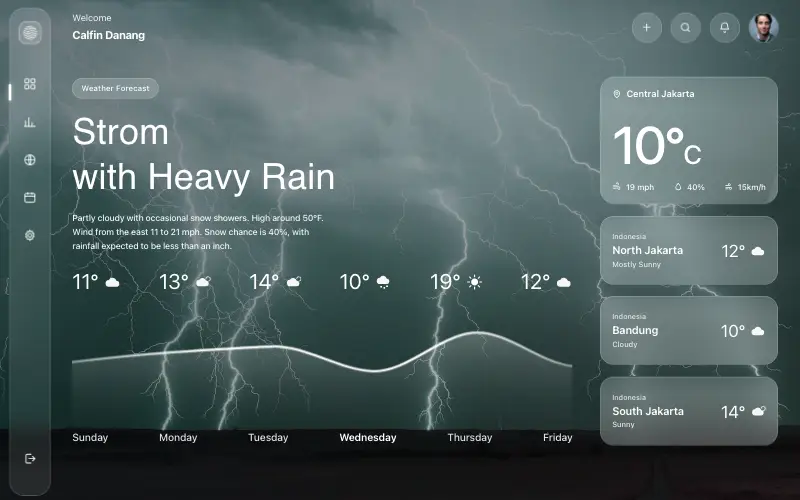
Aurora Weather Dashboard
📊 Dashboard
Liquid-glass weather dashboard on a 1357x871 unit grid: frosted panels over a storm photo and a chart that draws itself, then fills.
4.5k 527CursorClaude CodeLovable
Free
Featured
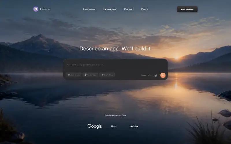
Fastshot Landing
🤖 AI
Single-screen AI app-builder landing: full-bleed dawn video, glass composer card and a pixel-specified absolute toolbar.
4.0k 639CursorClaude CodeLovable



