Nexeus
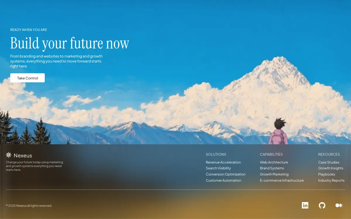
Pixel-exact single-file agency landing over a looping painted alpine film: a 1600×780 unit artboard with an Instrument Serif hero, a warm frosted-glass footer with three link columns, aspect-ratio scrims, a stacked portrait layout and a once-only Web Animations entrance.
Промпт
# Nexeus — Alpine Glass Landing

Build a single-file standalone HTML page (index.html) that recreates this Nexeus landing page PIXEL-EXACTLY. Do not invent extra sections, nav bars, extra CTAs, or restyle anything. One full-viewport cinematic page: looping background video + left-aligned hero + glass footer. No frameworks. No build step. Inline CSS and JS only.

==================================================
EXACT MEDIA (must use these URLs, no substitutes)
==================================================
Background video (CloudFront):
https://d8j0ntlcm91z4.cloudfront.net/user_38xzZboKViGWJOttwIXH07lWA1P/hf_20260826_123836_11a3c5e0-713f-4bef-a8e9-7dd93bdea3b0.mp4

Poster (CloudFront WebP, shown before/while video loads):
https://d2ol7oe51mr4n9.cloudfront.net/user_38xzZboKViGWJOttwIXH07lWA1P/693205bf-8048-456a-879e-4e0a1b85a098.webp

Video attributes: autoplay muted loop playsinline
aria-label: "Painted alpine panorama: a lone hiker with a pink backpack faces a snow-capped peak above a sea of clouds"
Video filter: saturate(0.86)
Fallback page background: #1d8fb8 (sky-blue, matches the painting)

==================================================
FONTS
==================================================
@font-face Instrument Serif (400) — display / headline
@font-face Plus Jakarta Sans (weight range 200–800) — body
Fallbacks: Georgia serif for display; system-ui sans-serif for body.
If local woff2 files are unavailable, load:
- Instrument Serif 400 from Google Fonts
- Plus Jakarta Sans 400 and 500 from Google Fonts
-webkit-font-smoothing: antialiased

Type tokens:
--font-display: 'Instrument Serif', Georgia, serif
--font-body: 'Plus Jakarta Sans', system-ui, sans-serif
--fw-regular: 400   (nav links, column headings, wordmark, CTA label)
--fw-medium: 450    (eyebrow, lede, footer tagline, legal) — if the font has no 450, use 500
--text-primary: #fff
--text-heading: rgba(255,255,255,.86)
--text-muted: rgba(255,255,255,.68)
--text-invert: #000

==================================================
COPY (verbatim)
==================================================
<title>Nexeus — Build your future now</title>
Eyebrow: Ready when you are
H1: Build your future now
Lede: From branding and websites to marketing and growth systems, everything you need to move forward starts right here.
CTA: Take Control  (href="#")
Footer wordmark: Nexeus
Footer tagline: Change your future today using marketing and growth systems everything you need starts here.
Column SOLUTIONS:
  Revenue Acceleration
  Search Visibility
  Conversion Optimization
  Customer Automation
Column CAPABILITIES:
  Web Architecture
  Brand Systems
  Growth Marketing
  E-commerce Infrastructure
Column RESOURCES:
  Case Studies
  Growth Insights
  Playbooks
  Industry Reports
Legal: ® 2025 Nexeus all rights reserved.
Socials (href="#"): LinkedIn, GitHub, Medium — with matching SVG icons and aria-labels.

==================================================
LAYOUT SYSTEM (desktop / landscape)
==================================================
html, body: height 100%; overflow hidden; background #1d8fb8
Design frame: 1600 × 780
Unit: --u: min(calc(100vw / 1600), calc(100vh / 780), 1.6px)
Frame width: --fw: calc(1600 * var(--u))

.viewport: position fixed; inset 0; overflow hidden

BACKGROUND VIDEO:
.bg: absolute inset 0; overflow hidden; background #1d8fb8
video: position absolute; right 0; bottom calc(-45 * var(--u));
width calc(1668 * var(--u)); height calc(1037 * var(--u));
min-width 100%; min-height calc(100% + 45 * var(--u));
object-fit cover; object-position right bottom

.scrim: absolute left/right/top 0; height 0 by default; pointer-events none
Aspect-ratio scrims (only these):
- min-aspect-ratio 17/10: height 450u, gradient rgba(4,20,32) .48 → .25 → 0
- min-aspect-ratio 19/10: height 470u, .58 → .31 → 0
- min-aspect-ratio 21/10: video object-position right 76%; height 480u, .56 → .30 → 0
- min-aspect-ratio 5/4 AND max-aspect-ratio 31/20: height 410u, .26 → .13 → 0

.stage: absolute; left 50%; top 0; width var(--fw); height 100%; translateX(-50%); pointer-events none
.stage > * pointer-events auto
.abs: position absolute

HERO (absolute positions in --u units):
.eyebrow: left 46.6u, top 128.2u, font-size 15.0u, weight medium, line-height 1, letter-spacing 0.2163u, color white, uppercase, nowrap
.headline-mask: left 46.0u, top 163.0u
.headline: Instrument Serif, weight 400, font-size 71.2u, line-height 1, letter-spacing 0.5696u, white, nowrap
.lede: left 46.4u, top 245.2u, width 432u, font-size 17.0u, weight medium, line-height 22.9u, letter-spacing -0.15232u, white
.cta: left 46.8u, top 335.0u, width 157.0u, height 40.6u, border-radius 4.2u, background #fff, display block, no underline
.cta:hover: background #eef2f3; translateY(-1.5u); box-shadow 0 8u 22u rgba(0,0,0,.20)
.cta span: absolute left 32.0u, top 13.8u, font-size 15.8u, weight 400, line-height 1, letter-spacing 0.057828u, color #000, nowrap
CTA transition: background/transform/box-shadow .25s ease

==================================================
FOOTER (glass pane, desktop)
==================================================
.footer: absolute left/right/bottom 0; height 342u
backdrop-filter: blur(50u) saturate(0.85)
background (THREE stacked gradients):
1) linear-gradient(90deg, rgba(255,255,255,0.022) 0, rgba(255,255,255,0.072) 20u, rgba(255,255,255,0) 58u)
2) linear-gradient(270deg, rgba(255,255,255,0.02) 0, rgba(255,255,255,0.05) 20u, rgba(255,255,255,0) 58u)
3) linear-gradient(180deg, rgba(34,14,0,0.28) 0%, rgba(70,34,0,0.24) 52%, rgba(160,120,48,0.6) 100%)
--hair: max(1px, 1u)
inset box-shadow hairlines: white 0.145 left, 0.125 right, 0.17 bottom, 0.03 top
overflow hidden

.finner: absolute left 50%; top 0; translateX(-50%); width var(--fw); height 100%

LOGO MARK (white 8-spoke starburst / asterisk, viewBox 0 0 100 100):
left 26.6u, top 36.2u, size 25.4u × 25.4u
Exact SVG paths (fill #fff):
M 45.13 1.28 L 54.87 1.28 L 54.87 42.42 L 45.13 38.09 Z
M 79.47 12.10 L 87.90 20.53 L 58.80 49.62 L 53.45 38.13 Z
M 98.72 45.13 L 98.72 54.87 L 57.58 54.87 L 61.91 45.13 Z
M 87.90 79.47 L 79.47 87.90 L 50.38 58.80 L 61.87 53.45 Z
M 54.87 98.72 L 45.13 98.72 L 45.13 57.58 L 54.87 61.91 Z
M 20.53 87.90 L 12.10 79.47 L 41.20 50.38 L 46.55 61.87 Z
M 1.28 54.87 L 1.28 45.13 L 42.42 45.13 L 38.09 54.87 Z
M 12.10 20.53 L 20.53 12.10 L 49.62 41.20 L 38.13 46.55 Z

.wordmark: left 62.8u, top 36.0u, font-size 23.4u, weight 400, letter-spacing 0.2808u, white, nowrap
.tagline: left 26.6u, top 73.0u, width 274u, font-size 13.5u, weight medium, line-height 17.4u, letter-spacing -0.18576u, muted white

Columns top 37.0u:
.c1 left 938.4u  .c2 left 1185.0u  .c3 left 1450.6u
h3: 15.84u, weight 400, letter-spacing 0.183744u, color text-heading, nowrap
ul: absolute top 31.0u, no list-style
li line-height 25.27u nowrap
a: 15.55u, weight 400, letter-spacing -0.07775u, white, no underline; hover opacity .6 (transition .2s)

.rule: left 26.6u, width 1546.8u, top 207.5u, height max(1px,1u), background rgba(255,255,255,.42)
.legal: left 26.6u, top 271.2u, font-size 14.0u, weight medium, letter-spacing -0.30422u, muted, nowrap
.socials: left 1375.8u, top 264.4u, flex, gap 47.1u
.socials a: 30u × 30u, color #fff, hover opacity .68
Icons: LinkedIn viewBox 0 0 30 30; GitHub viewBox 0 0 24 24; Medium viewBox 0 0 1043.63 592.71 — use the standard filled-white path icons matching those viewBoxes (LinkedIn square+in, GitHub octocat, Medium three circles).

==================================================
RESPONSIVE — portrait / narrow (max-aspect-ratio: 5/4)
==================================================
--u: calc(100vw / 780)
--pad: clamp(20px, 5.6vw, 56px)
Switch from absolute artboard to stacked flex column.
.viewport: flex column; min-height 100dvh
.stage: relative, width 100%, flex column
.bg video: left 0 right 0 bottom 0; width 100%; height 106%; object-fit cover; object-position 80% bottom
.scrim: fixed; height min(56vh, 560u); gradient rgba(6,22,34) .42 → .26 → 0
.abs becomes static
Hero: left/right padding --pad
eyebrow: margin-top clamp(28px,7vh,72px); font-size clamp(10.5px,2.9vw,15px); letter-spacing .09em; still uppercase
headline: wrap allowed; font-size clamp(34px,9.4vw,72px); line-height 1.04
lede: max-width 38ch; font-size clamp(14.5px,3.9vw,18px); line-height 1.42
cta: inline-flex centered; width auto; min-width clamp(140px,40vw,190px); height clamp(42px,6vh,52px); padding 0 clamp(20px,6vw,34px); radius 4px; span static
Footer: relative; height auto; margin-top auto; padding clamp(22px,3.4vh,40px) --pad clamp(20px,3vh,34px)
footer bg: linear-gradient(180deg, rgba(14,9,4,.58), rgba(26,16,5,.60) 55%, rgba(52,36,12,.66)); blur 28px saturate .9
.brandrow: flex align center; gap clamp(9px,2.6vw,14px)
.nav: 3-column grid; gap clamp(14px,3.4vw,30px)
.footrow: flex space-between wrap
Type uses the clamp() sizes listed in the source (do not improvise)

MOBILE architecture @ max-aspect-ratio 5/4 AND max-width 648px:
html/body overflow visible (so legal/socials are not clipped on short phones)
hero headline: clamp(32px,10.2vw,56px); max-width 15ch; text-wrap balance
lede max-width 34ch
.nav: 2-column grid; .c3 (RESOURCES) grid-column 1 / -1; .c3 ul columns: 2
.col a: inline-block; padding-block clamp(9px,1.1vh,11px) for tap targets
.footrow: nowrap, legal nowrap, socials flex-none
@ max-width 380px: legal wraps; footrow wraps
@ max-height 620px: tighter eyebrow margin-top

==================================================
ENTRANCE ANIMATION (first load only)
==================================================
Head script BEFORE paint:
If prefers-reduced-motion is NOT reduce, add class js-enter on <html>.
If JS fails, never add the class — content must render fully visible.

While html.js-enter:
eyebrow, lede, cta, mark, wordmark, tagline, .col, legal, .socials a { opacity: 0 }
.headline-mask { clip-path: inset(-45% -8% -6px -3%) }
.headline { transform: translate3d(0,118%,0) }
.rule { transform: scaleX(0); transform-origin left center }
prefers-reduced-motion: show everything immediately; disable transitions globally.

Body script: Web Animations API, run once (dataset.entered).
Easings:
EXPO   = cubic-bezier(.16,1,.3,1)
SOFT   = cubic-bezier(.22,.65,.28,1)
SETTLE = cubic-bezier(.33,1,.68,1)
On max-width 648px: travel scale d=0.62, tempo t=0.85; else d=1, t=1

Timeline (delay * t, duration in ms, Y travel * d):
eyebrow:  rise 12px, 560ms, delay 60, SOFT
headline: 118% → 0, 950ms, delay 170, EXPO
lede:     rise 14px, 660ms, delay 430, SOFT
cta:      opacity 0 + Y12 + scale(.985) → none, 580ms, delay 620, SETTLE
mark + wordmark: rise 10px, 540ms, delay 600, SOFT
tagline:  rise 10px, 540ms, delay 670, SOFT
each .col: rise 14px, 580ms, delay 720 + i*70, SOFT
.rule:    scaleX 0→1, 720ms, delay 980, EXPO
legal:    rise 8px, 500ms, delay 1120, SOFT
each .socials a: rise 8px, 500ms, delay 1170 + i*60, SOFT

On complete: remove js-enter, cancel all animations so no residual transforms remain.
Do NOT animate the background video — it is the stage.

==================================================
HTML STRUCTURE (must match)
==================================================
.viewport
  .bg > video
  .scrim
  .stage
    p.eyebrow
    .headline-mask > h1.headline
    p.lede
    a.cta > span
  footer.footer > .finner
    .brandrow > svg.mark + span.wordmark
    p.tagline
    nav.nav > .col.c1 / .col.c2 / .col.c3
    .rule
    .footrow > p.legal + .socials

Viewport meta: width=device-width, initial-scale=1, viewport-fit=cover
lang=en

OUTPUT: one complete index.html with all CSS and JS inlined, matching this spec exactly.

## Quality Bar

- **The artboard is exact — once the UA defaults are reset.** Driven in headless Chrome 153 at the 1600×780 design frame, every hero and footer element lands on its specified coordinates to within **0.01u** (eyebrow `46.59, 128.19`, CTA `46.8, 335, 157×40.59`, rule `26.59, 207.5, 1546.8`, socials `1375.8, 264.39`, 184.2u wide = 3×30 + 2×47.1). The spec never resets margins: `body` keeps its 8px (the document measured **788px tall** in a 780px window until `body{margin:0}`), and because every text block is placed by an explicit `top`, the default margins on `h1`, `h3`, `p` and `ul` would add to those tops. This build adds `body,h1,h3,p,ul{margin:0}`, `ul{padding:0}` and `box-sizing:border-box`.
- **There is a scrim hole between 1.55 and 1.7.** The four aspect queries cover `5/4–31/20` and `≥17/10`; everything in between gets `height:0`. That band holds **1440×900 and 1680×1050**, among the most common laptop sizes. At 1440×900 the 13.5px eyebrow measured **3.54:1** against white over the sky — under 4.5:1.
- **The lede sits on the brightest clouds and fails everywhere.** Contrast of white text against the backdrop under its box, sampled at six points through the loop (5th-percentile pixel / median): **2.05 / 2.48** at 1600×780 (with the 19/10 scrim), **1.88 / 3.94** at 1920×1080, **2.87 / 3.27** at 1440×900, **1.47 / 3.78** at 390×844. The 71px headline dips to **2.68:1** at 1600×780 near the end of the loop, below 3:1 even for large text. The eyebrow passes wherever a scrim exists (5.6–6.3:1). The footer text passes on desktop (tagline 7.0, headings 4.8, links 5.8, legal 4.9), but on phones the muted 12.5px tagline over the portrait footer gradient is **3.86:1**.
- **Landscape tablets get very small type.** The desktop artboard runs all the way down to aspect 5/4, and `--u` follows the width there: at 1024×768 the lede is **10.88px**, footer links **9.95px** and legal about **9px**; at 1180×820 (iPad Air landscape) links are 11.47px and legal 10.3px.
- **Short portrait windows wider than 648px clip the footer with no way to scroll.** `overflow: visible` only returns at `max-width:648px`; above that `html,body` stay `overflow:hidden`. At 700×560 (aspect 1.25, so the portrait column) the legal line ends at **y=635** in a 560px viewport, and socials at 641 — cut off and unreachable. 1000×800 and 660×800 just fit (legal bottom 770).
- **Portrait `.viewport` has to stop being fixed.** The spec keeps `position:fixed; inset:0` from desktop and adds `flex column; min-height:100dvh`. A fixed box contributes nothing to the document's scroll height, so the mobile rule "overflow visible so legal/socials are not clipped" would have nothing to scroll to. This build sets `position:relative` in the portrait query; at 390×844 the page is then 880px tall and scrolls the last 36px.
- **Much of the portrait layout is left to the builder.** "Type uses the clamp() sizes listed in the source" points at a source that isn't in the prompt. Unspecified and filled in here, scaled from the desktop proportions: the vertical gaps between eyebrow, headline, lede and CTA; the stage's bottom padding; the CTA label size; wordmark, tagline, column-heading, link and legal sizes; the mark and social icon sizes; and the tagline/nav/rule/footrow spacing. Two builds from this spec will not match below 5/4.
- **Gradient stop positions are not given.** ".48 → .25 → 0" gives no positions for the middle stop; they are evenly spaced here (0 / 50% / 100%).
- **`Y travel * d` cannot apply to the headline.** The headline moves by a percentage inside a clip whose bottom edge sits 6px below its box. Scaled by 0.62, 118% becomes 73%, and the bottom of the text would show inside the mask before the animation starts. The headline keeps 118% at every size; the trace at 390×844 shows **97.6px** of travel at 150ms on the 82.7px two-line headline. Durations are not scaled by `t`, since the formula only puts `t` on the delay.
- **The entrance cleans up completely.** At 1600×780, `js-enter` came off at **2145ms**, with `document.getAnimations()` empty and every transform `none`. At 390×844 (t=0.85) it came off at **1700ms**. The CTA hover then works (`#eef2f3`, −1.5u, `0 8u 22u` shadow), as do link hover (0.6) and social hover (0.68). With JS disabled the class is never added and everything renders at opacity 1. The head script only checks reduced motion. If the body script threw, the content would stay hidden, so it is wrapped in `try/catch` and removes the class on failure.
- **Reduced motion only covers the entrance.** With `prefers-reduced-motion: reduce` there is no class, no animations, and transition durations compute to `0s`. The full-screen video keeps looping, because the spec says nothing about it.
- **The mandated media is heavier than it looks.** The CloudFront clip is **9,686,601 B**: 1216×756 at 9.5 Mbps with a **128 kbps AAC track**, on a video that is always muted. Re-encoded without audio at CRF 24 it is **1,396,950 B**. The poster is 362,462 B at 1590×989. For this demo all media and fonts are served from `./assets`, because the site's demo pages make no external requests. The fonts are the Google Fonts Latin subsets: Instrument Serif 400 (15,040 B) and Plus Jakarta Sans variable 200–800 (27,272 B), so weight 450 is a real instance and needs no fallback to 500.
- **Small copy details, kept as written.** The legal line uses `®` (registered mark) where a copyright notice would use `©`. The Medium icon's 1043.63×592.71 viewBox letterboxes to 30×17 inside its 30×30 box, so it reads visibly lighter than the LinkedIn and GitHub marks.
Вам также может понравиться

Vectrus Energy
Scroll-tied cinematic section: a 500vh track scrubs an aerial clip frame by frame through a WebCodecs frame bank, with three sequential copy blocks.
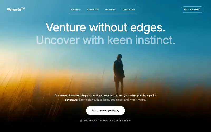
Wanderful
Cinematic travel hero: a full-bleed loop drifting under a GSAP mouse parallax, with a liquid-glass pill navbar and two fade-up copy blocks.
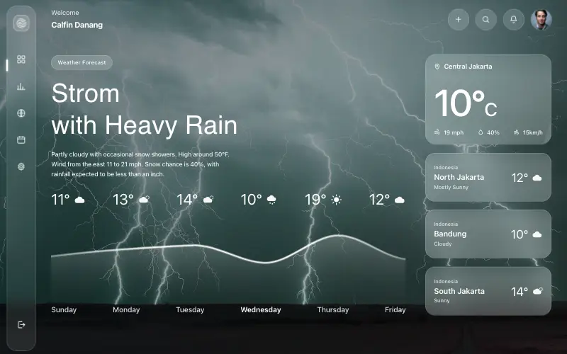
Aurora Weather Dashboard
Liquid-glass weather dashboard on a 1357x871 unit grid: frosted panels over a storm photo and a chart that draws itself, then fills.
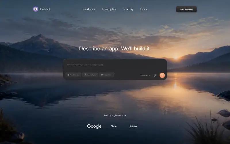
Fastshot Landing
Single-screen AI app-builder landing: full-bleed dawn video, glass composer card and a pixel-specified absolute toolbar.



