Bento Feature Grid
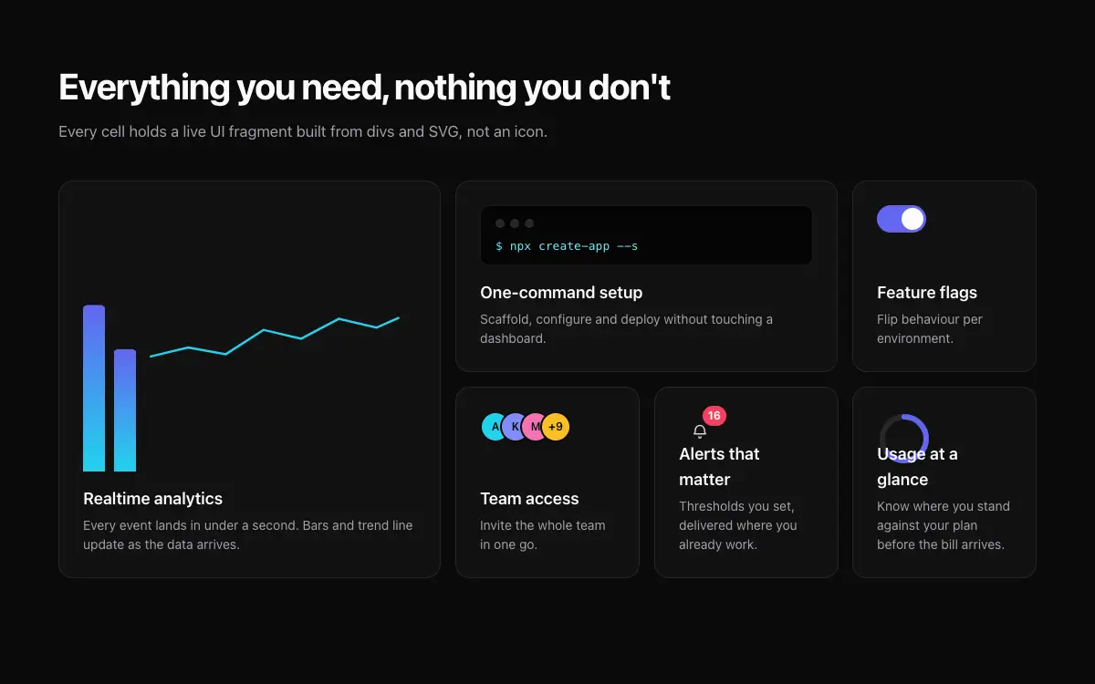
Six-cell bento features section with one hero cell, live UI fragments inside cells and hover choreography.
The Prompt
# Bento Feature Grid — Landing Page Section

## Goal
Build a 6-cell bento grid features section (4 cols × 2 rows on desktop): one 2×2 hero cell, one 2×1 wide cell, four 1×1 cells. It must drop cleanly into an existing Next.js + Tailwind project as a self-contained component.

## Design Spec
- Cells: rounded-2xl, bg-white/[0.03], border-white/[0.08]; inner padding 24-28px; title 18px semibold + 1-2 line muted description pinned bottom.
- Each cell's upper area holds a live UI fragment, not an icon: hero cell = mini dashboard with 2 animated bars + sparkline; wide cell = fake terminal line typin
Unlock the full 265-word prompt with one-time Lifetime access.
Unlock Full PromptYou may also like

Heritage Grove Footer
Full-viewport footer laid straight onto a hand-drawn ink landscape loop — five columns on the paper sky, and below 1100px the clip leaves the background and becomes a flow item under the copy.
Signal
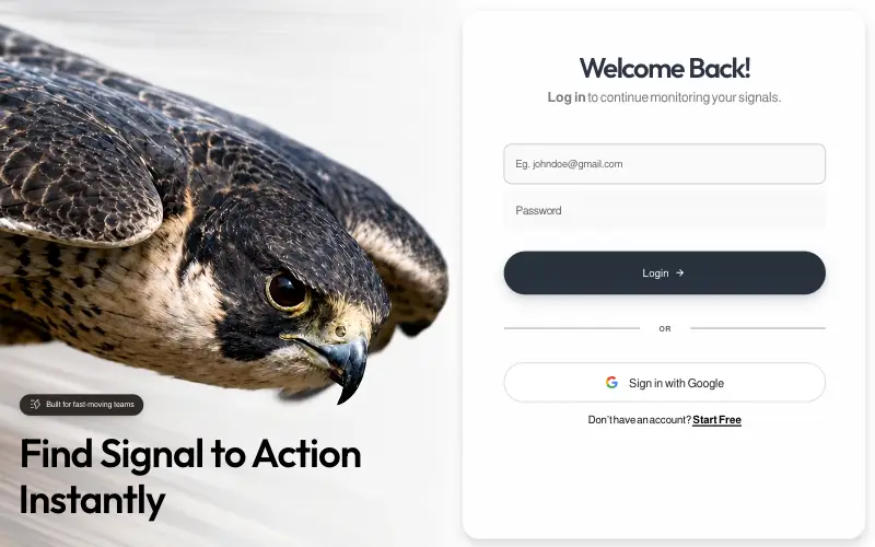
Pixel-locked single-file login page: a looping peregrine-falcon dive beside a frosted card, with embedded fonts, a JS layout engine that switches between desktop, tablet-portrait and phone compositions, and a once-only WAAPI entrance.

LinkFlow
Full-bleed hero whose clip is captured frame by frame and replayed forward-then-reverse on canvas, under a frosted pill nav, a two-tone green headline and a slide-in mobile drawer built entirely from CSS transitions.

Vesper.ai
Single-viewport AI-infrastructure landing on pure black: a liquid-metal pill nav, a serif-italic mixed headline over a full-bleed hero still, and three stats locked to the bottom of one non-scrolling frame.



