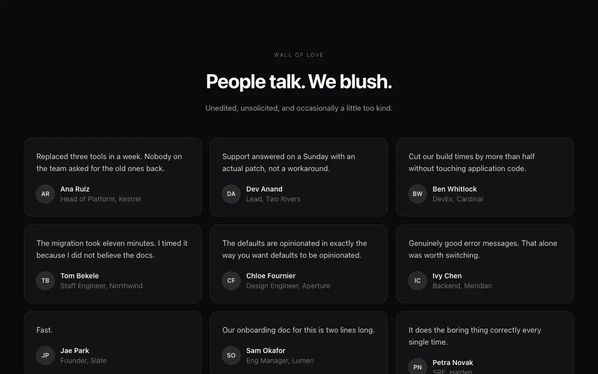
Testimonial Wall
Masonry testimonial wall with mixed-size quote cards, avatar rows and a soft spotlight hover.
The Prompt
# Testimonial Wall — Landing Page Section

## Goal
Build a masonry-style testimonial wall section: heading block + 9-12 quote cards in 3 columns of independent heights. It must drop cleanly into an existing Next.js + Tailwind project as a self-contained component.

## Design Spec
- Header: small caps label 'WALL OF LOVE', headline 'People talk. We blush.', subline — all centered, max-w-2xl.
- Cards: quote text (15-16px, 1.6 leading), then footer row of avatar (36px, ring-1), name semibold, handle/role muted.
- Mixed lengths: short one-liners and 4-5 line quotes interleaved so columns stagger n
Unlock the full 264-word prompt with one-time Lifetime access.
Unlock Full PromptYou may also like
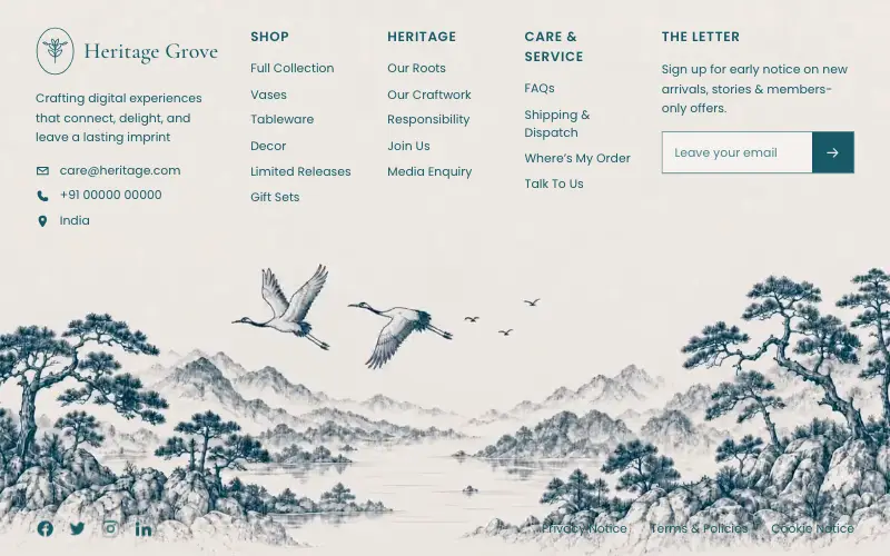
Heritage Grove Footer
Full-viewport footer laid straight onto a hand-drawn ink landscape loop — five columns on the paper sky, and below 1100px the clip leaves the background and becomes a flow item under the copy.

Vectrus Energy
Scroll-tied cinematic section: a 500vh track scrubs an aerial clip frame by frame through a WebCodecs frame bank, with three sequential copy blocks.

Figurine Carousel Hero
Full-viewport figurine carousel where background colour, scale, blur and position all crossfade together on one 650ms curve.

Asme
Dark cinematic hero over a looping film whose seam is hand-rolled with 500ms requestAnimationFrame fades: a liquid-glass nav and Login pill, an Instrument Serif headline, a glass email bar and three glass social buttons.



