Free
🏢 Agency
Forma
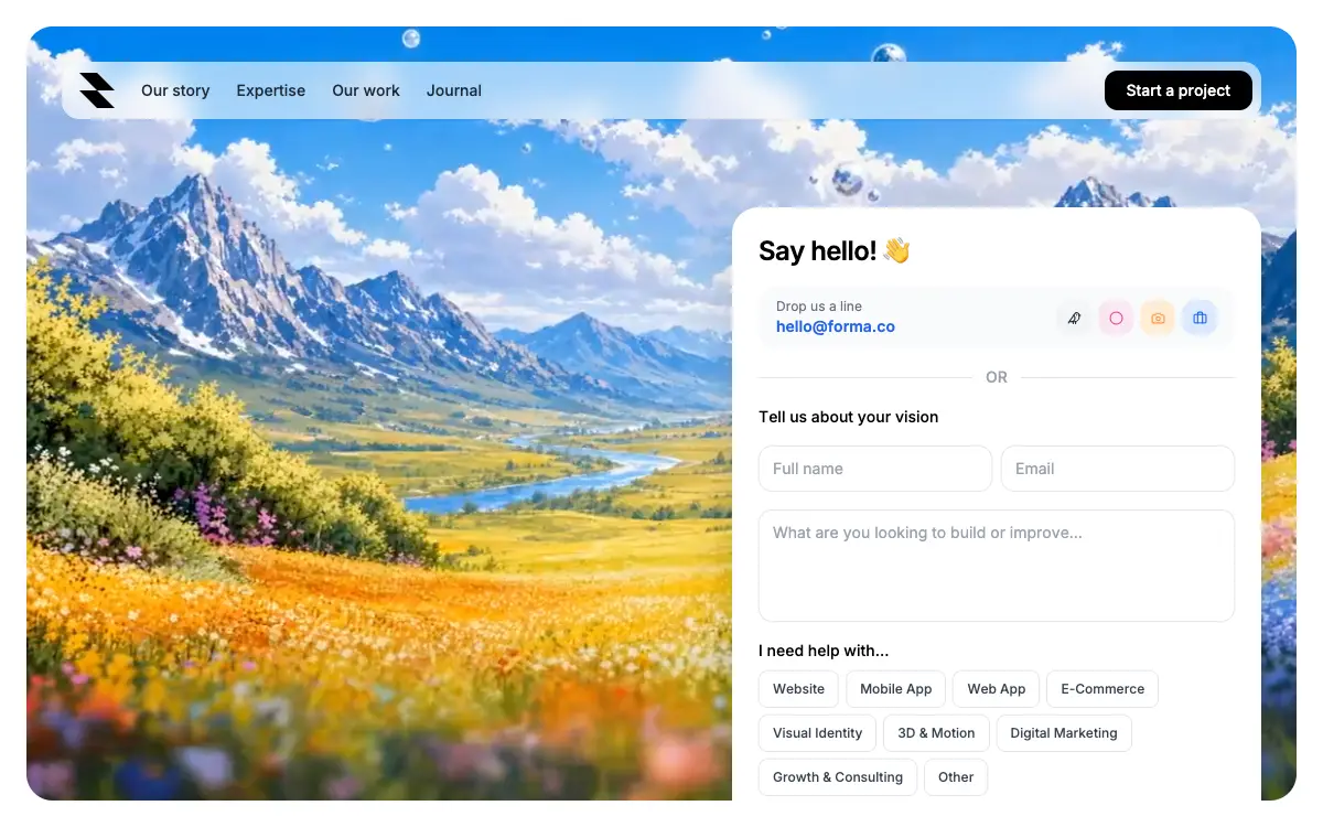
Studio landing inside one rounded video card: a glass pill navbar, a serif-accent headline and a contact form with nine multi-select service chips.
2.6k views 62 copies 1.6k kelime
Prompt
# Forma — Full-Screen Video Landing with Contact Form

Build a single-page React + TypeScript site on Vite with Tailwind CSS and `lucide-react`: a full-screen video-background landing page with a contact form.

Follow every specification below literally — exact class strings, exact copy, exact ordering. Do not substitute, round, simplify, or "improve" any value. Where a bracketed Tailwind arbitrary value is given (e.g. `lg:w-[min(480px,45%)]`), use it verbatim rather than the nearest preset.

---

## 1. Files

```
index.html
src/main.tsx
src/App.tsx      ← the entire component plus a SocialBtn helper
src/index.css
tailwind.config.js
```

`tailwind.config.js` is stock, scanning `./index.html` and `./src/**/*.{ts,tsx}`.

Two constants at the top of `App.tsx`: `VIDEO_URL` (the CloudFront URL below) and `SERVICES`.

## 2. `src/index.css`

Google Fonts import — **Inter** (weights 300–700) and **Instrument Serif** (italic + regular) — then Tailwind's three directives, then:

```css
* { font-family: 'Inter', sans-serif; }
```

Instrument Serif italic is used for exactly one accent word inline; see the headline.

---

## 3. Layout & sizing

- **Root**: `min-h-screen` on white, padding `p-3 sm:p-4 md:p-6`.
- **Card** (the only child): `relative rounded-2xl sm:rounded-3xl overflow-hidden` with the height ladder
  `min-h-[calc(100vh-24px)] sm:min-h-[calc(100vh-32px)] md:min-h-[calc(100vh-48px)] lg:h-[calc(100vh-48px)]`.
  On desktop it locks to the viewport; on tablet and mobile it grows with its content.
- **Background video**, filling the card: `absolute inset-0 w-full h-full object-cover`, attributes `autoPlay muted loop playsInline`. It is decoration — give it `aria-hidden`. Exact `src`:

```
https://d8j0ntlcm91z4.cloudfront.net/user_38xzZboKViGWJOttwIXH07lWA1P/hf_20260602_150901_c45b90ec-18d7-42ff-90e2-b95d7109e330.mp4
```

- **Content layer**: `relative z-10 flex flex-col` carrying the same min-height ladder plus `lg:h-full`, padding `p-4 sm:p-6 md:p-8`, `gap-6`.

---

## 4. Navbar

A pill bar: `bg-white/60 backdrop-blur-md rounded-2xl shadow-sm pl-3 sm:pl-4 pr-2 py-2 w-full sm:w-auto flex items-center gap-3 sm:gap-6`.

- **Logo** — a 32×32 inline SVG, `viewBox="0 0 256 256"`, two black filled paths forming a stylised "M":
  ```
  M 256 256 L 128 256 L 0 128 L 128 128 Z
  M 256 128 L 128 128 L 0 0 L 128 0 Z
  ```
- **Links**, hidden on mobile and `sm:flex` up: "Our story", "Expertise", "Our work", "Journal" — each `text-gray-800 text-sm font-medium hover:opacity-60 transition-opacity whitespace-nowrap`.
- **CTA**, floated right with `ml-auto`: `bg-black text-white text-sm font-medium px-4 sm:px-5 py-2 rounded-xl hover:bg-gray-800`, label "Start a project".

Then a spacer: `<div className="flex-1 min-h-[2rem]" />`.

---

## 5. Bottom row

Container: `flex flex-col lg:flex-row lg:items-end lg:justify-between gap-6`.

### 5.1 Headline (left)

A `<p>`: `text-white text-3xl sm:text-4xl xl:text-5xl font-medium leading-tight drop-shadow-lg lg:max-w-lg xl:max-w-2xl shrink-0`, broken with `<br />`:

> We craft bold ideas
> and ship them as *products*

"products" sits in a `<span>` with the inline style `{ fontFamily: "'Instrument Serif', serif", fontStyle: 'italic', fontWeight: 400 }`.

### 5.2 Contact card (right)

Outer: `w-full lg:w-[min(480px,45%)] shrink-0`. Card: `bg-white rounded-2xl sm:rounded-3xl shadow-2xl overflow-hidden`, inner `p-4 sm:p-6 flex flex-col gap-4`.

**1. Heading** — "Say hello! 👋", `text-xl sm:text-2xl font-semibold text-black tracking-tight`.

**2. Email + socials row**, always horizontal: `flex flex-row items-center justify-between gap-3 bg-gray-50 rounded-2xl px-4 py-2.5`.
- Left: a small grey label "Drop us a line", then the mailto link "hello@forma.co" as `text-blue-600 font-semibold hover:underline truncate`. Its wrapper needs `min-w-0` or `truncate` has nothing to bite on.
- Right: four 32×32 buttons, each `w-8 h-8 rounded-xl flex items-center justify-center hover:opacity-80 transition-opacity` around a lucide icon at `size={13}` — `Twitter` on `bg-gray-100 text-gray-800`, `Circle` on `bg-pink-100 text-pink-500`, `Instagram` on `bg-orange-100 text-orange-400`, `Linkedin` on `bg-blue-100 text-blue-600`. Extract this into a `SocialBtn` helper. Each carries an `aria-label` — an icon-only button has no accessible name otherwise.

**3. OR divider** — the word "OR" (`text-gray-400 font-medium text-sm`) between two `flex-1 h-px bg-gray-200` rules.

**4. Form** (`flex flex-col gap-4`):
- Label "Tell us about your vision", `text-sm font-medium text-black`.
- Name and Email inputs, side by side from `sm:` (`flex flex-col sm:flex-row gap-2`), placeholders "Full name" and "Email". Input class:
  `flex-1 min-w-0 text-sm px-3 py-2.5 rounded-xl border border-gray-200 bg-transparent placeholder-gray-400 focus:outline-none focus:ring-2 focus:ring-gray-900 focus:border-transparent transition`
- A 4-row `<textarea>`, placeholder "What are you looking to build or improve...", same class plus `resize-none`.
- Service tags: label "I need help with...", then a wrapping row `flex flex-wrap gap-1.5`. Each tag is a `<button>` `text-xs font-medium px-3 py-2 rounded-lg border transition-all` — inactive `bg-white text-gray-700 border-gray-200 hover:border-gray-400`, active `bg-gray-100 text-black border-black`, with `aria-pressed`. Multi-select, toggled in state. Exact order: Website, Mobile App, Web App, E-Commerce, Visual Identity, 3D & Motion, Digital Marketing, Growth & Consulting, Other.
- Submit: `w-full bg-black text-white text-sm font-semibold py-3 rounded-2xl hover:bg-gray-800 transition-colors disabled:opacity-60`, label "Send my message", or "Sending..." while submitting.

**5. Submit behaviour** — set `sending=true`, `await new Promise(r => setTimeout(r, 1000))`, then replace the form with a success state: a centred column `py-6 gap-3` holding a `w-12 h-12 rounded-full bg-green-50 flex items-center justify-center text-xl` pill containing "✓", the heading "You're all set!" (`text-base font-semibold text-gray-900`) and "Expect a reply within 24 hours." (`text-sm text-gray-500`).

---

## 6. State & motion

`useState`: `selected: string[]`, `name`, `email`, `message`, `sending`, `sent`.

No animation library. Everything is Tailwind `transition-*` on hover and focus, plus `backdrop-blur-md` on the navbar.

---

## Quality Bar

- TypeScript strict, zero `any`. Tailwind only — no CSS beyond `index.css`.
- Autoplay survives only while the element is genuinely `muted` and `playsInline`; keep both.
- `lucide-react` no longer ships brand icons. `Twitter`, `Instagram` and `Linkedin` were removed in v1 — on 1.28.0 there is not one brand glyph among the 6014 exports — so those three imports are a build error on any current install, not a deprecation warning. Pick non-brand icons from the library, or pull the marks from a brand-icon set and accept the extra dependency.
- `w-full sm:w-auto` on the navbar does nothing above `sm`. Its parent is `flex flex-col`, so `align-items` is `stretch` and a `width: auto` child still fills the cross axis — measured 1328px of 1328px at a 1440px viewport. The pill is full-bleed at every size, and `ml-auto` on the CTA only reads as "floated right" because of it. If a hugging pill was the intent, the parent needs `items-start` or the bar needs `self-start`.
- Respect `prefers-reduced-motion`: nothing here animates on entrance, but a permanently looping full-bleed video is exactly what that setting asks you to stop. Pause it and hold a frame, and collapse the transition durations. Read the query inside an effect and re-read it on `change`, not in a `useState` initialiser — that is client-only and would disagree with hydration in Next.js.
- The headline is white with `drop-shadow-lg` and no scrim. Sampled straight off the decoded frames behind it, across the whole 12s loop: the average backdrop under those two lines runs 5.06–6.07:1 against white, which passes — but 36% to 49% of the individual pixels under the text sit below 4.5:1, and the worst of them reach 1.66:1. An average is the wrong statistic for type on moving footage; a third of every glyph is failing at any given moment, and which third changes as the loop plays. Add a scrim or a bottom gradient rather than trusting the drop shadow, which is a shadow, not contrast.
- `lg:h-[calc(100vh-48px)]` is a hard height on an `overflow-hidden` card, the content layer is `lg:h-full`, and the spacer only guarantees `min-h-[2rem]`. The form card measures 618px on its own. Measured at 1024×768: the content overflows its layer by 65px, the submit button is cut in half, the headline's second line is gone entirely, and `document.scrollHeight` still equals the viewport — the clipping happens on the card, so there is no scrollbar and no way to reach the button. Below `lg` the ladder switches to `min-h-` and the card grows instead, so this bites only on the widths most likely to be an actual laptop.
- The form's only `<label>` is the group heading "Tell us about your vision"; the three fields carry placeholders and nothing else. Placeholders vanish on first keystroke and are not accessible names — bind that label to a field with `htmlFor`/`id` and give the other two an `aria-label`, or add real labels.
- "✓" is U+2713, which is not in Inter's Google Fonts latin subset. It renders from a system fallback, so its weight and metrics will not match the rest of the card — as will the 👋, which comes from the platform emoji font. Both are fine, but neither is the typeface you loaded.
- The Instrument Serif import asks for `ital@0;1` and only the italic ever lands: the single element using that family hard-codes `fontStyle: 'italic'` inline. Drop the regular face rather than making every visitor download a font that never renders.
- The socials row is `flex-row` at every width, and four 32px buttons plus gaps is an incompressible 146px, so the email column is what gives. It does not overflow — `truncate` plus `min-w-0` on that column sees to that, and without the `min-w-0` flex would refuse to shrink and the row would burst its rounded background. But measured at 375px the link has 97px for 108px of text, so `hello@forma.co` renders clipped on a stock iPhone, and at 320px it is down to "hell…" with the label stacked three lines high beside it. The row survives; the address, which is the entire point of the row, does not. Let it wrap below `sm`.
- Watch the payload: the source clip is 3828×2164 and dominates page weight on its own. Downscale to what actually renders, drop the audio track muted playback never uses, and serve a compressed derivative — dense footage like this meadow does not compress the way flat or dark footage does, so measure rather than assume.
- Fonts from a Google Fonts `@import` are a render-blocking third-party request. Both families here are OFL 1.1, so self-host and subset them if the page must run without external requests.
Bunları da beğenebilirsiniz
Free
Featured
Vectrus Energy
🛬 Landing Page
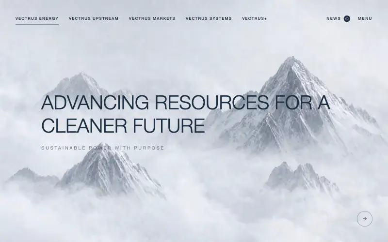
Scroll-tied cinematic section: a 500vh track scrubs an aerial clip frame by frame through a WebCodecs frame bank, with three sequential copy blocks.
4.9k 535CursorClaude CodeLovable
Free
Wanderful
✈️ Travel
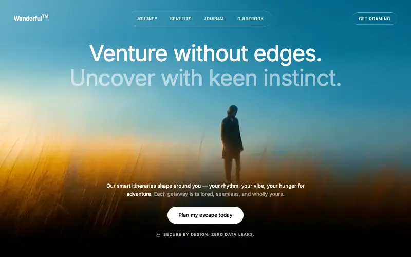
Cinematic travel hero: a full-bleed loop drifting under a GSAP mouse parallax, with a liquid-glass pill navbar and two fade-up copy blocks.
4.8k 445CursorClaude CodeLovable
Free
Featured
Aurora Weather Dashboard
📊 Dashboard
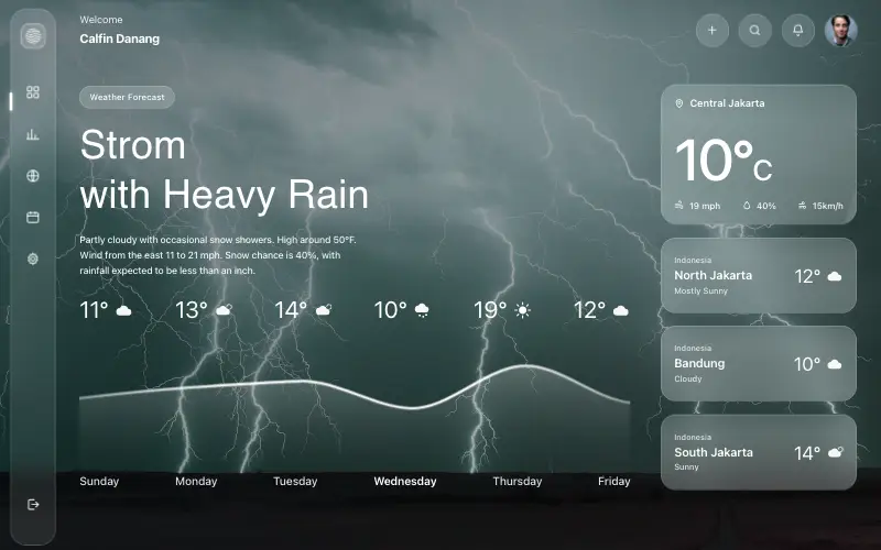
Liquid-glass weather dashboard on a 1357x871 unit grid: frosted panels over a storm photo and a chart that draws itself, then fills.
4.5k 527CursorClaude CodeLovable
Free
Featured
Fastshot Landing
🤖 AI
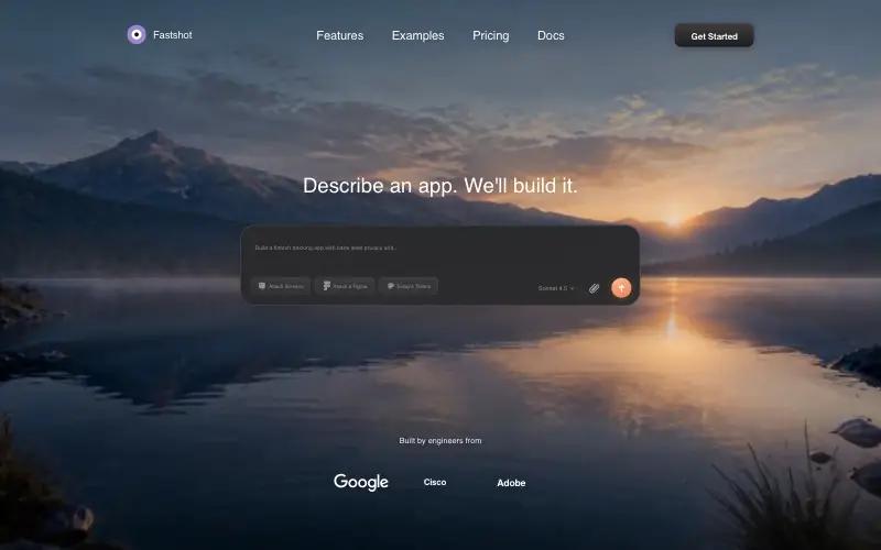
Single-screen AI app-builder landing: full-bleed dawn video, glass composer card and a pixel-specified absolute toolbar.
4.0k 639CursorClaude CodeLovable



