Signal
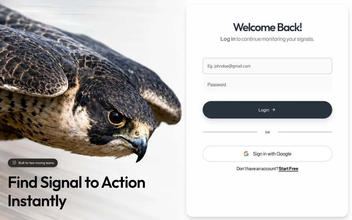
Pixel-locked single-file login page: a looping peregrine-falcon dive beside a frosted card, with embedded fonts, a JS layout engine that switches between desktop, tablet-portrait and phone compositions, and a once-only WAAPI entrance.
Prompt
# Signal — Pixel-Locked Falcon Login
Build a single, self-contained `index.html` — no build step, no external requests except one video URL, no frameworks, no dependencies. Everything (CSS, JS, SVG) is inline. It is a pixel-locked recreation of a designed login page, reconstructed from a 1464×949 reference frame. Follow every number exactly; the design is calibrated, not approximate.
## 0. Global rules
- `<!DOCTYPE html>`, `<html lang="en">`
- `<meta name="viewport" content="width=device-width, initial-scale=1, viewport-fit=cover">`
- `<title>Signal — Log in</title>`
- `html,body{height:100%;background:var(--page)}`; `body` sets `-webkit-font-smoothing:antialiased; text-rendering:geometricPrecision; overflow:hidden`
- No semicolon-optional sloppiness — this is production-grade static output.
## 1. Fonts
Two families, both **embedded as base64 `data:font/woff2` URIs inside `@font-face`** (the page must work fully offline for type):
| Family | Weights | Format | Use |
|---|---|---|---|
| `FreeSans` | 400, 700 (two `@font-face` blocks) | `format('woff2')` | Body / UI |
| `Eloquia` | variable `200 800` | `format('woff2-variations')` | Display: headline + card H1 |
All three declare `font-display:block` (no FOUT — the entrance waits on `document.fonts.ready`).
- Body stack: `'FreeSans',-apple-system,BlinkMacSystemFont,'Helvetica Neue',Arial,sans-serif`
- Display: `font-family:'Eloquia',sans-serif` **plus** `font-variation-settings:'wght' var(--hl-wght)` — the variable axis sets weight, not `font-weight`.
If you cannot source the exact fonts, substitute a grotesque for FreeSans and a variable geometric sans for Eloquia, keep `font-variation-settings`, and say so — do not silently swap in a system font.
## 2. Hero media — a video, not an image
The left panel is a **looping video of a peregrine falcon in a high-speed dive** — feathers rippling, eye locked forward, background streaking with motion blur, slow camera push-in. 1352×1532, ~5s, silent.
```
https://d8j0ntlcm91z4.cloudfront.net/user_38xzZboKViGWJOttwIXH07lWA1P/hf_20260813_052122_e77a27e6-17f1-4794-889b-3ceaa0e9e8cb.mp4
```
Two `<video>` elements — responsive variants CSS shows/hides, both pointing at the same file:
```html
<video class="photo-img photo-img--tall" autoplay muted loop playsinline preload="auto" poster="data:image/webp;base64,…">
<source src="falcon.mp4" type="video/mp4">
</video>
<video class="photo-img photo-img--wide" aria-hidden="true" autoplay muted loop playsinline preload="auto" poster="data:image/webp;base64,…">
<source src="falcon.mp4" type="video/mp4">
</video>
```
- `autoplay muted loop playsinline` are all required (muted + playsinline are what let iOS autoplay)
- `poster` on each is a **base64 webp still of the same falcon** (the original 1177×1336 photograph), so first paint is the photo, with no empty flash while the video buffers
- The `--tall` one carries the alt-equivalent meaning; the `--wide` duplicate is `aria-hidden="true"`
- Reference the CloudFront URL directly in `src`, or download it beside the file as `falcon.mp4` and reference it relatively
## 3. Design tokens (`:root`)
```css
--W:1464; --H:949; --photoW:836; --paneW:628; --cardW:613; --cardH:922;
--badge-fs:13.60px; --badge-fw:400; --badge-ls:-0.163px; --badge-gap:10px; --badge-dy:0px; --badge-ws:0px;
--badge-left:34px; --badge-top:684px;
--hl-lh:1; --hl-wght:578;
--hl1-fs:69.14px; --hl1-ls:-1.936px; --hl1-ws:0px; --hl1-left:33.00px; --hl1-top:750.02px;
--hl2-fs:68.95px; --hl2-ls:-1.931px; --hl2-left:32.00px; --hl2-top:831.01px;
--h1-top:65.00px; --h1-fs:42.55px; --h1-ls:-2.553px; --h1-ws:1.300px; --h1-wght:584;
--sub-top:120.00px; --sub-fs:20.41px; --sub-ls:-0.245px; --sub-ws:-2.000px; --sub-fw:400; --sub-fwb:700;
--fieldpad:19px;
--eph-fs:15.68px; --eph-ls:-0.188px; --eph-left:17.0px; --eph-fw:400; --eph-ws:0px;
--pph-fs:17.29px; --pph-ls:-0.698px; --pph-left:18px; --pph-fw:400;
--login-fs:16.38px; --login-fw:400; --login-ls:0.200px; --login-gap:10px; --login-dy:0.00px; --login-padl:-12.00px;
--arrow-w:13.2px;
--div-top:477px; --or-fs:11.5px; --or-fw:700; --or-ls:0.8px; --or-dy:2.00px; --or-dx:0.00px;
--or-line-l:205px; --or-line-r:204px;
--g-gap:17px; --g-icon:18.5px;
--gt-fs:18.10px; --gt-fw:400; --gt-ls:-0.217px; --gt-ws:-1.000px; --gt-dy:1.00px;
--bt-top:611.00px; --bt-fs:16.37px; --bt-fw:400; --bt-ls:-0.196px; --bt-ws:-2.060px; --bt-fwb:700; --bt-uo:3px;
--card-shadow:1px 10px 14px rgba(10,14,20,0.14), 0 1px 3px rgba(10,14,20,0.05);
--cs:1;
--ink:#000; --h1-color:#2c3343; --sub-grey:#797979;
--badge-bg:#2f2a27; --ph:#606060; --or:#5a5a5b;
--gtext:#232424; --bottom:#0a0a0a;
--btn1:#283139; --btn2:#293340;
--inputFill:#fafafa; --inputBorder:#acacae; --pwFill:#f9f9f9;
--gBorder:#c8c8ca; --divider:#b1b1b2; --page:#fefefe;
```
The asymmetries are deliberate: the two headline lines differ slightly (69.14 vs 68.95px), the OR rules differ by 1px (205/204), the email and password fields differ in fill, height, border and padding, and `--login-padl` is negative to optically centre the Login label against its trailing arrow.
## 4. Structure and copy
```
body > .stage
section.photo
video.photo-img.photo-img--tall
video.photo-img.photo-img--wide
div.scrim
div.hero#hero
div.badge → inline SVG signal glyph + span#badgeTxt
div.hl-wrap → span.hl#hl1, span.hl#hl2
section.pane
div.card#card
div.card-in#cardIn
h1.col.center#h1
p.col.center#sub
div.field#email > input
div.field#pw > input
button#loginBtn > span + arrow SVG
div.divider > i + b + i
button#gBtn > Google SVG + span
p#bottom > text + a
```
Badge **"Built for fast-moving teams"** · headline **"Find Signal to Action"** / **"Instantly"** · H1 **"Welcome Back!"** · sub **`<b>Log in</b> to continue monitoring your signals.`** · email placeholder **"Eg. johndoe@gmail.com"** (`type="email"`, `autocomplete="email"`, `aria-label="Email address"`) · password placeholder **"Password"** (`type="password"`, `autocomplete="current-password"`, `aria-label="Password"`) · button **"Login"** + right arrow · divider **"OR"** · **"Sign in with Google"** · footer **"Don’t have an account? "** + link **"Start Free"**. Both buttons are `type="button"`; there is no `<form>` and no submit handling — this is a static composition.
**Badge glyph** — `viewBox="0 0 582 557"`, one white `fill-rule="evenodd"` path, rendered 17 × 16.27px, nudged `top:-1px`:
```
M449.0 0.0 435.0 0.0 415.0 10.0 200.0 249.0 187.0 276.0 189.0 299.0 212.0 326.0 232.0 332.0 289.0 334.0 289.0 516.0 301.0 543.0 324.0 556.0 346.0 556.0 374.0 536.0 573.0 311.0 582.0 288.0 579.0 264.0 559.0 240.0 539.0 233.0 478.0 230.0 478.0 32.0 470.0 13.0ZM442.0 38.0 446.0 250.0 466.0 267.0 540.0 270.0 547.0 285.0 341.0 520.0 332.0 522.0 324.0 514.0 321.0 314.0 307.0 300.0 295.0 297.0 233.0 297.0 224.0 291.0 221.0 282.0ZM1.0 67.0 4.0 81.0 17.0 90.0 216.0 90.0 223.0 87.0 232.0 74.0 228.0 57.0 215.0 49.0 18.0 49.0 5.0 57.0ZM0.0 285.0 4.0 300.0 17.0 308.0 105.0 308.0 118.0 299.0 121.0 291.0 119.0 278.0 111.0 270.0 103.0 267.0 17.0 267.0 4.0 275.0ZM1.0 495.0 4.0 511.0 10.0 517.0 23.0 520.0 179.0 520.0 191.0 516.0 200.0 500.0 196.0 488.0 182.0 479.0 18.0 479.0 9.0 483.0Z
```
**Login arrow** — `viewBox="0 0 22 22"`, `<path d="M3 11h15.4M11 3.3l7.7 7.7-7.7 7.7" stroke="#fff" stroke-width="2.6" stroke-linecap="round" stroke-linejoin="round"/>`. **Google mark** — the standard 4-colour `viewBox="0 0 48 48"` G, fills `#EA4335`, `#4285F4`, `#FBBC05`, `#34A853`.
## 5. Desktop layout (the base composition)
- `.stage{position:fixed;inset:0;overflow:hidden}`
- `.photo{position:absolute;left:0;top:0;height:100%;width:57.1038%;overflow:hidden}` — 836/1464
- `.photo-img{position:absolute;inset 0;width:100%;height:100%;object-fit:cover;object-position:100% 50%;display:block;-webkit-user-drag:none}`
- `.scrim` — `display:none` on desktop; a white top-down gradient defined but unused until mobile
- `.hero{position:absolute;left:0;bottom:0;width:836px;height:949px;transform-origin:left bottom;pointer-events:none}`, `.hero>*{pointer-events:auto}` — JS scales the whole block
- `.badge` — `inline-flex`, height 37px, padding `0 16px 0 19px`, `border-radius:999px`, `--badge-bg`, `backdrop-filter:blur(7px) saturate(120%)`, shadow `0 1px 2px rgba(0,0,0,.18), 0 6px 18px rgba(0,0,0,.14)`, white text, `white-space:nowrap`
- `.hl` — absolute, Eloquia, `line-height:1`, `color:var(--ink)`, `white-space:nowrap`
- `.pane{position:absolute;left:57.1038%;right:0;top:0;bottom:0}`
- `.card` — `left:1px;top:14px;width:613px;height:922px;border-radius:26px;overflow:hidden;background:rgba(254,254,254,.90);backdrop-filter:blur(28px) saturate(160%);border:1px solid rgba(0,0,0,.036);box-shadow:var(--card-shadow)`
- `.card-in` — 613×922, `transform-origin:left top` (JS scales it)
- `.col{position:absolute;left:62px;width:488px}`; `.field{left:62px;width:489px;display:flex;align-items:center;border-radius:12px}`
- `#email{top:203px;height:61px;background:var(--inputFill);border:1.5px solid var(--inputBorder)}` · `#pw{top:273.5px;height:59px;background:var(--pwFill);border:0}`
- `#loginBtn{left:62px;top:366px;width:489px;height:65.5px;border-radius:999px;background:linear-gradient(180deg,var(--btn1) 0%,var(--btn2) 100%);color:#fff;display:flex;align-items:center;justify-content:center;gap:var(--login-gap);padding-left:var(--login-padl);padding-right:4px;box-shadow:0 8px 20px rgba(18,26,34,.16), 0 2px 5px rgba(18,26,34,.10)}`
- `.divider{left:63px;top:var(--div-top);width:487px;display:flex;align-items:center;justify-content:center}` — `i` rules `height:1.5px`, first `flex:0 0 205px`, last `flex:0 0 204px`; `b` is `flex:1 1 auto`
- `#gBtn{left:62px;top:535px;width:489px;height:59.5px;border:1.5px solid var(--gBorder);border-radius:999px;background:rgba(255,255,255,.92);box-shadow:0 1px 2px rgba(0,0,0,.03)}`
- `#bottom{left:62px;width:489px;top:var(--bt-top);text-align:center}`; its link is `#000`, weight 700, underlined, `text-underline-offset:3px`, `text-decoration-thickness:2px`
States: `#loginBtn` — `transition:transform .18s cubic-bezier(.2,.7,.3,1), box-shadow .18s ease, filter .18s ease`, `:hover{filter:brightness(1.12)}`, `:active{transform:translateY(1px)}`. `#gBtn` — `transition:background .18s ease, box-shadow .18s ease, transform .18s cubic-bezier(.2,.7,.3,1)`, `:hover{background:#fff;box-shadow:0 3px 10px rgba(0,0,0,.07)}`, `:active{transform:translateY(1px)}`. `:focus-visible{outline:2px solid #2b6cb0;outline-offset:2px}`. `@media (prefers-reduced-motion:reduce){*{transition:none!important;animation:none!important}}`.
## 6. Responsive engine (JS-driven, three modes)
```js
var REF_W=1464, REF_H=949, PHOTO_W=836, PANE_W=628, CARD_W=613, CARD_H=922;
var CONTENT_H=697; // form block + breathing room, reference px
var IMG_W=1177, IMG_H=1336, IMG_REF_SCALE=836/1177;
var PANE_RATIO=PANE_W/REF_W;
var HERO_W=681, HERO_H=219; // hero block extents, reference px
var REF_CARD_ASPECT=692/855;
var RAMP_HI=1280, RAMP_LO=1000, PHOTO_MIN=0.42;
var RAMP_LO2=820, PHOTO_MIN2=0.36;
var TP={"pad":0.1076,"h1Top":0.08656,"h1Fs":0.06839,"subTop":0.17368,"subFs":0.0309,"emTop":0.25435,"emH":0.10257,"emR":0.0202,"ephFs":0.02702,"ephPad":0.0332,"pwTop":0.36851,"pwH":0.10839,"btnTop":0.50435,"btnH":0.10981,"btnFs":0.0275,"arrow":0.026,"btnGap":0.02,"divTop":0.68222,"orFs":0.02245,"orPad":0.051,"divH":0.0026,"gTop":0.76445,"gH":0.09966,"gIcon":0.032,"gtFs":0.03205,"gGap":0.026,"btTop":0.89668,"btFs":0.1058,"badgeH":0.0742,"heroLh":1.1246,"heroBot":0.06493,"heroGap":-0.30423,"heroSide":0.0525};
```
(`btFs` is `0.02876` and `heroFs` is `0.1058` — keep both keys.)
```js
var mqLandscape = window.matchMedia('(min-width:700px) and (min-aspect-ratio:51/50)');
var mqPortrait = window.matchMedia('(min-width:700px) and (max-aspect-ratio:51/50)');
```
**Mode A — `land` (desktop / landscape ≥700px).** The photo column width comes from `photoRatio(vw)`: at ≥1280px the untouched `1 - PANE_RATIO` (57.1%); from 1280→1000 it eases linearly to `0.42`; from 1000→820 further to `0.36` — yielding width to the card as the frame narrows, with no jump. `placeCard(paneW, vh)`: `cs = Math.min(paneW/PANE_W, vh/CONTENT_H)`; margins `gapL=1*cs, mT=14*cs, mB=13*cs, mR=14*cs`; card width `Math.max(CARD_W*cs, paneW-gapL-mR)`, height `vh-mT-mB`, radius `26*cs`, border `Math.max(1,cs)`; then `cardIn.style.transform='translate('+((cw-CARD_W*cs)/2)+'px,0) scale('+cs+')'` — the interior is *scaled*, so the fixed pixel values hold at any size. `seatHero(photoW, vh)`: `imgScale=Math.max(photoW/IMG_W, bandH/IMG_H)`, then `s=Math.min(imgScale/IMG_REF_SCALE, photoW*0.92/HERO_W)`, applied as `transform:scale(s)` from `left bottom`, `bottom:0`.
**Mode B — `tabport` (≥700px, portrait) — `body.tabport`.** The photo becomes a masthead band with the badge and headline at its foot; the card takes the full measure underneath. From a 1086×1448 tablet reference: band = `round(vh*0.425)`, side margin = `round(vw*0.0525)`, footer = `round(vh*0.0297)`. The photo becomes `width:100%;height:var(--band-h)` and swaps to the `--wide` video at `object-position:50% 50%`. The hero becomes a static flex column anchored to the band's bottom with `--tp-hero-b`, `--tp-hero-gap` (note: **negative**, −0.30423 × band) and a scaled badge via `--badge-k = band*0.0742/37`. The headline goes inline-wrapping inside `.hl-wrap`, its measure set to `round(headlineMeasure()*0.61)px` so the line can only break after "to"; `headlineMeasure()` clones a hidden span with the computed font-family/size/weight/letter-spacing/word-spacing/variation-settings, measures "Find Signal to Action Instantly", and removes it. The card interior goes **fluid, not scaled**: `card-in` becomes `inset:0; transform:none`, and every interior value is a CSS var derived from the card — vertical keys off `cardH`, `pad`/`orPad` off `cardW`, hero/badge keys off the band, everything else off `S = Math.min(cardH, cardW*REF_CARD_ASPECT)`; camelCase TP keys become `--tp-kebab-case`. Tracking is re-derived proportionally, e.g. `letter-spacing:calc(var(--h1-ls)/var(--h1-fs)*var(--tp-h1-fs))`.
**Mode C — `phone` (<700px) — `body.stacked`.** A real document-flow composition — nothing viewport-scaled, so type stays readable and short screens scroll. `--mobile-hero-h:clamp(244px,34svh,304px)`; body becomes `height:auto;min-height:100%;overflow-y:auto;background:#fff`; `.stage` a relative flex column with `min-height:100svh`. The photo is a relative band of `--mobile-hero-h` using the `--wide` video at `object-position:64% 48%` with `transform:scale(1.015)`. `.scrim` turns **on**: `linear-gradient(180deg,rgba(7,10,13,.02) 18%,rgba(7,10,13,.12) 48%,rgba(7,10,13,.78) 100%)`. The hero sits bottom-left over it; the badge becomes `height:31px;padding:0 12px;background:rgba(24,27,30,.82);box-shadow:0 4px 16px rgba(0,0,0,.18)` with an 11px label; headline lines go **white**, `font-size:clamp(30px,8.8vw,38px);letter-spacing:-.035em;line-height:.96;text-shadow:0 2px 18px rgba(0,0,0,.32)`. The card overlaps the photo: `margin:-28px 0 0;border-radius:28px 28px 0 0;background:#fff;border:0;box-shadow:0 -10px 28px rgba(20,28,36,.10);min-height:calc(100svh - var(--mobile-hero-h) + 28px)`. `card-in`: `max-width:500px;margin:0 auto;padding:36px clamp(24px,7vw,38px) max(30px,env(safe-area-inset-bottom));display:flex;flex-direction:column;justify-content:center`. All children go `position:static;width:100%`: fields 56px, login 58px, Google 56px, **inputs `font-size:16px`** (no iOS zoom-on-focus), H1 `clamp(31px,8.8vw,38px)`, sub 15px, footer 14px. `@media (max-width:370px)`: hero 232px, tighter padding, headline pinned to 30px. `@media (max-height:520px) and (orientation:landscape)`: hero 208px, `card-in` `justify-content:flex-start`. The JS phone branch is deliberately **empty** — it only calls `setMode('phone')`.
**Mode-switch hygiene.** Every branch writes inline styles, and inline styles outrank the stylesheet, so on a mode change **wipe first**: `clearInline()` resets `cssText=''` on `photo`, `pane`, `card`, `cardIn`, `hero`. None carry a `style` attribute in the markup, so clearing is safe. `layout()` is bound to `resize` (passive), `orientationchange`, both media-query `change` events and `document.fonts.ready`, and called once immediately.
## 7. Entrance animation (runs exactly once)
A tiny `<script>` in `<head>`, before the stylesheet:
```js
document.documentElement.classList.add('entry-pending');
window.__entryFallback=setTimeout(function(){
document.documentElement.classList.remove('entry-pending');
},3500);
```
With JS disabled the class is never added, so the whole page stays visible — do not add a `<noscript>`. `.entry-pending …` sets `opacity:0` and `will-change:transform,opacity,clip-path` on `.card`, `.badge`, `#hl1`, `#hl2`, `#h1`, `#sub`, `#email`, `#pw`, `#loginBtn`, `.divider`, `#gBtn`, `#bottom`, with: card `translateY(12px) scale(.988)`, badge `translateY(8px)`, headlines `translateY(16px)` **with `clip-path:inset(100% 0 0 0)`**, h1/sub `translateY(10px)`, the rest `translateY(8px)`. Under `max-width:699px` the card uses `translateY(14px)` and headlines `translateY(12px)`. Under `prefers-reduced-motion:reduce` all of these are forced back to `opacity:1;transform:none;clip-path:none;will-change:auto`. **The photograph/video is excluded — it is the static stage and never animates.**
A second IIFE at the end of `<body>`: if reduced motion is on or `Element.prototype.animate` is missing, call `releaseEntrance()` and return. Otherwise, with `ease='cubic-bezier(.16,1,.3,1)'`, `softEase='cubic-bezier(.22,1,.36,1)'` and `compact = matchMedia('(max-width:699px)').matches`, run each step as `el.animate([from,to],{delay,duration,easing,fill:'both'})`:
| Target | Delay | Duration | Easing | From |
|---|---|---|---|---|
| `.card` | 40 | 820 | ease | `opacity:0`, `translateY(14px)` compact else `translateY(12px) scale(.988)` |
| `.badge` | 120 | 480 | softEase | `translateY(8px)` |
| `#hl1` | 240 | 760 | ease | `translateY(16/12px)` + `clipPath:inset(100% 0 0 0)` |
| `#hl2` | 330 | 760 | ease | `translateY(16/12px)` + `clipPath:inset(100% 0 0 0)` |
| `#h1` | 470 | 620 | ease | `translateY(10px)` |
| `#sub` | 570 | 560 | ease | `translateY(10px)` |
| `#email` | 720 | 520 | softEase | `translateY(8px)` |
| `#pw` | 790 | 520 | softEase | `translateY(8px)` |
| `#loginBtn` | 930 | 560 | ease | `translateY(8px)` |
| `.divider` | 1060 | 440 | softEase | `translateY(6px)` |
| `#gBtn` | 1150 | 540 | ease | `translateY(8px)` |
| `#bottom` | 1260 | 500 | softEase | `translateY(6px)` |
Every `to` is `{opacity:1,transform:'none'}` (headlines also `clipPath:'inset(0 0 0 0)'`). Intent: **surface establishes depth → brand promise overlaps it → functional form groups resolve last.** Immediately after scheduling, remove `entry-pending` (the animation layer now owns the hidden first frame); then `Promise.allSettled(animations.map(a=>a.finished))` → `cancel()` every animation, empty the array, `releaseEntrance()` (which also clears `__entryFallback`) — cancelling restores the authored styles exactly, leaving no `fill:'both'` residue. Trigger: `Promise.race([document.fonts.ready, new Promise(r=>setTimeout(r,650))])` then a double `requestAnimationFrame`.
## 8. Acceptance checks
1. Desktop 1464×949 reproduces the reference frame exactly.
2. Resizing 1400 → 900 → 700 eases the photo column back smoothly, with no jump and no reload.
3. Rotating a tablet swaps cleanly between `land` and `tabport` (proof that `clearInline()` works).
4. On a phone the page scrolls, inputs do not trigger iOS zoom, and the headline is white over the scrim.
5. The entrance plays once on load and never again on resize.
6. With `prefers-reduced-motion:reduce`, everything is visible immediately and nothing moves.
7. With JS disabled, the full page renders statically.
8. The falcon video autoplays silently and loops in every mode, with the poster visible during buffering.
## Quality Bar
- **The engine is genuinely precise — once three unstated resets are in place.** Driven in headless Chrome 153 at 1464×949, every element landed on its specified coordinates to within **0.05px**: card `[837, 14, 613, 922]`, `#h1` at 65, `#email` at 203, `#loginBtn` at 366, `#gBtn` at 535, `#bottom` at 611, the headline lines at 750.02 / 831.01. The photo column matched `photoRatio()` at 73 of 74 widths from 1440 to 710px (the one miss is a 1px rounding tie), never moving more than 13px per 10px step. Five mode switches without a reload each matched a fresh load exactly, so `clearInline()` does its job. The entrance handed off at **72ms**, released at **1880ms** (72 plus the 1760ms longest step), and never replayed during 74 resizes.
- **But §0 never resets UA margins or control fonts, and "pixel-locked" does not survive without them.** Every text element is placed by an explicit `top`, so the default `0.67em` margin on the `h1` pushes it **28.5px** below its calibrated position; `#sub` lands **20.4px** low and `#bottom` **16.4px** low (measured by removing the resets). Form controls don't inherit `font-family`, so the **Login label and the typed input text render in Arial** — the embedded FreeSans never reaches them. And in phone mode, where `.stage` re-enters normal flow, `body`'s 8px margin frames the "full-bleed" photo and card: measured at 390px wide, the photo sat at x = 8 and was 374px wide. Add `body,h1,p{margin:0}` and `button,input{font:inherit}`.
- **Two negative values are silently discarded, because `var()` hides them from the parser.** `--login-padl:-12px` is routed into `padding-left`, which rejects negatives — computed, it is **`0px`**, so the "optical centring" of the Login label never happens. `--tp-hero-gap` (−0.30423 × band = **−187px** at the tablet reference) is routed into a flex `gap`, which also rejects negatives — computed `row-gap` is **`normal`**. A literal negative would at least be flagged when parsed; through a custom property it is simply "invalid at computed-value time" and falls back without a word. Use a negative margin, or `translateX()`, for optical nudges.
- **The TP table is wrong as printed, and its own note says so.** The block has `"btFs":0.1058` and no `heroFs` key; the line beneath says `btFs` is `0.02876` and `heroFs` is `0.1058`. Taken literally, at the 1086×1448 reference the footer renders at **79px**, wraps to two lines and runs **114px past the bottom of the card**. With the note's value it is 21.5px and fits. Fix the table rather than rely on the note.
- **`heroSide` misaligns the tablet headline by 25px.** It is keyed off the band as the rule says, so at the tablet reference it resolves to 0.0525 × 615 = **32px** — while the card below sits at the side margin, 0.0525 × 1086 = **57px**. The two ratios are identical, which suggests `heroSide` was meant to track the viewport like the side margin does.
- **Two `<video>` elements download the same file twice.** On a first visit (cache disabled) Chrome issues **two separate `bytes=0-` requests** for the clip, both elements buffer all 5.04s, and the `display:none` duplicate still reports itself playing. With the 9,981,473-byte source that is about **20 MB per cold load**. The poster is duplicated too: the same **75,976-byte** base64 WebP is inlined on both elements, 151,952 bytes in total. The two variants differ only in `object-position` — one `<video>` whose object-position changes per mode does the same job for half the bytes.
- **In tablet portrait the headline falls on the bird.** The desktop composition was calibrated with the black headline over the light, motion-blurred lower frame, and it holds: measured over seven points in the clip, **0.51%** of the headline's pixels drop below 3:1, in one frame of seven. The tablet crop (`--wide` video, `50% 50%`, a band 42.5% of the viewport tall) moves the falcon's dark body behind the text: **33.53% of the headline's pixels fall below 3:1, in all seven frames**. The phone's white-on-scrim headline sits between the two at 3.67% (measured without its text-shadow). Re-seat the tablet crop, or add a scrim there as the phone does.
- **Three card colours sit just under their thresholds.** `--sub-grey #797979` on the card is **4.32:1** against 4.5:1 for 20px regular text (the bold "Log in" passes as large text). The password field has **no border and a `#f9f9f9` fill on a `#fefefe` card — 1.04:1** — so once typing clears the placeholder there is no visible box at all; the email field's border is **2.25:1** and the Google button's **1.66:1**, against the 3:1 an input's boundary needs.
- **The footer's words nearly touch.** FreeSans' space is 0.250em — 4.09px at 16.37px — and `--bt-ws:-2.06px` takes half of it: a **2.03px** word gap, which is why it reads as "Don'thaveanaccount?". The subhead keeps 3.10px (61% of a space). Calibrated or not, that is too tight for running text.
- **Acceptance checks 6 and 8 contradict each other.** Check 6 says nothing moves under reduced motion; check 8 says the video loops in every mode — and a full-panel falcon dive with streaking motion blur is exactly what that preference exists to stop. Pause it on its poster when `prefers-reduced-motion` is set.
- **Check 7 only holds at desktop sizes.** Phone mode is pure CSS, but it is *entered* through a `body.stacked` class that only JavaScript applies. With JS off at 390×844 the page renders the desktop composition: the photo takes 223px, the 613px card starts at x = 224 with **166px of it on screen**, the Login button spans x 287→776, and `body{overflow:hidden}` means none of it can be scrolled into view. Key phone mode off `@media (max-width:699px)` so it does not need JS.
- **The mode classes lose to the desktop ID selectors.** Every desktop rule targets IDs (`#hl1`, `#email input`), and a mode override written as `body.tabport .hl` or `body.stacked .field input` has lower specificity, so it silently does nothing. Building this, the tablet headline stayed at the desktop 69.14px instead of 65.07px, and — verified by swapping in a class-only `body.stacked .field input{font-size:16px}` — the phone email input stays at **15.68px, under the 16px that stops iOS zooming on focus**, the very thing check 4 guards against. Write the mode overrides with the same IDs.
- **The spec's own CSS has a typo.** `.photo-img{position:absolute;inset 0;…}` has no colon, so the parser drops the declaration outright (verified: only `position`, `width` and `height` survive). It works by accident — each video's static position happens to be the panel's top-left. For a document that asks for "no semicolon-optional sloppiness", fix it to `inset:0`.
- **The embed and media weigh far more than the page needs.** Embedding the whole of FreeSans, as the spec implies, is 574,680 + 169,482 bytes of WOFF2 — about **992 KB of base64 in the `<head>`**, parsed before first paint. Subset to the page's characters — keeping all of printable ASCII so typed input stays in the face — it is 9,928 + 9,722 bytes. The video is 9,981,473 bytes for 5.04 seconds (~15.8 Mbps); the same frames at native resolution re-encode to **1,976,583 bytes (19.8%)**.
- **About the fonts in this build.** FreeSans is the genuine GNU FreeFont, whose licence carries an explicit exception for embedding in documents. Eloquia isn't freely available to embed, so — as §1 allows — the `'Eloquia'` face here is **Outfit**, a variable geometric sans with its `wght` axis kept live over 200–800, so `font-variation-settings:'wght' 578` still sets the weight. Chrome 153 accepts the legacy `format('woff2-variations')` hint.
- **There is no `<form>`.** It is a stated choice, but it means Enter in the password field does nothing, and password managers — which look for a form wrapping a password input — have less to go on when offering to save or fill.
Bunları da beğenebilirsiniz

Vectrus Energy
Scroll-tied cinematic section: a 500vh track scrubs an aerial clip frame by frame through a WebCodecs frame bank, with three sequential copy blocks.
Wanderful
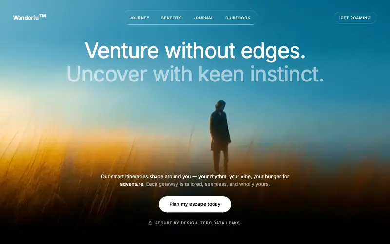
Cinematic travel hero: a full-bleed loop drifting under a GSAP mouse parallax, with a liquid-glass pill navbar and two fade-up copy blocks.
Aurora Weather Dashboard
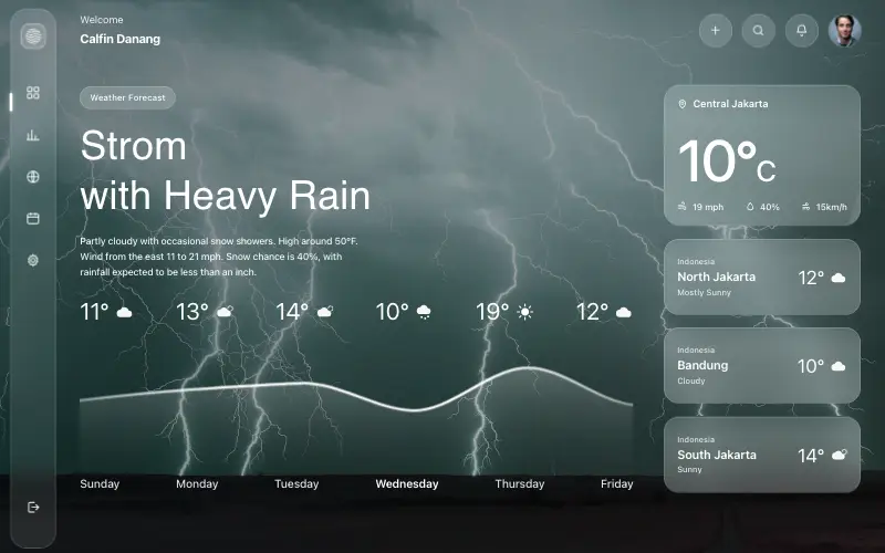
Liquid-glass weather dashboard on a 1357x871 unit grid: frosted panels over a storm photo and a chart that draws itself, then fills.
Fastshot Landing
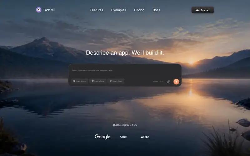
Single-screen AI app-builder landing: full-bleed dawn video, glass composer card and a pixel-specified absolute toolbar.



