Free
🎓 Education
SpaceEdu Planet Hero
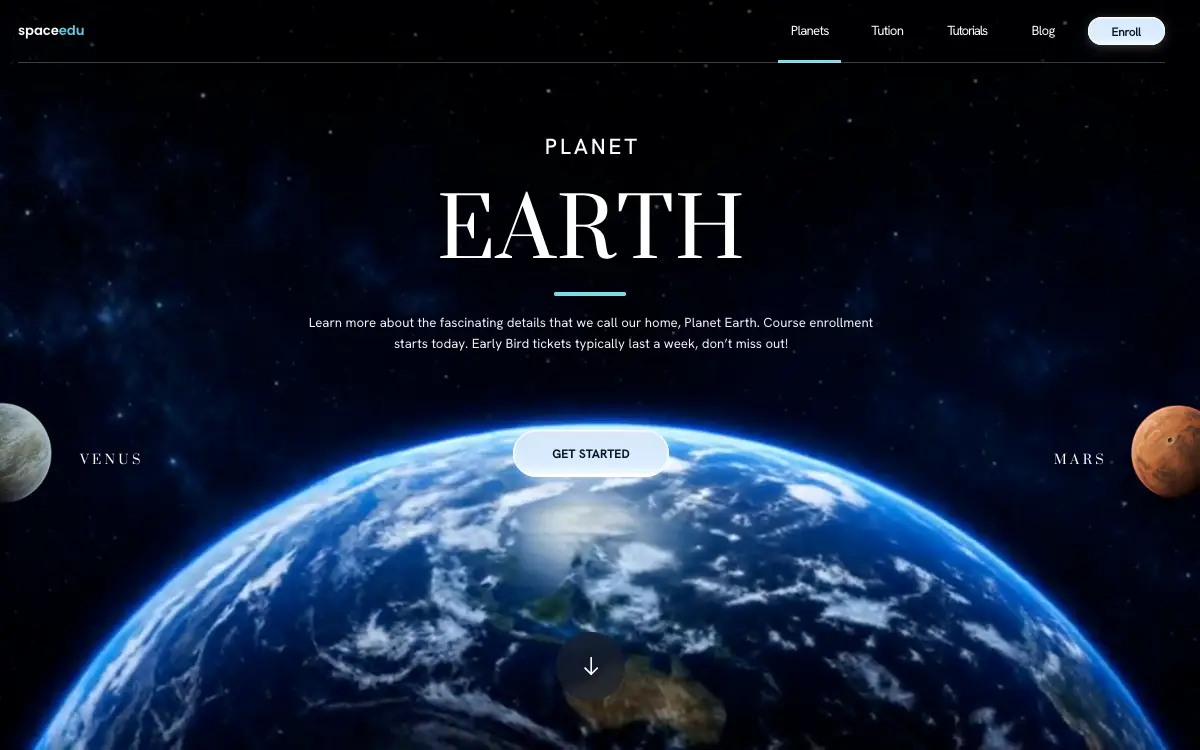
Full-bleed planet loop on a 1353x1163 unit grid: two edge-cropped cut-outs flank the button and swap which world is featured.
5.0k views 70 copies 3.3k kelime
Prompt
# SpaceEdu — Cinematic Planet Hero
Build a single, self-contained HTML file: a full-viewport space-themed hero section for a site called "SpaceEdu". No build step, no frameworks, no external JS. All CSS in one `<style>` block in `<head>`, all JS in one `<script>` block before `</body>`. It must be pixel-faithful to the spec below and fully mobile responsive.
## 1. Concept
A cinematic hero. A looping video of a single planet fills the whole viewport as the background. Centred over it: eyebrow "PLANET", a huge serif planet name, a short cyan rule, a paragraph, and a glossy white pill button. Flanking the button, cropped by the left and right screen edges, sit two transparent planet cut-outs with serif labels.
Three planets exist: EARTH, VENUS, MARS. Exactly one is "featured" (its clip is the background, its name is the headline). The other two occupy the left and right slots. Clicking a side planet makes it featured; the two slots then re-fill with the other two. Earth is featured on load. The rotation is fully reversible.
## 2. Assets — use these exact URLs
Background clips (10s, 16:9, 1276x720, silent, loop):
- EARTH `https://d8j0ntlcm91z4.cloudfront.net/user_38xzZboKViGWJOttwIXH07lWA1P/hf_20260827_202422_3ffb4889-c520-432d-8458-038009eb40df.mp4`
- VENUS `https://d8j0ntlcm91z4.cloudfront.net/user_38xzZboKViGWJOttwIXH07lWA1P/hf_20260827_202422_b211cd74-013b-4dd3-bfd0-64491d8696fa.mp4`
- MARS `https://d8j0ntlcm91z4.cloudfront.net/user_38xzZboKViGWJOttwIXH07lWA1P/hf_20260827_202422_51eae59a-2459-4c84-907c-cc5edfe5fea7.mp4`
Poster / still for each clip (also used as the `.sky` background-image fallback):
- EARTH `https://d8j0ntlcm91z4.cloudfront.net/user_38xzZboKViGWJOttwIXH07lWA1P/hf_20260827_202133_508c64b8-a31e-4290-bdfc-1187df70e0a6.png`
- VENUS `https://d8j0ntlcm91z4.cloudfront.net/user_38xzZboKViGWJOttwIXH07lWA1P/hf_20260827_202133_cf55d1d8-7b59-4a64-80da-d72052ae974e.png`
- MARS `https://d8j0ntlcm91z4.cloudfront.net/user_38xzZboKViGWJOttwIXH07lWA1P/hf_20260827_202133_0ba6de7c-285d-43dc-b7ab-8c54c73707cb.png`
Transparent planet cut-outs, 2048x2048 PNG with alpha (the side-slot artwork):
- EARTH `https://d8j0ntlcm91z4.cloudfront.net/user_38xzZboKViGWJOttwIXH07lWA1P/hf_20260827_202005_3346cc4d-ec3b-44ab-825c-b18e49f5021a.png`
- VENUS `https://d8j0ntlcm91z4.cloudfront.net/user_38xzZboKViGWJOttwIXH07lWA1P/hf_20260827_202012_640b239a-d08a-4200-adb2-741bbe129ac8.png`
- MARS `https://d8j0ntlcm91z4.cloudfront.net/user_38xzZboKViGWJOttwIXH07lWA1P/hf_20260827_202018_3d559490-f613-4ed7-a3bb-3b7e9fc90fb8.png`
Favicon: use the Earth cut-out URL above, `type="image/png"`.
## 3. Fonts — load from Google Fonts
```html
<link rel="preconnect" href="https://fonts.googleapis.com">
<link rel="preconnect" href="https://fonts.gstatic.com" crossorigin>
```
Load: Prata 400; Hanken Grotesk 400,500,600,700; Poppins 500,600.
Stacks:
- `--font-serif` : `'Prata', Georgia, serif`
- `--font-body` : `'Hanken Grotesk', system-ui, -apple-system, 'Segoe UI', sans-serif`
- `--font-logo` : `'Poppins', sans-serif`
Body text uses `--font-body`. Headline and the two planet labels use `--font-serif`. The wordmark uses `--font-logo`.
## 4. Design System — the single most important rule
The layout is NOT built from rem/%/flex guesswork. It is a fixed composition measured from a 1353 x 1163 reference, expressed in ONE custom property `--u` = one design pixel. EVERY length in the file is `calc(N * var(--u))`. Do not substitute px values.
```css
*, *::before, *::after { box-sizing:border-box; margin:0; padding:0 }
:root{
--dw:1353; --dh:1163; --gutter:25;
--u:max(min(.72px, calc(100vh / 700)), min(calc(100vw / 1353), calc(100vh / 1163)));
--dh-px:calc(1163 * var(--u));
--vshift:calc(max(0px, (100vh - var(--dh-px))) * .42);
--ink:#ffffff; --cyan:#79dce8; --cyan-logo:#5fd0e1;
--rule:rgba(255,255,255,.23); --btn-ink:#071227;
}
@supports (height:100dvh){
:root{
--u:max(min(.72px, calc(100dvh / 700)), min(calc(100vw / 1353), calc(100dvh / 1163)));
--vshift:calc(max(0px, (100dvh - var(--dh-px))) * .42);
}
}
html,body{height:100%}
body{background:#04101f; color:var(--ink); font-family:var(--font-body);
-webkit-font-smoothing:antialiased; -moz-osx-font-smoothing:grayscale;
text-rendering:geometricPrecision; overflow:hidden}
```
`--vshift` pushes everything below the nav down on taller-than-design viewports so the composition stays balanced. `--gutter` offsets the content column left by half its value so the optical centre sits at x=664, not 676.
## 5. Markup
```
<div class="stage"> position:fixed; inset:0; overflow:hidden;
isolation:isolate
<div class="sky"> absolute; inset:0; z-index:0;
background-image:url(EARTH STILL);
background-size:cover; background-position:center;
background-repeat:no-repeat
3 x <video data-planet="earth|venus|mars">
Earth: class="is-active" autoplay muted loop playsinline preload="auto"
src=EARTH CLIP poster=EARTH STILL aria-hidden="true"
Venus & Mars: muted loop playsinline preload="none"
data-src=CLIP (NOT src) poster=STILL aria-hidden="true"
</div>
<div class="ui"> absolute; inset:0; z-index:3
<header class="navbar">
<div class="navrow">
<a class="logo" href="#">space<i>edu</i></a>
<nav class="links" id="site-nav">
<a href="#" aria-current="page">Planets</a>
<a href="#">Tution</a> (keep this spelling)
<a href="#">Tutorials</a>
<a href="#">Blog</a>
<a class="enroll" href="#">Enroll</a>
</nav>
<button class="burger" type="button" aria-label="Open navigation"
aria-expanded="false" aria-controls="site-nav">
<span></span><span></span><span></span>
</button>
</div>
</header>
<div class="copy">
<div class="col eyebrow"><span class="ent-mask"><span class="ent-line">PLANET</span></span></div>
<h1 class="col title"><span class="ent-mask"><span class="ent-line">EARTH</span></span></h1>
<div class="col rule"><span></span></div>
<p class="col lede">Learn more about the fascinating details that we call our home,
Planet Earth. Course enrollment <br>starts today. Early Bird tickets typically
last a week, don’t miss out!</p>
<div class="col cta">
<button class="planet planet-l" type="button" data-slot="l">
3 x <img data-planet="earth|venus|mars" alt="" src="CUTOUT URL">
</button>
<button class="planet planet-r" type="button" data-slot="r">
3 x <img data-planet="earth|venus|mars" alt="" src="CUTOUT URL">
</button>
<a href="#">GET STARTED</a>
<span class="label label-l"></span> (empty — filled by script)
<span class="label label-r"></span>
</div>
</div>
</div>
<button class="scroll" type="button" aria-label="Scroll to next section">
<svg viewBox="0 0 26 33" fill="none" aria-hidden="true">
<path d="M13 1.5 V31.5 M1.9 20.4 L13 31.5 L24.1 20.4" stroke="#ffffff"
stroke-width="3" stroke-linecap="square" stroke-linejoin="miter"/>
</svg>
</button>
</div>
```
CRITICAL: all three cut-outs are present in BOTH slots as sibling `<img>` tags. Switching reveals one with a class — it must never reassign `img.src`, or the browser keeps painting the old planet until the new 2048px file downloads.
## 6. CSS — exact values
### Backdrop
```css
.sky video{position:absolute; inset:0; width:100%; height:100%; object-fit:cover;
display:block; opacity:0; transition:opacity .22s linear}
.sky video.is-active{opacity:1}
@media (prefers-reduced-motion:reduce){ .sky video{display:none} }
```
### Side planet slots (two slots, not two planets)
```css
.planet{position:absolute; z-index:-1; padding:0; border:0; background:none;
-webkit-appearance:none; appearance:none; line-height:0; cursor:pointer;
pointer-events:auto; /* .copy disables pointers wholesale */
transition:transform .45s cubic-bezier(.22,1,.36,1)}
.planet img{display:none; width:100%; height:auto}
.planet img.is-shown{display:block}
.planet:hover{transform:scale(1.045)}
.planet:active{transform:scale(.99)}
.planet-l{width:calc(143 * var(--u)); left:calc(-69.5 * var(--u)); top:calc(-38.3 * var(--u))}
.planet-r{width:calc(143 * var(--u)); right:calc(-64.7 * var(--u)); top:calc(-40.6 * var(--u))}
@media (prefers-reduced-motion:reduce){
.planet{transition:none} .planet:hover,.planet:active{transform:none} }
```
(The cut-outs fill ~97% of their square canvas; these box sizes make the rendered sphere 139u across with its centre 2u from the left edge / 6.8u from the right.)
### Layout
```css
.copy{position:absolute; inset:0; transform:translateY(var(--vshift)); pointer-events:none}
.copy a{pointer-events:auto}
.col{position:absolute; left:0; right:calc(var(--gutter) * var(--u)); text-align:center}
```
### Nav
```css
.navbar{position:absolute; top:0; left:0; right:0; z-index:6; height:calc(88 * var(--u))}
.navbar::after{content:""; position:absolute; left:calc(25 * var(--u));
right:calc(49 * var(--u)); top:calc(86 * var(--u)); height:calc(2 * var(--u));
background:var(--rule)}
.navrow{position:absolute; left:calc(25 * var(--u)); right:calc(49 * var(--u)); top:0;
height:calc(86 * var(--u)); display:flex; align-items:center; justify-content:space-between}
.logo{font-family:var(--font-logo); font-weight:600; font-size:calc(18.4 * var(--u));
letter-spacing:calc(-0.15 * var(--u)); line-height:1; color:#fff; text-decoration:none;
white-space:nowrap; position:relative; top:calc(-1 * var(--u))}
.logo i{font-style:normal; color:var(--cyan-logo)}
.burger{display:none; position:relative; width:calc(46 * var(--u)); height:calc(46 * var(--u));
padding:0; border:0; background:none; cursor:pointer; flex-direction:column;
align-items:center; justify-content:center; gap:calc(6 * var(--u)); flex:none}
.burger span{display:block; width:calc(24 * var(--u)); height:calc(2 * var(--u));
border-radius:calc(2 * var(--u)); background:#fff;
transition:transform .28s cubic-bezier(.4,0,.2,1), opacity .18s linear}
.navrow[data-open="true"] .burger span:nth-child(1){transform:translateY(calc(8 * var(--u))) rotate(45deg)}
.navrow[data-open="true"] .burger span:nth-child(2){opacity:0}
.navrow[data-open="true"] .burger span:nth-child(3){transform:translateY(calc(-8 * var(--u))) rotate(-45deg)}
.links{display:flex; align-items:center}
.links a{position:relative; display:flex; align-items:center; height:calc(86 * var(--u));
font-size:calc(18.4 * var(--u)); font-weight:400; line-height:1; color:#fff;
text-decoration:none; padding:0 calc(17.5 * var(--u));
letter-spacing:calc(-1 * var(--u)); white-space:nowrap}
.links a[aria-current="page"]::after{content:""; position:absolute; left:0; right:0;
top:calc(83.5 * var(--u)); height:calc(4 * var(--u)); background:var(--cyan);
border-radius:calc(1 * var(--u))}
.links a:nth-child(3){letter-spacing:calc(-1.75 * var(--u))}
.links a:nth-child(2){margin-left:calc(24 * var(--u))}
.links a:nth-child(3){margin-left:calc(26 * var(--u))}
.links a:nth-child(4){margin-left:calc(27 * var(--u))}
.links a.enroll{margin-left:calc(28.5 * var(--u)); width:calc(107 * var(--u));
height:calc(38 * var(--u)); border-radius:calc(19 * var(--u)); display:flex;
align-items:center; justify-content:center; font-size:calc(17 * var(--u));
font-weight:600; letter-spacing:calc(-0.75 * var(--u)); line-height:1;
color:var(--btn-ink); text-decoration:none; padding-top:calc(2 * var(--u));
background:linear-gradient(180deg,#ffffff 0%,#d8ecfe 9%,#dceefe 72%,#f4f9ff 100%);
box-shadow:0 calc(3 * var(--u)) calc(14 * var(--u)) rgba(255,255,255,.22),
inset 0 0 0 calc(1.5 * var(--u)) rgba(255,255,255,.92);
flex:none}
```
### Hero copy
```css
.eyebrow{top:calc(188.8 * var(--u)); font-size:calc(30.45 * var(--u)); font-weight:500;
line-height:1; letter-spacing:calc(4 * var(--u)); text-indent:calc(4 * var(--u)); color:#fff}
h1.title{top:calc(268 * var(--u)); font-family:var(--font-serif); font-weight:400;
font-size:calc(112.4 * var(--u)); line-height:1; letter-spacing:calc(2 * var(--u));
text-indent:calc(2 * var(--u)); color:#fff}
.rule{top:calc(405.5 * var(--u)); height:calc(5 * var(--u)); font-size:0; line-height:0;
padding-right:calc(2 * var(--u))}
.rule span{display:inline-block; vertical-align:top; width:calc(100 * var(--u));
height:100%; border-radius:calc(2.5 * var(--u)); background:var(--cyan)}
p.lede{top:calc(433.2 * var(--u)); font-size:calc(18.36 * var(--u)); font-weight:400;
line-height:calc(30 * var(--u)); color:rgba(255,255,255,.95)}
```
### CTA row
```css
.cta{top:calc(597 * var(--u)); height:calc(66 * var(--u)); isolation:isolate}
.cta a{display:inline-flex; align-items:center; justify-content:center;
width:calc(216 * var(--u)); height:calc(66 * var(--u)); border-radius:calc(33 * var(--u));
font-size:calc(17 * var(--u)); font-weight:700; letter-spacing:0; text-indent:0;
line-height:1; color:var(--btn-ink); text-decoration:none; padding-top:calc(2 * var(--u));
background:linear-gradient(180deg,#ffffff 0%,#d6e8f8 4%,#d9ecfe 72%,#ffffff 100%);
box-shadow:0 calc(10 * var(--u)) calc(18 * var(--u)) calc(-8 * var(--u)) rgba(255,255,255,.50),
0 0 calc(26 * var(--u)) rgba(255,255,255,.18),
inset 0 0 0 calc(2 * var(--u)) rgba(255,255,255,.9)}
.label{position:absolute; top:calc(33 * var(--u)); font-family:var(--font-serif);
font-weight:400; font-size:calc(17.8 * var(--u)); letter-spacing:calc(4.6 * var(--u));
line-height:1; color:#fff; white-space:nowrap}
.label.label-l{left:calc(111 * var(--u))}
.label.label-r{right:calc(104 * var(--u))}
```
### Scroll control
```css
.scroll{position:absolute; z-index:4; left:50%;
margin-left:calc((-48 - (var(--gutter) / 2)) * var(--u)); bottom:calc(68 * var(--u));
width:calc(96 * var(--u)); height:calc(96 * var(--u)); border-radius:50%;
background:rgba(24,30,42,.70); -webkit-backdrop-filter:blur(calc(6 * var(--u)));
backdrop-filter:blur(calc(6 * var(--u))); border:0; display:flex; align-items:center;
justify-content:center; cursor:pointer}
.scroll svg{width:calc(20 * var(--u)); height:calc(25 * var(--u)); display:block}
```
### Focus
```css
.scroll:focus-visible,.links a:focus-visible,.enroll:focus-visible,
.cta a:focus-visible,.logo:focus-visible{
outline:calc(2 * var(--u)) solid var(--cyan); outline-offset:calc(3 * var(--u))}
.planet:focus-visible{outline:calc(2 * var(--u)) solid var(--cyan);
outline-offset:calc(6 * var(--u)); border-radius:50%}
```
## 7. Responsive — six tiers, in this exact source order
### A) Nav collapse — `@media (max-width:1030px), (max-height:620px)`
Threshold is derived: below ~1030px the desktop labels fall under ~14px with sub-40px touch targets. The SAME `<a>` elements re-compose into a panel — never duplicate markup.
```css
.navrow{left:calc(25 * var(--u)); right:calc(25 * var(--u))}
.burger{display:flex}
.links{position:absolute; top:calc(96 * var(--u)); right:0; z-index:5;
width:min(calc(324 * var(--u)), calc(100vw - 50 * var(--u)));
flex-direction:column; align-items:stretch; padding:calc(12 * var(--u));
border-radius:calc(20 * var(--u)); background:rgba(9,21,42,.84);
backdrop-filter:blur(calc(18 * var(--u)));
border:calc(1 * var(--u)) solid rgba(255,255,255,.14);
box-shadow:0 calc(18 * var(--u)) calc(44 * var(--u)) rgba(2,8,20,.55);
opacity:0; visibility:hidden; transform:translateY(calc(-10 * var(--u)));
transition:opacity .24s ease, transform .28s cubic-bezier(.4,0,.2,1), visibility .28s}
.navrow[data-open="true"] .links{opacity:1; visibility:visible; transform:none}
.links a:nth-child(n){margin-left:0; height:auto; justify-content:flex-start;
padding:calc(14 * var(--u)) calc(16 * var(--u)); font-size:calc(19 * var(--u));
letter-spacing:calc(-.6 * var(--u))}
.links a + a{border-top:calc(1 * var(--u)) solid rgba(255,255,255,.08)}
.links a[aria-current="page"]::after{top:auto; bottom:calc(9 * var(--u));
left:calc(16 * var(--u)); right:auto; width:calc(26 * var(--u)); height:calc(3 * var(--u))}
.links a.enroll{margin:calc(14 * var(--u)) 0 calc(2 * var(--u)); width:100%;
height:calc(46 * var(--u)); border-radius:calc(23 * var(--u)); justify-content:center;
padding-top:calc(2 * var(--u)); font-size:calc(18 * var(--u));
letter-spacing:calc(-.4 * var(--u)); border-top:0}
.links a.enroll::after{content:none}
```
### B) Tablet — `@media (min-width:580px) and (max-width:1030px) and (min-height:621px)`
The hero is a centred symmetric composition — it is re-proportioned, NOT stacked. The flanking planet / button / planet row is the section's signature and must survive.
```css
:root{--gutter:0;
--u:min(max(min(.85px, calc(100vh / 780)), min(calc(100vw / 900), calc(100vh / 1163))), 1.15px);
--dh-px:calc(1120 * var(--u));
--vshift:calc(max(0px, (100vh - var(--dh-px))) * .38)}
/* repeat inside @supports (height:100dvh) with 100dvh */
.navbar::after{left:calc(25 * var(--u)); right:calc(25 * var(--u))}
p.lede br{display:none}
p.lede{max-width:calc(620 * var(--u)); margin-left:auto; margin-right:auto; text-wrap:pretty}
.label.label-r{right:calc(116 * var(--u))}
```
### C) Phone — `@media (max-width:579px), (max-height:620px)`
Below the nav the interface FLOWS (flex column) instead of being absolutely pinned, so it adapts to however many lines the copy wraps onto.
```css
:root{--gutter:0;
--u:max(min(.92px, calc(100vh / 620)), min(calc(100vw / 430), calc(100vh / 880)));
--dh-px:calc(880 * var(--u));
--vshift:calc(max(0px, (100vh - var(--dh-px))) * .34)}
/* repeat inside @supports (height:100dvh) */
.navbar{height:calc(76 * var(--u))}
.navbar::after{left:calc(24 * var(--u)); right:calc(24 * var(--u)); top:calc(74 * var(--u))}
.navrow{left:calc(24 * var(--u)); right:calc(24 * var(--u)); height:calc(74 * var(--u))}
.links{top:calc(84 * var(--u))}
.copy{top:calc(76 * var(--u)); display:flex; flex-direction:column; align-items:center;
padding:calc(56 * var(--u)) calc(26 * var(--u)) 0}
.col{position:static; width:100%; right:auto}
.eyebrow{font-size:calc(20 * var(--u)); letter-spacing:calc(5 * var(--u)); text-indent:calc(5 * var(--u))}
h1.title{font-size:calc(86 * var(--u)); margin-top:calc(15 * var(--u))}
.rule{margin-top:calc(20 * var(--u)); height:calc(5 * var(--u)); padding-right:0}
.rule span{width:calc(84 * var(--u))}
p.lede{margin-top:calc(19 * var(--u)); font-size:calc(15.5 * var(--u));
line-height:calc(26 * var(--u)); max-width:calc(400 * var(--u)); text-wrap:balance}
p.lede br{display:none}
.cta{top:auto; margin-top:calc(32 * var(--u)); height:calc(60 * var(--u)); position:relative}
.cta a{width:calc(190 * var(--u)); height:calc(60 * var(--u)); border-radius:calc(30 * var(--u))}
.label{top:50%; transform:translateY(-50%); font-size:calc(16 * var(--u));
letter-spacing:calc(4 * var(--u))}
.label.label-l{left:calc(56 * var(--u))}
.label.label-r{right:calc(60 * var(--u))}
.planet-l{width:calc(89 * var(--u)); left:calc(-44.5 * var(--u)); top:calc(-17 * var(--u))}
.planet-r{width:calc(89 * var(--u)); right:calc(-44.5 * var(--u)); top:calc(-18.3 * var(--u))}
.scroll{width:calc(74 * var(--u)); height:calc(74 * var(--u));
margin-left:calc(-37 * var(--u)); bottom:calc(49 * var(--u))}
.scroll svg{width:calc(15.5 * var(--u)); height:calc(19.5 * var(--u))}
```
### D) `@media (max-height:660px){ .scroll{display:none} }` — no room for it
### E) Short — `@media (max-height:620px)`
```css
:root{--u:max(min(.85px, calc(100vh / 470)), min(calc(100vw / 640), calc(100vh / 560)));
--dh-px:calc(560 * var(--u)); --vshift:0px}
.copy{padding-top:calc(26 * var(--u))}
h1.title{font-size:calc(64 * var(--u)); margin-top:calc(8 * var(--u))}
.rule{margin-top:calc(12 * var(--u))}
p.lede{margin-top:calc(12 * var(--u))}
.cta{margin-top:calc(20 * var(--u))}
.label{top:50%; transform:translateY(-50%); font-size:calc(15 * var(--u))}
.label.label-l{left:calc(58 * var(--u))}
.label.label-r{right:calc(58 * var(--u))}
```
```css
@media (min-width:821px) and (max-height:660px){ .copy{transform:none} }
```
### F) Narrow phone — `@media (max-width:500px)` — declared LAST so it wins inside tier E
Below ~500px the label / button / label triad can no longer share a line, so the two labels drop to their own band beneath the button, still left- and right-anchored.
```css
.label{top:calc(100% + 34 * var(--u)); transform:none; font-size:calc(15 * var(--u))}
.label.label-l{left:calc(6 * var(--u))}
.label.label-r{right:calc(6 * var(--u))}
```
```css
@media (prefers-reduced-motion:reduce){ .links,.burger span{transition:none} }
```
## 8. Entrance animation — runs once, then deletes itself
Motion language: DRAW hairlines scale from centre · REVEAL type rises out of a mask · RISE copy lifts a short distance · SETTLE pills arrive with a small scale resolve · FADE the full-bleed backdrop resolves in (it fades, never translates — a translate would drag a bare edge into frame).
In `<head>`, BEFORE the stylesheet, a blocking inline script so the opening frame is composed rather than flashing the finished page:
```js
(function(){try{
if(!window.matchMedia||!matchMedia('(prefers-reduced-motion: reduce)').matches){
document.documentElement.classList.add('anim');
}
}catch(e){}})();
```
```css
@keyframes ent-reveal{from{transform:translateY(115%)}to{transform:translateY(0)}}
@keyframes ent-rise{from{opacity:0;transform:translateY(var(--rise,10px))}to{opacity:1;transform:none}}
@keyframes ent-settle{from{opacity:0;transform:translateY(var(--rise,8px)) scale(.965)}to{opacity:1;transform:none}}
@keyframes ent-draw{from{transform:scaleX(0)}to{transform:scaleX(1)}}
@keyframes ent-fade{from{opacity:0}to{opacity:1}}
.anim{--e-expo:cubic-bezier(.16,1,.3,1); --e-quint:cubic-bezier(.22,1,.36,1);
--e-slow:cubic-bezier(.4,0,.2,1)}
.ent-mask,.ent-line{display:block}
.anim .ent-mask{overflow:hidden; padding-top:.18em; margin-top:-.18em}
.anim .ent-line{transform:translateY(115%); will-change:transform}
.anim .navbar::after,.anim .links a[aria-current="page"]::after,.anim .rule span{transform:scaleX(0)}
.anim .logo,.anim .links a,.anim .burger,.anim p.lede,.anim .label,.anim .cta a,
.anim .scroll,.anim .sky{opacity:0}
.anim .sky{will-change:opacity}
```
Sequence (all `both` fill):
| target | keyframes | duration | easing | delay |
| --- | --- | --- | --- | --- |
| `.anim.play .sky` | ent-fade | 1.6s | `--e-slow` | .25s |
| `.anim.play .navbar::after` | ent-draw | .9s | `--e-expo` | .12s |
| `.anim.play .logo` (`--rise` 8u) | ent-rise | .6s | `--e-quint` | .20s |
| `.anim.play .links a` (`--rise` 8u) | ent-rise | .55s | `--e-quint` | nth-child(1) .26s · (2) .31s · (3) .36s · (4) .41s |
| `.anim.play .links a.enroll`, `.burger` (`--rise` 8u) | ent-settle | .6s | `--e-quint` | .46s |
| `.anim.play .links a[aria-current]::after` | ent-draw | .55s | `--e-expo` | .60s |
| `.anim.play .eyebrow .ent-line` | ent-reveal | .75s | `--e-expo` | .30s |
| `.anim.play h1.title .ent-line` | ent-reveal | .95s | `--e-expo` | .44s |
| `.anim.play .rule span` | ent-draw | .65s | `--e-expo` | .78s |
| `.anim.play p.lede` (`--rise` 12u) | ent-rise | .7s | `--e-quint` | .86s |
| `.anim.play .label.label-l` (`--rise` 8u) | ent-rise | .6s | `--e-quint` | 1.04s |
| `.anim.play .label.label-r` (`--rise` 8u) | ent-rise | .6s | `--e-quint` | 1.10s |
| `.anim.play .cta a` (`--rise` 8u) | ent-settle | .7s | `--e-quint` | 1.14s |
| `.anim.play .scroll` | ent-settle | .6s | `--e-quint` | 1.42s |
Driver script: if `<html>` lacks `.anim`, return. Otherwise wait for `document.fonts.ready` (with a 500ms guard timeout so a font stall cannot block the page), then two nested `requestAnimationFrame` calls, then add `.play`. After 2150ms remove BOTH `.anim` and `.play`, leaving the page in its authored static state with no timers or residual transforms.
## 9. Planet switcher — JS behaviour
```js
const ORDER = ['earth','venus','mars'];
```
Per planet store: name (uppercase), cut-out URL, still URL, and lede HTML:
- earth: "Learn more about the fascinating details that we call our home, Planet Earth. Course enrollment `<br>`starts today. Early Bird tickets typically last a week, don’t miss out!"
- venus: "The hottest world in our solar system, wrapped in clouds of sulfuric acid. Course enrollment `<br>`starts today. Early Bird tickets typically last a week, don’t miss out!"
- mars: "The rust-red desert world, home to the tallest volcano we know of. Course enrollment `<br>`starts today. Early Bird tickets typically last a week, don’t miss out!"
`show(next)`:
1. bail if unknown or already featured
2. for each clip: if it is `next` and has no src but has `data-src`, assign src from `data-src` (first-use fetch). Toggle `.is-active` on the matching clip; `.play()` it (catch the rejected promise); `.pause()` every other clip.
3. set `.sky` background-image to that planet's still — keeps reduced-motion users, who never see the clip, on the correct planet
4. set the h1's `.ent-line` textContent to the planet name
5. set `p.lede` innerHTML to that planet's lede
6. rest = ORDER minus `next`; slot L gets rest[0], slot R gets rest[1]. For each slot: toggle `.is-shown` on the img whose `data-planet` matches — DO NOT touch `img.src` — set the button's `data-planet`, set aria-label "Show <NAME>", set the label text.
`warm(planet)`: if that clip has no src but has `data-src`, set `preload='auto'`, assign src, call `load()`. Bind it to `pointerenter` AND `focus` on both buttons so the fetch starts on intent rather than on click. After first paint, `requestIdleCallback(warm all, {timeout:4000})` — fall back to `setTimeout` 2500ms — to pull the remaining clips down.
Bind click on both buttons -> `show(this.dataset.planet)`. Call `show('earth')` once at the end of setup to establish the initial state.
## 10. Burger menu — JS behaviour
`set(open)` writes `navrow.dataset.open`, the button's `aria-expanded`, and its `aria-label` ("Open navigation" / "Close navigation"). Initialise with `set(false)`. Toggle on button click (`stopPropagation`). Close on: a document click outside the menu and button, Escape (then return focus to the button), and any click on a link inside the menu.
## 11. Accessibility
- Side planets are real `<button type="button">` with a dynamic aria-label — keyboard operable, focus-visible ringed in `--cyan`.
- Videos are `aria-hidden="true"`, muted, playsinline (required for iOS autoplay).
- Cut-out `<img>` tags carry `alt=""` — they are decorative; the labels carry the meaning.
- `prefers-reduced-motion`: no entrance sequence at all (the `.anim` class is never added), clips hidden in favour of the still, no planet hover/press transforms, no nav transitions.
- `.copy` spans the whole frame with `pointer-events:none` so it can never swallow nav clicks; only `.copy a` and `.planet` re-enable pointers.
## 12. Acceptance checks
- Loads with EARTH featured, VENUS left, MARS right. Only the Earth clip has a src.
- Clicking a side planet swaps the visible cut-out in the SAME FRAME (measurable at <2ms) — no flash of the previous planet.
- Earth -> Venus -> Mars -> Earth returns to the exact initial state.
- Backdrop crossfades in .22s; headline, lede, both cut-outs and both labels all update together.
- body never scrolls horizontally at any width from 320px to 2560px.
- Entrance runs once; afterwards `<html>` carries neither `.anim` nor `.play`.
## Quality Bar
- Autoplay only survives while the element is genuinely `muted` and `playsInline` — keep both, and keep the `play()` promise in a `catch`; a browser that blocks it still has to leave the page in a coherent state.
- The three cut-outs living in both slots is what makes the swap instant, but it also means six `<img>` elements — two of every planet — decode on load. Ship them at the size they render (143u wide, so ~300px for a 2x display), not the 2048px originals: at full size this markup is 40MB of decoded bitmaps for a 143px sphere.
- Tiers C and E centre the labels with `transform:translateY(-50%)`, and `ent-rise` ends on `transform:none` under a `both` fill — so the fill sits on top of the centring until `.anim`/`.play` come off at 2150ms. Measured at 560px the label lands 8.2px low (half its line box) from the moment its animation ends until the classes are removed. Give those tiers their own keyframe — `from{transform:translateY(calc(-50% + var(--rise)))} to{transform:translateY(-50%)}` — and let tier F, which sets `transform:none` anyway, go back to the plain `ent-rise`.
- `--u` is derived from `100vh` on mobile browsers whose toolbars change what `100vh` means; the `@supports (height:100dvh)` blocks are not optional polish — without them the composition jumps when the address bar collapses.
- Poppins 500 is in the font request and never painted (the wordmark is the only Poppins on the page, at 600). Every unused weight is a file every visitor downloads for nothing — drop it or give it a job.
- White type sits straight on the footage with no scrim. It holds against these three clips, whose centres are dark; re-check the headline, `rgba(255,255,255,.95)` lede and the labels against any replacement video before shipping, and remember the `.scroll` disc is the only element with a background of its own.
- The videos are decoration (`aria-hidden`), so the still is what reduced-motion users see — `show()` must keep `.sky` background-image in sync or they get Earth's sky behind Mars' headline.
- Watch the payload: three 10s clips, three stills and three 2048px cut-outs is easily 60MB of source. Downscale to the rendered size, drop the audio track muted playback never uses, and keep `preload="none"` on the two clips that are not featured — warming them on pointer intent is what makes the swap feel instant without paying for it at load.
- Assets served from someone else's CDN are a dependency, not a licence. Self-host what ships, and keep the fonts self-hosted too if the page must run without third-party requests.
Bunları da beğenebilirsiniz
Free
Featured
Vectrus Energy
🛬 Landing Page
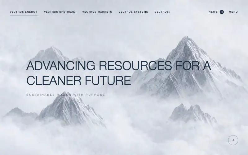
Scroll-tied cinematic section: a 500vh track scrubs an aerial clip frame by frame through a WebCodecs frame bank, with three sequential copy blocks.
4.9k 535CursorClaude CodeLovable
Free
Wanderful
✈️ Travel
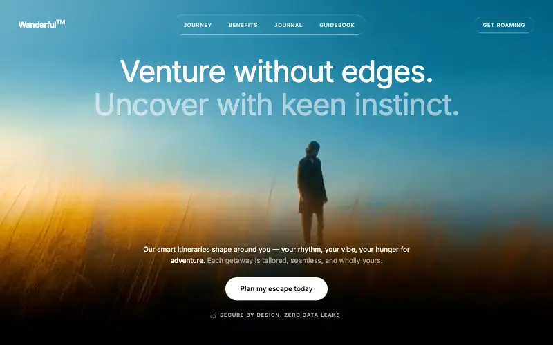
Cinematic travel hero: a full-bleed loop drifting under a GSAP mouse parallax, with a liquid-glass pill navbar and two fade-up copy blocks.
4.8k 445CursorClaude CodeLovable
Free
Featured
Aurora Weather Dashboard
📊 Dashboard
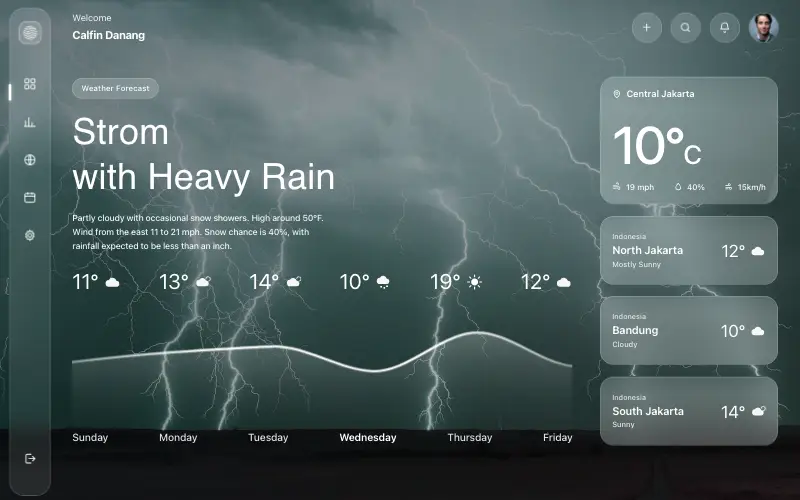
Liquid-glass weather dashboard on a 1357x871 unit grid: frosted panels over a storm photo and a chart that draws itself, then fills.
4.5k 527CursorClaude CodeLovable
Free
Featured
Fastshot Landing
🤖 AI
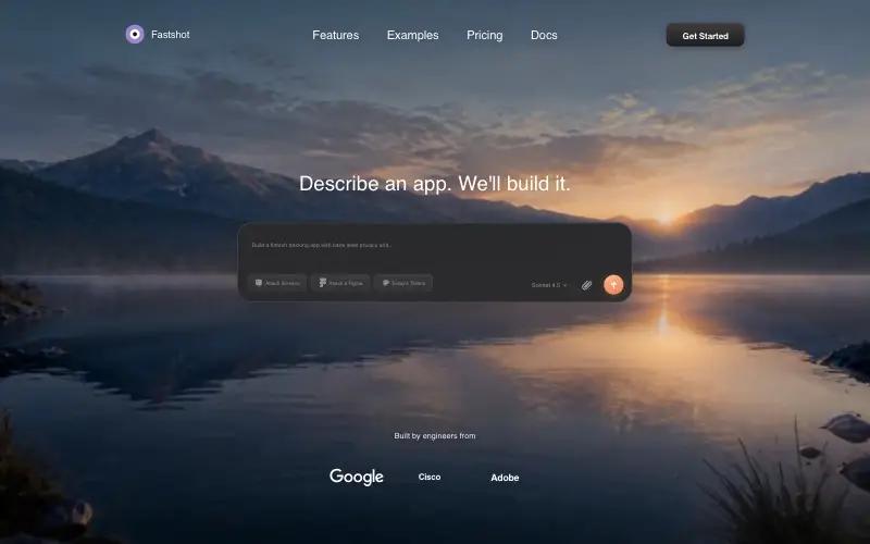
Single-screen AI app-builder landing: full-bleed dawn video, glass composer card and a pixel-specified absolute toolbar.
4.0k 639CursorClaude CodeLovable



