Comparison Table Section
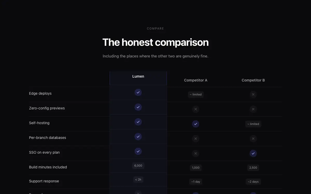
A 'Why us' comparison section: sticky feature column, competitor columns that blur on hover, and animated check reveals.
Nội dung prompt
# Comparison Table Section — Landing Page Section

## Goal
Build a conversion-focused comparison section pitting 'Us' against two competitor columns across 8 feature rows. It must drop cleanly into an existing Next.js + Tailwind project as a self-contained component.

## Design Spec
- Header: small caps eyebrow 'Compare', H2 'The honest comparison', one-line sub — centered, max-w-xl.
- Table: first column (features) sticky on horizontal scroll for mobile; 'Us' column elevated: accent-tinted bg, 1px accent border, rounded-xl standing 8px taller than competitor columns.
- Cells: ✓ in accent circle, ✗ in muted ghost circle, partial support renders as a small '~ limited' text chip — three distinct states, not just check/cross.
- Row hover: the whole row gets a subtle bg tint; competitor columns drop to 60% opacity + 1px blur, sharpening focus on 'Us'.
- Bottom row: CTA cell only under 'Us' — 'Start free' button + 'No credit card' microcopy; competitor columns show a muted dash.

## Motion Spec
- Check icons draw in with a 300ms path animation, staggered 40ms per row when the section enters the viewport.
- The 'Us' column lifts 8px with a spring after the checks finish — choreographed sequence, not simultaneous.
- Row hover blur/opacity transitions 180ms; disabled entirely on touch devices.
- Respect `prefers-reduced-motion` — provide a static fallback that still looks intentional.

## Component API
- `<ComparisonSection us={Column} competitors={Column[]} rows={{feature, values: ('yes'|'no'|'partial'|string)[]}[]} cta={{label, href}} />`
- `Column = { name, logo?: ReactNode }` — cap competitors at 2 for readability, warn in dev if more.

## Quality Bar
- TypeScript strict, zero `any`. Tailwind only — no external CSS files.
- Works on mobile: touch targets ≥ 44px, no hover-only affordances.
- 60fps: animate only `transform` and `opacity`; use `will-change` sparingly.
- Accessible: correct roles/aria, keyboard operable, focus-visible styles.
Có thể bạn cũng thích

Heritage Grove Footer
Full-viewport footer laid straight onto a hand-drawn ink landscape loop — five columns on the paper sky, and below 1100px the clip leaves the background and becomes a flow item under the copy.

Vectrus Energy
Scroll-tied cinematic section: a 500vh track scrubs an aerial clip frame by frame through a WebCodecs frame bank, with three sequential copy blocks.

Figurine Carousel Hero
Full-viewport figurine carousel where background colour, scale, blur and position all crossfade together on one 650ms curve.

Asme
Dark cinematic hero over a looping film whose seam is hand-rolled with 500ms requestAnimationFrame fades: a liquid-glass nav and Login pill, an Instrument Serif headline, a glass email bar and three glass social buttons.



