Free
📊 Dashboard
File Dropzone Uploader
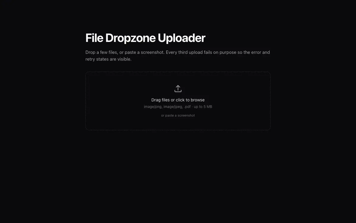
Drag-and-drop upload component with paste support, per-file progress rings, retry states and image previews.
10 views 0 copies 321 词
Prompt 正文
# File Dropzone Uploader — UI Component

## Goal
Build a production-grade file uploader: dropzone + file list with progress, previews, retry and remove — upload transport injected via props. It must drop cleanly into an existing Next.js + Tailwind project as a self-contained component.

## Design Spec
- Dropzone: dashed 1.5px border rounded-xl, centered upload icon + 'Drag files or click to browse' + accepted-types hint; drag-over state: border turns accent, bg tints, icon scales 1.1.
- Also accepts paste (Cmd/Ctrl+V screenshots) — show a tiny 'or paste' hint that pulses once on mount.
- File rows: 44px height — type icon or 32px image thumb, name (truncate middle, keep extension), size, then status zone right: progress ring 20px → ✓ on done, or error state with 'Retry' text button.
- Progress ring: SVG circle with round linecap, percentage not shown under 100px width; indeterminate spin state before the server responds.
- Errors: row gets a rose left border 2px + one-line reason under the name (too large / wrong type / network) — never a toast.

## Motion Spec
- New rows enter with height auto-animate + fade (120ms stagger for multi-drop); removed rows collapse smoothly.
- Ring progress animates via stroke-dashoffset; on completion the ring morphs to a checkmark with a small pop.
- Drag-over pulse: a soft radial highlight follows the cursor inside the dropzone (transform only).
- Respect `prefers-reduced-motion` — provide a static fallback that still looks intentional.

## Component API
- `<Dropzone accept={string[]} maxSizeMb maxFiles onUpload={(file, onProgress)=>Promise<{url}>} onComplete? onRemove? />` — component owns UI state, caller owns transport.
- Expose an imperative `retry(fileId)` via ref; validate size/type client-side before calling onUpload.

## Quality Bar
- TypeScript strict, zero `any`. Tailwind only — no external CSS files.
- Works on mobile: touch targets ≥ 44px, no hover-only affordances.
- 60fps: animate only `transform` and `opacity`; use `will-change` sparingly.
- Accessible: correct roles/aria, keyboard operable, focus-visible styles.
你可能还喜欢
Free
Featured
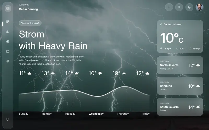
Aurora Weather Dashboard
📊 Dashboard
Liquid-glass weather dashboard on a 1357x871 unit grid: frosted panels over a storm photo and a chart that draws itself, then fills.
4.5k 527CursorClaude CodeLovable

Free
Magnetic CTA Cluster
✨ Creative
Buttons that pull toward the cursor within a radius, with the label lagging behind the shell for weight.
3.9k 710CursorClaude CodeLovable
Premium
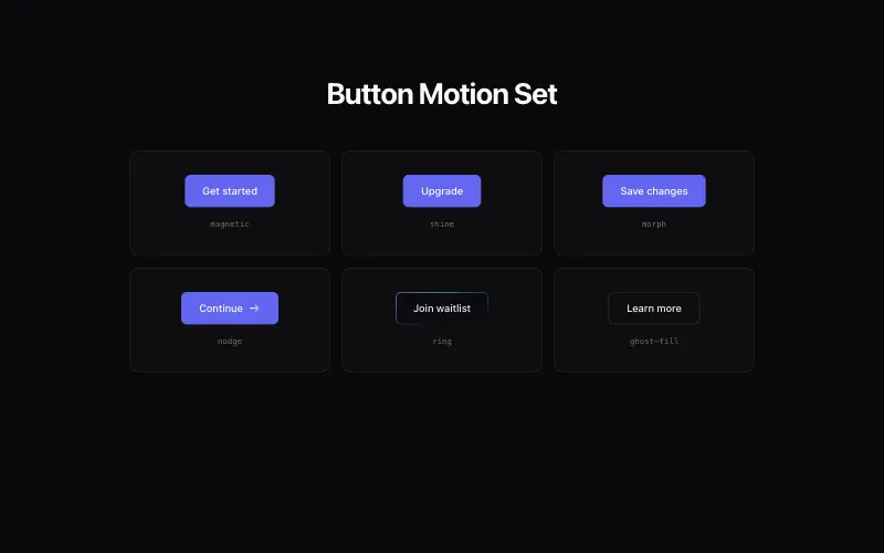
Button Motion Set
🛬 Landing Page
A cohesive set of 6 animated buttons: magnetic, shine-sweep, morph-to-loader, icon-nudge, gradient-ring, ghost-fill.
3.5k 371CursorClaude CodeLovable
Free
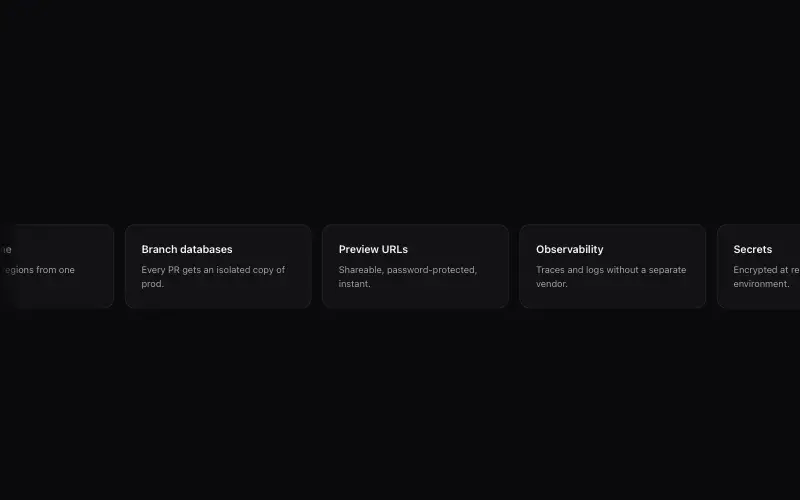
Marquee Carousel Strip
✨ Creative
Infinite marquee that doubles as a draggable carousel — seamless loop, drag to scrub, snap to card.
1.2k 232CursorClaude CodeLovable



