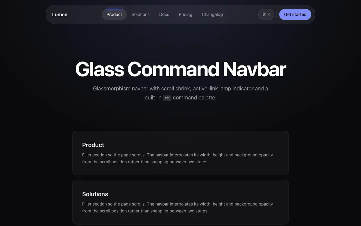
Glass Command Navbar
Glassmorphism navbar with scroll shrink, active-link lamp indicator and a built-in ⌘K command palette stub.
El prompt
# Glass Command Navbar — UI Component

## Goal
Build a premium glass navbar: blur shell, lamp-style active indicator, scroll behavior, mobile overlay, and a ⌘K palette stub. It must drop cleanly into an existing Next.js + Tailwind project as a self-contained component.

## Design Spec
- Shell: fixed top, inner container rounded-full mt-4 px-2 with bg-white/[0.06] backdrop-blur-xl border-white/[0.1] — floating pill style, not full-width bar.
- Links: 5 items px-4 py-2; active link gets a 'lamp': a pill highlight behind it plus a 2px glow line on top edge — the highlight is one shared element th
Desbloquea el prompt completo de 289 palabras con el acceso de por vida de pago único.
Unlock Full PromptTambién te puede interesar
Signal
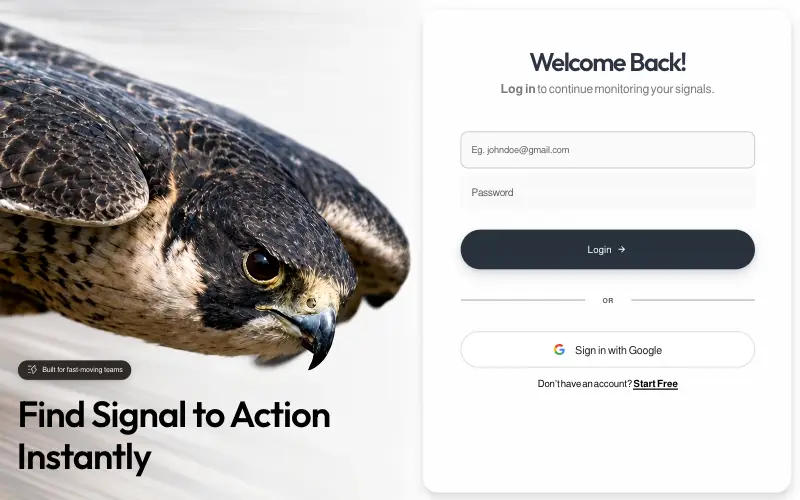
Pixel-locked single-file login page: a looping peregrine-falcon dive beside a frosted card, with embedded fonts, a JS layout engine that switches between desktop, tablet-portrait and phone compositions, and a once-only WAAPI entrance.
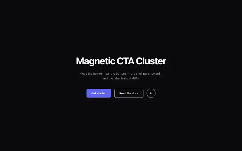
Magnetic CTA Cluster
Buttons that pull toward the cursor within a radius, with the label lagging behind the shell for weight.

LinkFlow
Full-bleed hero whose clip is captured frame by frame and replayed forward-then-reverse on canvas, under a frosted pill nav, a two-tone green headline and a slide-in mobile drawer built entirely from CSS transitions.

Vesper.ai
Single-viewport AI-infrastructure landing on pure black: a liquid-metal pill nav, a serif-italic mixed headline over a full-bleed hero still, and three stats locked to the bottom of one non-scrolling frame.



