RIVR
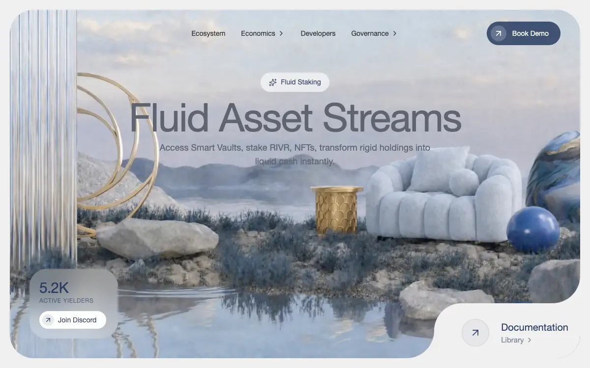
DeFi dashboard hero as an inset rounded video card: a centred glass nav, a Sparkles badge over an 80px slate headline, a frosted stats card and a faux-cutout documentation corner built from two inverse-radius SVGs.
O prompt
# RIVR — Glassmorphic DeFi Dashboard Hero

Build the hero section for a DeFi dashboard called **RIVR**. The whole page is one screen: a rounded video card inset from the viewport edge, with a centred nav, a badge and headline floating over it, a frosted stats card at one corner, and a documentation panel that appears to be cut out of the opposite corner.

Match these specifications exactly — same class strings, same hex and rgba values, same copy, same video URL. Do not add sections, gradients, scrims, or overlays.

## 1. Dependencies

- **Vite + React + TypeScript + Tailwind CSS**
- **`lucide-react`** for icons — `ArrowUpRight`, `ChevronRight`, `Sparkles`
- **`motion`** (imported from `'motion/react'`) for animations

## 2. Global styles — `src/index.css`

```css
@import "tailwindcss";

@font-face {
    font-family: "Helvetica Regular";
    src: url("https://db.onlinewebfonts.com/t/a64ff11d2c24584c767f6257e880dc65.eot");
    src: url("https://db.onlinewebfonts.com/t/a64ff11d2c24584c767f6257e880dc65.eot?#iefix")format("embedded-opentype"),
    url("https://db.onlinewebfonts.com/t/a64ff11d2c24584c767f6257e880dc65.woff2")format("woff2"),
    url("https://db.onlinewebfonts.com/t/a64ff11d2c24584c767f6257e880dc65.woff")format("woff"),
    url("https://db.onlinewebfonts.com/t/a64ff11d2c24584c767f6257e880dc65.ttf")format("truetype"),
    url("https://db.onlinewebfonts.com/t/a64ff11d2c24584c767f6257e880dc65.svg#Helvetica Regular")format("svg");
}

@theme {
  --font-helvetica: "Helvetica Regular", ui-sans-serif, system-ui, sans-serif;
}

:root {
  font-family: var(--font-helvetica);
}

body {
  margin: 0;
  overflow-x: hidden;
  background-color: #f0f0f0;
}
```

## 3. App — `src/App.tsx`

A single `<main className="min-h-screen bg-[#f0f0f0]">` returning `<Hero />`.

## 4. Hero — `src/components/Hero.tsx`

Outer wrapper: `<div className="w-full h-screen flex items-center justify-center p-3 md:p-5 bg-[#f0f0f0]">`

Inner container: `<section className="relative w-full max-w-[1536px] h-full rounded-[1.5rem] md:rounded-[3rem] overflow-hidden shadow-none flex flex-col items-center bg-white/10 group">`

**Video background** — a `<video>` with `autoPlay muted loop playsInline`, classes `absolute inset-0 w-full h-full object-cover object-[65%] lg:object-center z-0`, source exactly:

```
https://d8j0ntlcm91z4.cloudfront.net/user_38xzZboKViGWJOttwIXH07lWA1P/hf_20260428_193507_4286c423-2fd9-4efd-92bd-91a939453fc1.mp4
```

The clip is a pale, high-key surreal tableau: a lavender-grey sky over misty ridges, a boucle armchair, gold rings and a gold side table, a deep blue sphere, all reflected in still water. Almost every value in it is light.

**Content layer** — `<div className="relative z-10 w-full h-full flex flex-col items-center">` holding `<Navbar />`, the text container, `<BottomLeftCard />` and `<BottomRightCorner />`.

**Text container** — `<div className="w-full flex flex-col items-center pt-8 px-6 text-center max-w-4xl">` holding:

- `<HeroBadge />`
- `<motion.h1>` — `text-4xl sm:text-5xl md:text-6xl lg:text-[80px] font-normal text-[#5E6470] mb-2 tracking-tight leading-[1.05]`, text **Fluid Asset Streams**, `initial={{ opacity: 0, scale: 0.98 }}`, `animate={{ opacity: 1, scale: 1 }}`, `transition={{ duration: 0.8, delay: 0.2 }}`
- `<motion.p>` — `text-sm sm:text-base md:text-lg text-[#5E6470] opacity-80 leading-relaxed max-w-xl font-normal`, text **Access Smart Vaults, stake RIVR, NFTs, transform rigid holdings into liquid cash instantly.**, `initial={{ opacity: 0 }}`, `animate={{ opacity: 1 }}`, `transition={{ duration: 0.8, delay: 0.4 }}`

## 5. Navbar — `src/components/Navbar.tsx`

`<nav className="flex items-center justify-between py-6 px-6 md:px-10 w-full relative z-10">`

- Left spacer for centring: `<div className="flex-1 hidden md:block" />`
- Centre menu: `<ul className="hidden md:flex items-center gap-8 text-[rgb(45,45,45)] font-normal text-sm">` with **Ecosystem**, **Economics** (hasDropdown), **Developers**, **Governance** (hasDropdown). Each item: `cursor-pointer hover:opacity-70 transition-opacity flex items-center gap-1 group`, and when `hasDropdown` append `<ChevronRight className="w-4 h-4 transition-transform group-hover:translate-x-0.5" />`
- Mobile logo: `<div className="md:hidden"><span className="font-regular tracking-tighter text-xl text-[rgba(30,50,90,0.9)]">RIVR</span></div>`
- Right: `<div className="flex-1 flex justify-end">` wrapping a `<motion.button whileHover={{ scale: 1.02 }} whileTap={{ scale: 0.98 }}>` with classes `flex items-center bg-[rgba(30,50,90,0.8)] text-white rounded-full pl-2 pr-4 md:pr-6 py-1.5 md:py-2 gap-2 md:gap-3 hover:bg-[rgba(30,50,90,1)] transition-colors group`, containing `<div className="bg-white/20 p-1 md:p-1.5 rounded-full flex items-center justify-center">` with `ArrowUpRight` (`w-4 h-4 md:w-5 md:h-5 text-white`), then **Book Demo** (`text-xs md:text-sm font-normal`)

## 6. HeroBadge — `src/components/HeroBadge.tsx`

`<motion.div>` with `initial={{ opacity: 0, y: 20 }}`, `animate={{ opacity: 1, y: 0 }}`, `transition={{ duration: 0.6, ease: "easeOut" }}`, classes `flex items-center gap-2 px-4 py-2 rounded-full bg-white/60 backdrop-blur-md border border-white/20 mx-auto mb-3 w-fit`.

Contents: `<Sparkles className="w-4 h-4 text-[rgba(30,50,90,0.8)]" />` and `<span className="text-[14px] font-normal text-[rgba(30,50,90,0.9)]">Fluid Staking</span>`.

## 7. BottomLeftCard — `src/components/BottomLeftCard.tsx`

`<motion.div>` with `initial={{ x: -20, opacity: 0 }}`, `animate={{ x: 0, opacity: 1 }}`, `transition={{ duration: 0.8, delay: 0.2 }}`, classes:

```
absolute bottom-28 right-4 left-auto md:left-6 md:right-auto md:bottom-6 lg:bottom-10 lg:left-10 p-3 md:p-4 lg:p-5 rounded-[1.2rem] md:rounded-[1.5rem] lg:rounded-[2.2rem] bg-white/30 backdrop-blur-xl flex flex-col gap-2 lg:gap-3 min-w-[140px] md:min-w-[150px] lg:min-w-[180px] w-fit
```

- Text block: **5.2K** (`text-2xl md:text-3xl font-normal text-[rgba(30,50,90,0.9)] tracking-tight`) over **Active Yielders** (`text-[10px] md:text-[12px] font-normal text-[rgba(30,50,90,0.6)] uppercase tracking-wider`)
- **Join Discord** `<motion.button>` (`whileHover` 1.02 / `whileTap` 0.98), classes `flex items-center bg-white rounded-full pl-1.5 pr-5 py-1.5 gap-2 hover:bg-white/90 transition-colors self-start group`, containing `ArrowUpRight` wrapped in `<div className="bg-[rgba(30,50,90,0.1)] p-1 rounded-full flex items-center justify-center">` (icon `text-[rgba(30,50,90,0.9)]`) then the label (`text-[14px] font-normal text-[rgba(30,50,90,0.9)]`)

## 8. BottomRightCorner — `src/components/BottomRightCorner.tsx`

A faux-cutout: the panel is painted the same `#f0f0f0` as the page, its top-left corner is rounded, and two inverse-radius SVGs fill the square notches where it meets the video card's edges — so it reads as a piece bitten out of the card.

`<motion.div>` with `initial={{ y: 20, opacity: 0 }}`, `animate={{ y: 0, opacity: 1 }}`, `transition={{ duration: 0.8, delay: 0.4 }}`, classes:

```
absolute bottom-0 right-0 p-3 pt-5 pl-8 sm:p-4 sm:pt-6 sm:pl-10 md:p-6 md:pt-8 md:pl-14 bg-[#f0f0f0] rounded-tl-[1.5rem] sm:rounded-tl-[2rem] md:rounded-tl-[3.5rem] flex items-center gap-3 sm:gap-4 md:gap-6
```

Both masks are required:

```jsx
<div className="absolute -top-[1.5rem] sm:-top-[2rem] md:-top-[3.5rem] right-0 w-[1.5rem] sm:w-[2rem] md:w-[3.5rem] h-[1.5rem] sm:h-[2rem] md:h-[3.5rem] pointer-events-none">
  <svg width="100%" height="100%" viewBox="0 0 56 56" fill="none" xmlns="http://www.w3.org/2000/svg"><path d="M56 56V0C56 30.9279 30.9279 56 0 56H56Z" fill="#f0f0f0"/></svg>
</div>
<div className="absolute bottom-0 -left-[1.5rem] sm:-left-[2rem] md:-left-[3.5rem] w-[1.5rem] sm:w-[2rem] md:w-[3.5rem] h-[1.5rem] sm:h-[2rem] md:h-[3.5rem] pointer-events-none">
  <svg width="100%" height="100%" viewBox="0 0 56 56" fill="none" xmlns="http://www.w3.org/2000/svg"><path d="M56 56H0C30.9279 56 56 30.9279 56 0V56Z" fill="#f0f0f0"/></svg>
</div>
```

Content:

- Circle icon: `<div className="bg-[rgba(30,50,90,0.05)] w-10 h-10 md:w-14 md:h-14 rounded-full flex items-center justify-center border border-[rgba(30,50,90,0.1)]">` with `ArrowUpRight` (`text-[rgba(30,50,90,0.8)]`)
- Info column: **Documentation** (`text-[16px] md:text-[20px] font-normal text-[rgba(30,50,90,0.95)]`), and below it `<div className="flex items-center gap-1 text-[rgba(30,50,90,0.6)] cursor-pointer hover:text-[rgba(30,50,90,0.8)] transition-colors">` holding **Library** (`text-[12px] md:text-[15px] font-normal`) and a `ChevronRight`

## Deliver

A working Vite + React + TS app with `src/App.tsx`, `src/index.css`, and the five components above. `lucide-react` and `motion` installed. Pixel-faithful to the spec.

## Quality Bar

- **`#5E6470` never clears the contrast threshold on this footage, and it carries the headline and the only sentence on the page.** Measured against all 193 frames at 1440×900: the 18px subtext, at the specified 80% opacity, has a worst case of **2.00:1** and **100% of its band below 4.5:1 — in every single frame**. There is no bad-luck moment here; it is never legible enough. The 80px H1 fares better but still puts **17.98%** of its band under the 3:1 large-text threshold, worst case 2.69:1. The clip is uniformly pale, and `#5E6470` is a mid-grey, so it is the wrong side of every value in the frame. The page already contains the fix twice over: the nav's `rgb(45,45,45)` measures **8.28:1** at its worst, and the badge — the same ink on a `bg-white/60` pill — measures **7.91:1**. Either darken the type or put it on a surface.
- **`opacity-80` on the subtext is overwritten by its own animation.** The `<p>` carries the class *and* animates `opacity` 0 → 1. Motion writes the value inline (verified: the element's initial style is `opacity: 0`), and an inline style beats a class, so once the animation settles the paragraph renders at 100%, not 80%. Whichever you meant, say it once — animate to `0.8`, or drop the class.
- **Every visible thing on the content layer starts at `opacity: 0` and only JavaScript brings it back.** The badge, the H1, the paragraph and both corner panels are all `motion` elements with zero-opacity initial states. If the bundle fails, or the animation engine never gets a frame, the page renders as an empty video card with a nav bar and nothing else — verified by loading it with the animation loop stalled. Give the content a CSS resting state and let motion enhance it, rather than making the copy conditional on a successful hydration.
- **A 4K source for a box that is never wider than 1536px.** The clip is 3828×2164, H.264, 24fps, 8.04s, 10,911,314 bytes. The container is `max-w-[1536px]`, and at 1440×900 the painted video box measures 1400×860, sampling at most 1521.8px across — so the browser decodes a 4K frame to throw away roughly 60% of it, on every device including phones rendering a 360px-wide card. Re-encoded to 1536×868 the same clip is **731,806 bytes, 6.7% of the original**. There is also no `poster`, so the first paint is the bare `#f0f0f0`.
- **The font is Helvetica itself, hotlinked from a third-party mirror.** The woff2 at that URL has a name table reading family `Helvetica`, subfamily `Regular`, version `19: 14459: 1999` — this is the Linotype typeface, and `db.onlinewebfonts.com` is not its licensor. A hotlink is not a licence. Separately, the `@font-face` sets no `font-display`, so slow connections get a blank-text FOIT on a page whose entire content is text; and the `.eot` and `.svg` sources target IE8 and iOS ≤4.2, both of which have been dead for a decade.
- **`font-regular` is not a Tailwind class.** The mobile wordmark uses it; only `font-normal` exists (verified against the Tailwind CLI — `font-normal` and `shadow-none` are emitted, `font-regular` is not). It silently inherits 400 from `:root`, which is what was wanted, but the class is doing nothing.
- **Only two things on this page can be reached by a keyboard.** Enumerated from the rendered DOM: `Book Demo` and `Join Discord`, both real `<button>`s. The four nav items are `<li>` elements with `cursor-pointer`, and the `Documentation` / `Library` row is a `<div>` with `cursor-pointer` — five controls that look and hover like buttons and cannot be tabbed to or activated. Make them `<button>` or `<a>`. And with `hover:` states specified throughout and no `:focus-visible` rule anywhere, even the two real buttons show nothing when focused.
- **`ChevronRight` is the wrong affordance for `hasDropdown`, and there is no dropdown.** A right-pointing chevron that nudges further right on hover reads as "go", not "expand"; the convention is a down chevron. Neither item opens anything, and neither carries `aria-haspopup` or `aria-expanded`.
- **`BottomLeftCard` is on the right for every viewport below `md`.** `bottom-28 right-4 left-auto` puts it bottom-right, and only `md:left-6 md:right-auto` moves it across. Measured at 390×844, the card occupies x 201.7–362 of a 390px viewport — the right half. The name describes the desktop case only, which is the minority of traffic for a page like this.
- **Three of the four `group` classes have no consumer.** Only the nav `<li>` uses one, driving the chevron's `group-hover:translate-x-0.5`. The `<section>`, the Book Demo button and the Join Discord button each declare `group` with no `group-*` utility anywhere inside them.
- **`shadow-none` and `bg-white/10` on the `<section>` are both inert.** `shadow-none` removes a shadow nothing applied, and the white wash sits underneath a `w-full h-full object-cover` video at `z-0` — it can only ever be seen in the gap before the first frame decodes, which is exactly the gap that has no `poster` to fill it.
- **`h-screen` resolves to the large viewport on mobile Safari.** The card is sized to the height measured with the toolbar retracted, and the document is exactly one viewport tall (measured at 390×844: `scrollHeight - innerHeight` is 0), so with the toolbar out the documentation corner is below the fold with nothing to scroll. Use `svh` or `dvh`.
- **There is no `prefers-reduced-motion` branch.** Five entrance animations plus two `whileHover` scales plus a permanently looping fullscreen video. `motion` will not opt out on its own — read `useReducedMotion()` and skip the initial states, and pause the video, which no CSS can do for you.
- **The CSS is Tailwind v4 and nothing else in the spec says so.** `@import "tailwindcss"` and `@theme` are v4-only syntax, which pins the project's tooling; a v3 setup needs the token in `theme.extend` and the `:root`/`body` rules in a base layer instead. Note also that `@theme` generates a `font-helvetica` utility the design never uses — the family is applied by inheritance from `:root`.
Você também pode gostar
Heritage Grove Footer
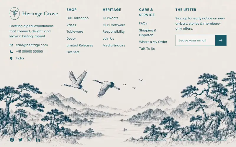
Full-viewport footer laid straight onto a hand-drawn ink landscape loop — five columns on the paper sky, and below 1100px the clip leaves the background and becomes a flow item under the copy.

Figurine Carousel Hero
Full-viewport figurine carousel where background colour, scale, blur and position all crossfade together on one 650ms curve.

Asme
Dark cinematic hero over a looping film whose seam is hand-rolled with 500ms requestAnimationFrame fades: a liquid-glass nav and Login pill, an Instrument Serif headline, a glass email bar and three glass social buttons.
Augment Reveal Hero
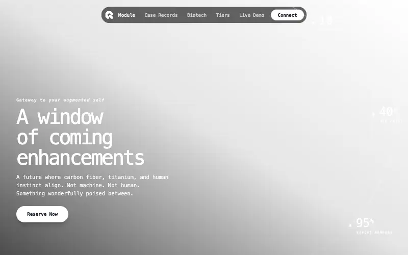
Cyberpunk hero where a cursor spotlight reveals the augmented version of the portrait, with stats drawn on fading circular arcs.



