Team Grid Section
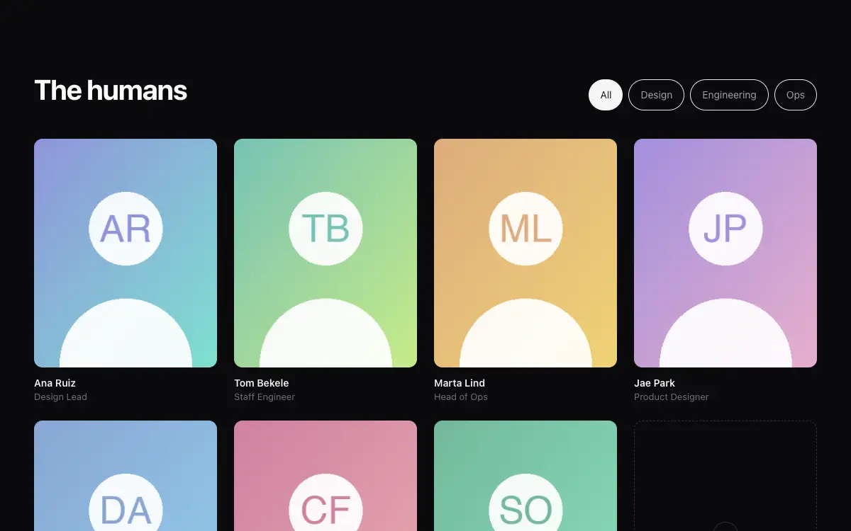
Team section with portrait cards, role filters, playful hover states and an open-roles card at the end.
The Prompt
# Team Grid — About Page Section

## Goal
Build a team section: heading, role filter pills, responsive portrait grid, and a final 'join us' card. It must drop cleanly into an existing Next.js + Tailwind project as a self-contained component.

## Design Spec
- Header row: 'The humans' headline left; filter pills right (All / Design / Engineering / Ops) — active pill solid, others ghost.
- Cards (4-col → 2 → 1): portrait 4:5 rounded-xl grayscale-[0.3], name semibold, role muted 13px, tiny social icon pair appearing on hover.
- Hover: portrait desaturation lifts to full color + scale 1.03; a hand-written style tag rotates in at a corner (pre-made per person, e.g. 'ships fast', 'plant parent') — personality without silliness overload.
- Last card: dashed border, plus icon, 'This could be you — 4 open roles' linking to careers.
- Filter transition: non-matching cards animate out (scale 0.95 + fade), grid reflows with layout animation.

## Motion Spec
- Grid uses FLIP/layout animations on filter change — cards glide to new positions, 350ms.
- Initial reveal: rows stagger 80ms.
- Corner tag springs in with slight overshoot rotation (−8°→3°→0°).
- Respect `prefers-reduced-motion` — provide a static fallback that still looks intentional.

## Component API
- `<TeamGrid people={Person[]} roles={string[]} />`; `Person = { name, role, dept, img, tag?, socials? }`

## Quality Bar
- TypeScript strict, zero `any`. Tailwind only — no external CSS files.
- Works on mobile: touch targets ≥ 44px, no hover-only affordances.
- 60fps: animate only `transform` and `opacity`; use `will-change` sparingly.
- Accessible: correct roles/aria, keyboard operable, focus-visible styles.
You may also like
Heritage Grove Footer
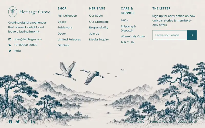
Full-viewport footer laid straight onto a hand-drawn ink landscape loop — five columns on the paper sky, and below 1100px the clip leaves the background and becomes a flow item under the copy.
Nexeus
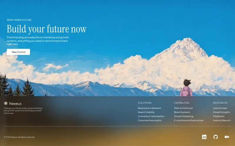
Pixel-exact single-file agency landing over a looping painted alpine film: a 1600×780 unit artboard with an Instrument Serif hero, a warm frosted-glass footer with three link columns, aspect-ratio scrims, a stacked portrait layout and a once-only Web Animations entrance.

Figurine Carousel Hero
Full-viewport figurine carousel where background colour, scale, blur and position all crossfade together on one 650ms curve.
Asme
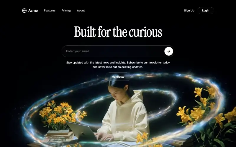
Dark cinematic hero over a looping film whose seam is hand-rolled with 500ms requestAnimationFrame fades: a liquid-glass nav and Login pill, an Instrument Serif headline, a glass email bar and three glass social buttons.



