Premium
🎨 Portfolio
Arcline Atelier
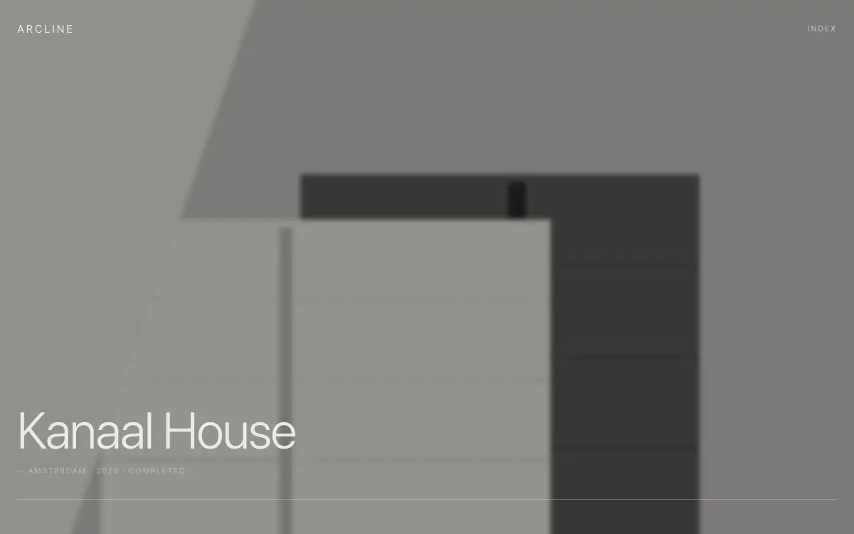
Architecture studio portfolio with strict grid, oversized project imagery and drawing-style line animations.
4.9k views 514 copies 407 words
The Prompt
# Arcline — Architecture Studio Portfolio

## Goal
Build a production-ready architecture studio portfolio called "Arcline". Overall vibe: precise, monumental, quiet — buildings speak, the site whispers. It should look hand-crafted by a senior product designer — not like a generic template.

## Design System
- **Palette**: charcoal #141414 base, bone #EDEAE4 text, no accent color — hierarchy through scale and weight only
- **Typography**: neutral grotesque, display 72px light (300), labels 11px uppercase 0.12em tracking, architectural feel
- **Grid & spacing**: 12-col grid, 8px base unit. Deskt
Unlock the full 407-word prompt with one-time Lifetime access.
Unlock Full PromptYou may also like
Free
Featured
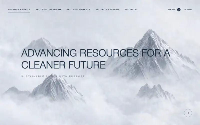
Vectrus Energy
🛬 Landing Page
Scroll-tied cinematic section: a 500vh track scrubs an aerial clip frame by frame through a WebCodecs frame bank, with three sequential copy blocks.
4.9k 535CursorClaude CodeLovable
Free
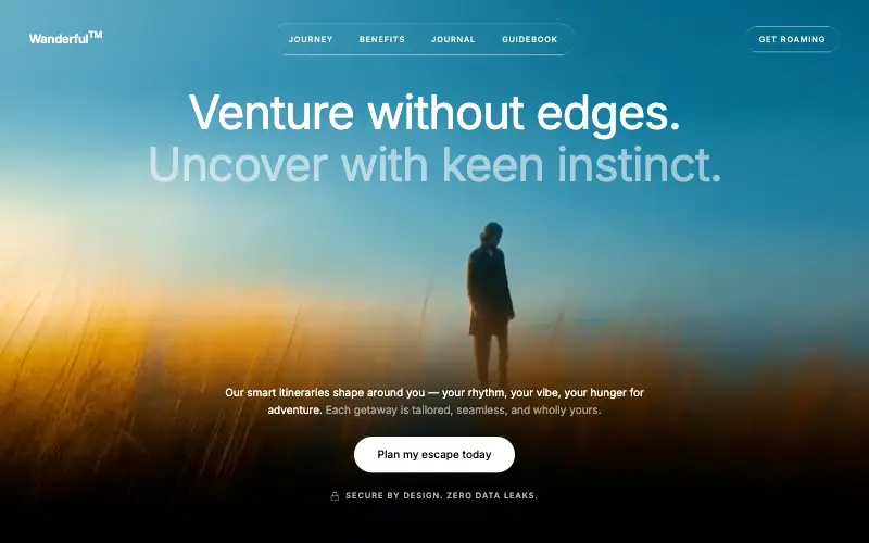
Wanderful
✈️ Travel
Cinematic travel hero: a full-bleed loop drifting under a GSAP mouse parallax, with a liquid-glass pill navbar and two fade-up copy blocks.
4.8k 445CursorClaude CodeLovable
Free
Featured
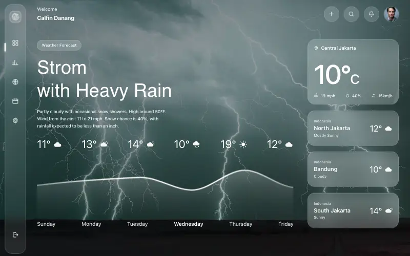
Aurora Weather Dashboard
📊 Dashboard
Liquid-glass weather dashboard on a 1357x871 unit grid: frosted panels over a storm photo and a chart that draws itself, then fills.
4.5k 527CursorClaude CodeLovable
Free
Featured
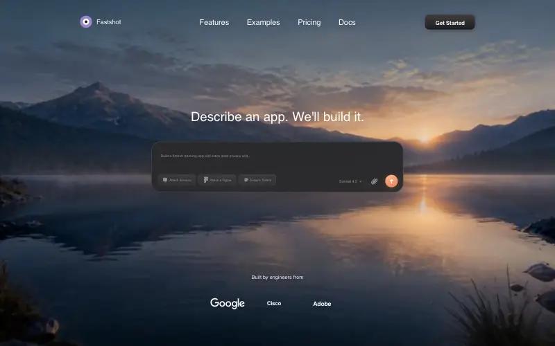
Fastshot Landing
🤖 AI
Single-screen AI app-builder landing: full-bleed dawn video, glass composer card and a pixel-specified absolute toolbar.
4.0k 639CursorClaude CodeLovable



