Premium
⛓️ Web3
Blockmesh Protocol
Web3 protocol site with isometric node-network hero, docs-first IA and restrained institutional styling.
1.6k views 646 copies 423 words
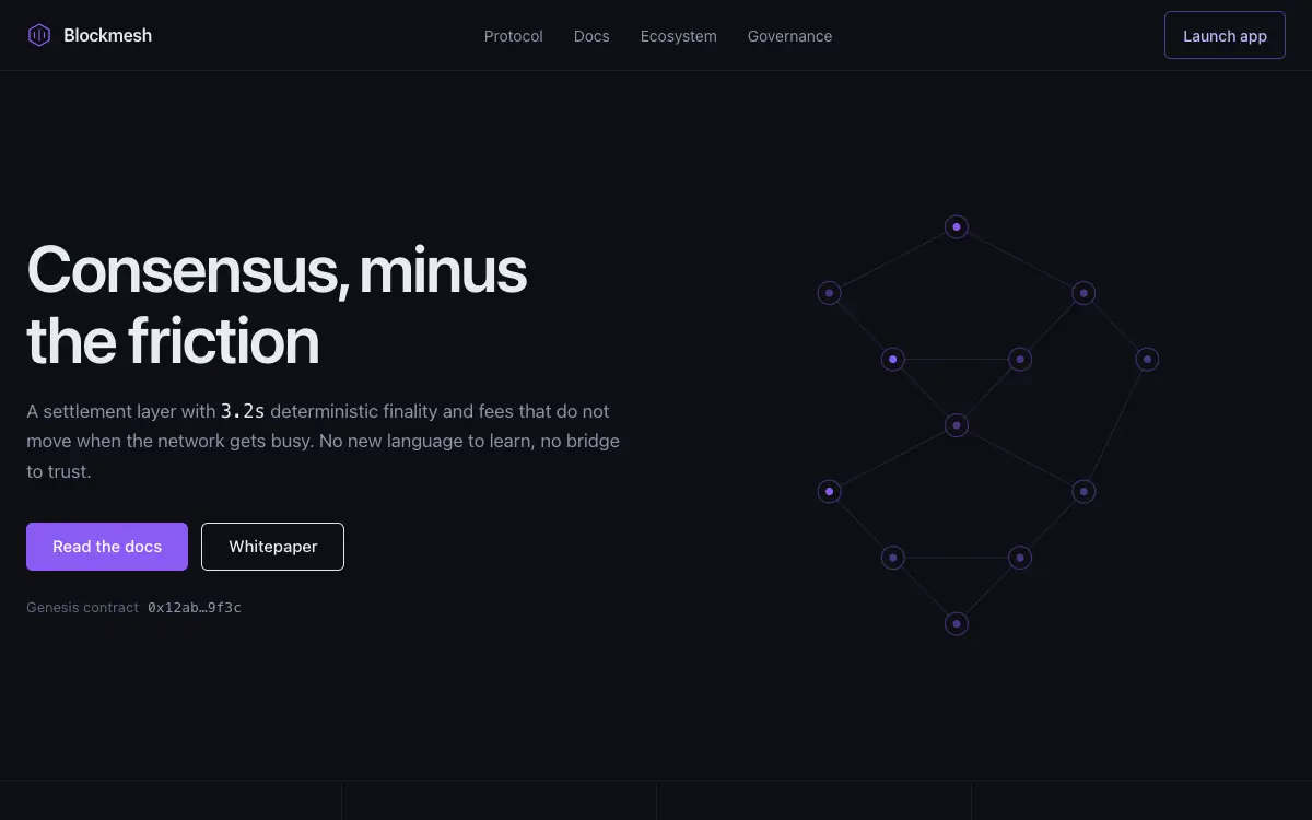
The Prompt
# Blockmesh — Web3 Protocol Website

## Goal
Build a production-ready web3 protocol website called "Blockmesh". Overall vibe: serious infrastructure — closer to a database company than a casino. It should look hand-crafted by a senior product designer — not like a generic template.

## Design System
- **Palette**: graphite #0D0F14, porcelain #E8EBF0 text, single violet #8B5CF6 accent; absolutely no rainbow gradients
- **Typography**: engineering sans; mono for addresses, hashes, and all numbers
- **Grid & spacing**: 12-col grid, 8px base unit. Desktop sections 112-128px vertical padding, mobil
Unlock the full 423-word prompt with one-time Lifetime access.
Unlock Full PromptYou may also like
Free
Featured
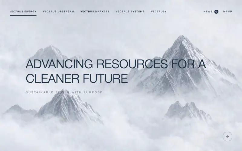
Vectrus Energy
🛬 Landing Page
Scroll-tied cinematic section: a 500vh track scrubs an aerial clip frame by frame through a WebCodecs frame bank, with three sequential copy blocks.
4.9k 535CursorClaude CodeLovable
Free
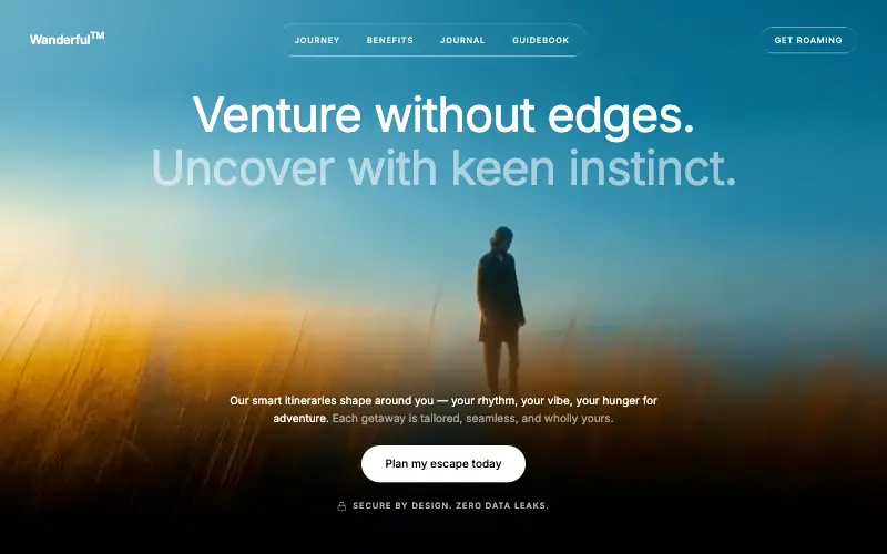
Wanderful
✈️ Travel
Cinematic travel hero: a full-bleed loop drifting under a GSAP mouse parallax, with a liquid-glass pill navbar and two fade-up copy blocks.
4.8k 445CursorClaude CodeLovable
Free
Featured
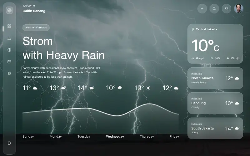
Aurora Weather Dashboard
📊 Dashboard
Liquid-glass weather dashboard on a 1357x871 unit grid: frosted panels over a storm photo and a chart that draws itself, then fills.
4.5k 527CursorClaude CodeLovable
Free
Featured
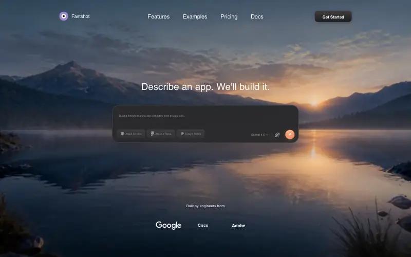
Fastshot Landing
🤖 AI
Single-screen AI app-builder landing: full-bleed dawn video, glass composer card and a pixel-specified absolute toolbar.
4.0k 639CursorClaude CodeLovable