Free
🎨 Portfolio
Frameline
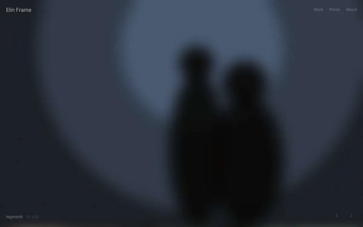
Photographer portfolio with edge-to-edge masonry, film-strip hover previews and a darkroom-inspired dark theme.
579 views 69 copies 426 words
The Prompt
# Frameline — Photography Portfolio

## Goal
Build a production-ready photography portfolio called "Frameline". Overall vibe: darkroom intimacy — the photos glow, everything else disappears. It should look hand-crafted by a senior product designer — not like a generic template.

## Design System
- **Palette**: true black #000000 base, warm gray #B8B4AE text, no accent — photographs are the only color on the page
- **Typography**: small neutral sans used sparingly; captions 12px, name 18px — typography defers to imagery
- **Grid & spacing**: 12-col grid, 8px base unit. Desktop sections 112-128px vertical padding, mobile 56-64px.
- **Corners & borders**: cards 16px radius, buttons 10px, inputs 10px. 1px borders at 8-12% white (dark) or 8% black (light).
- **Shadows**: layered, soft (0 1px 2px + 0 8px 24px), never harsh.

## Page Structure
1. **Navbar** — photographer name left, Work/Prints/About right, all 13px; fades out while scrolling down, returns on scroll up.
2. **Hero** — one full-viewport photograph, no text overlay except a small series title bottom-left; arrow-key/swipe cycles 3 hero frames with crossfade.
3. **Masonry grid** — edge-to-edge 3-col masonry (1-col mobile), gaps 4px; images load with a soft develop-in effect (blur 8px + brightness 1.3 → sharp).
4. **Series rows** — each series a horizontal film strip: sprocket-hole borders top/bottom, scrolls horizontally, frame counter '07 / 22' in mono.
5. **About** — portrait, 3 sentences, client list in plain text, gear note as an easter egg tooltip.
6. **Prints shop teaser** — 3 print cards with paper-size options and edition count.
7. **Footer** — email, Instagram, 'All photographs ©' line — nothing else.

## Motion
- Develop-in effect: 700ms ease-out, triggered per-image at 20% viewport visibility.
- Lightbox opens with the clicked image FLIP-transitioning to center, background dims to 95% black.
- Film strips scrub horizontally tied to vertical scroll while the section is pinned.
- All entrances use IntersectionObserver-triggered reveals; never animate on every scroll tick.
- Respect `prefers-reduced-motion`: disable transforms, keep opacity fades under 150ms.

## Details That Matter
- Right-click on images is allowed — add a subtle watermark instead of blocking; hostility is off-brand.
- Preload neighboring lightbox images so arrows feel instant.

## Tech & Quality Bar
- Next.js App Router + TypeScript + Tailwind CSS. No UI kit — style from scratch.
- Fully responsive at 375 / 768 / 1024 / 1440px. Mobile nav becomes a full-screen overlay with staggered link reveal.
- Semantic landmarks (header/main/section/footer), WCAG AA contrast, focus-visible rings on all interactive elements.
- Optimize LCP: hero media preloaded, fonts `display: swap`, zero layout shift.
You may also like
Free
Featured
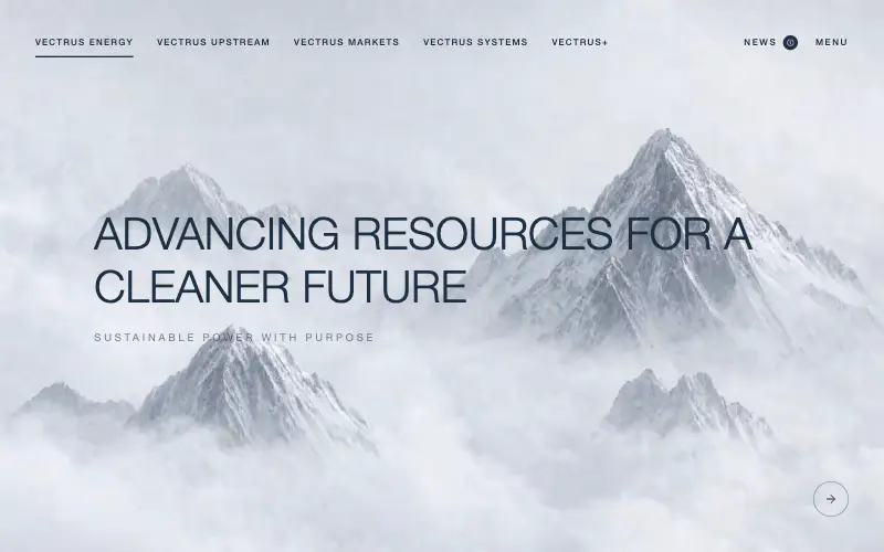
Vectrus Energy
🛬 Landing Page
Scroll-tied cinematic section: a 500vh track scrubs an aerial clip frame by frame through a WebCodecs frame bank, with three sequential copy blocks.
4.9k 535CursorClaude CodeLovable
Free
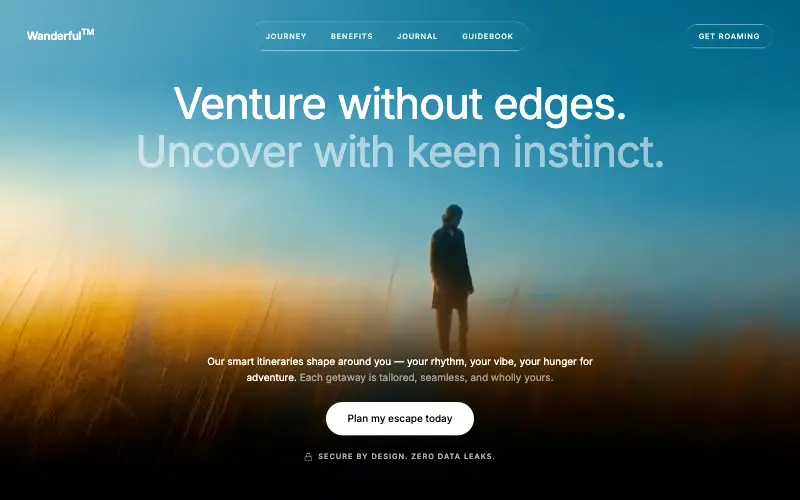
Wanderful
✈️ Travel
Cinematic travel hero: a full-bleed loop drifting under a GSAP mouse parallax, with a liquid-glass pill navbar and two fade-up copy blocks.
4.8k 445CursorClaude CodeLovable
Free
Featured
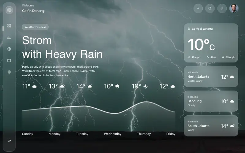
Aurora Weather Dashboard
📊 Dashboard
Liquid-glass weather dashboard on a 1357x871 unit grid: frosted panels over a storm photo and a chart that draws itself, then fills.
4.5k 527CursorClaude CodeLovable
Free
Featured
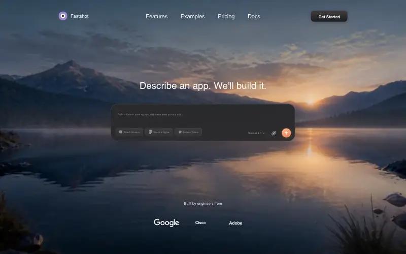
Fastshot Landing
🤖 AI
Single-screen AI app-builder landing: full-bleed dawn video, glass composer card and a pixel-specified absolute toolbar.
4.0k 639CursorClaude CodeLovable



