Premium
🤖 AI
Prism Labs
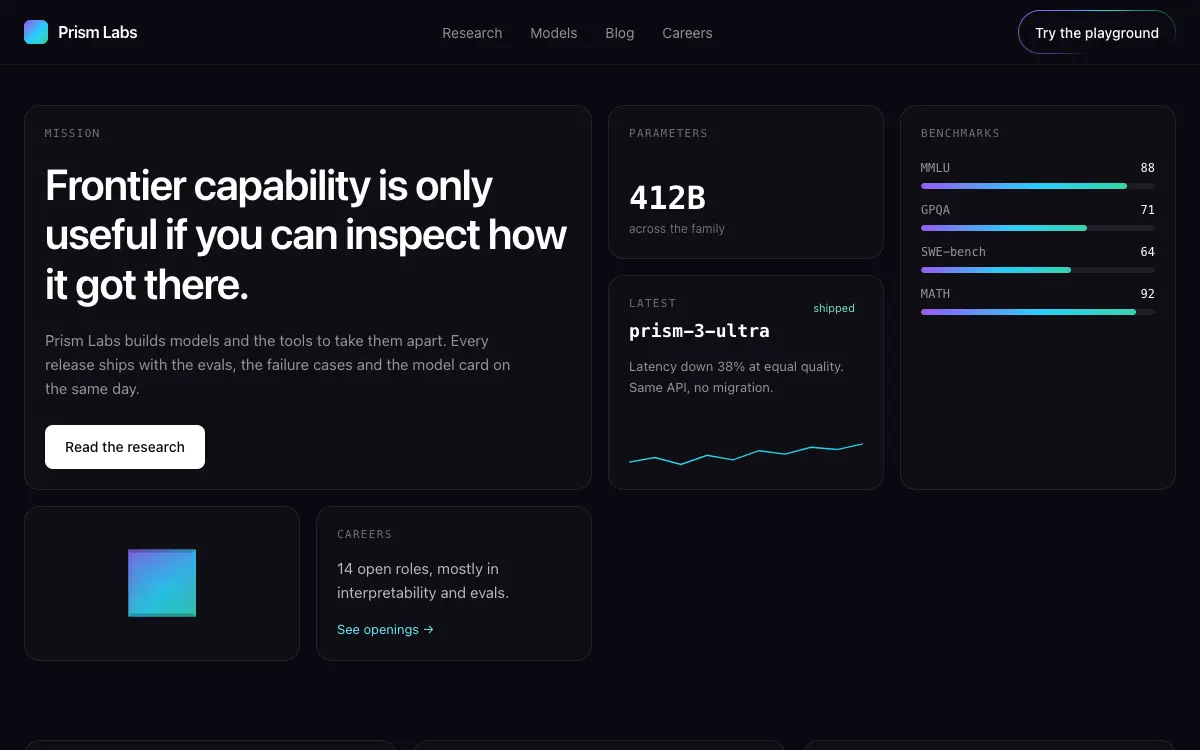
AI research lab site built entirely as a bento grid — every fact, demo and paper lives in a tile with its own micro-interaction.
2.1k views 230 copies 467 words
The Prompt
# Prism Labs — AI Research Lab Website

## Goal
Build a production-ready ai research lab website called "Prism Labs". Overall vibe: frontier research made tangible — serious science with playful demos. It should look hand-crafted by a senior product designer — not like a generic template.

## Design System
- **Palette**: deep space #0A0A10 base, soft white text, iridescent accent gradient (violet #8B5CF6 → cyan #22D3EE → emerald #34D399) used only inside tiles
- **Typography**: Inter tight; mono for model names, benchmark numbers and paper IDs
- **Grid & spacing**: 12-col grid, 8px base unit.
Unlock the full 467-word prompt with one-time Lifetime access.
Unlock Full PromptYou may also like
Free
Featured
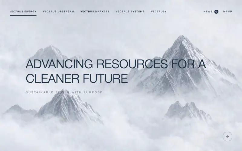
Vectrus Energy
🛬 Landing Page
Scroll-tied cinematic section: a 500vh track scrubs an aerial clip frame by frame through a WebCodecs frame bank, with three sequential copy blocks.
4.9k 535CursorClaude CodeLovable
Free
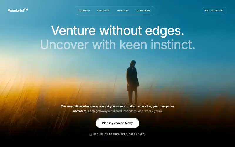
Wanderful
✈️ Travel
Cinematic travel hero: a full-bleed loop drifting under a GSAP mouse parallax, with a liquid-glass pill navbar and two fade-up copy blocks.
4.8k 445CursorClaude CodeLovable
Free
Featured
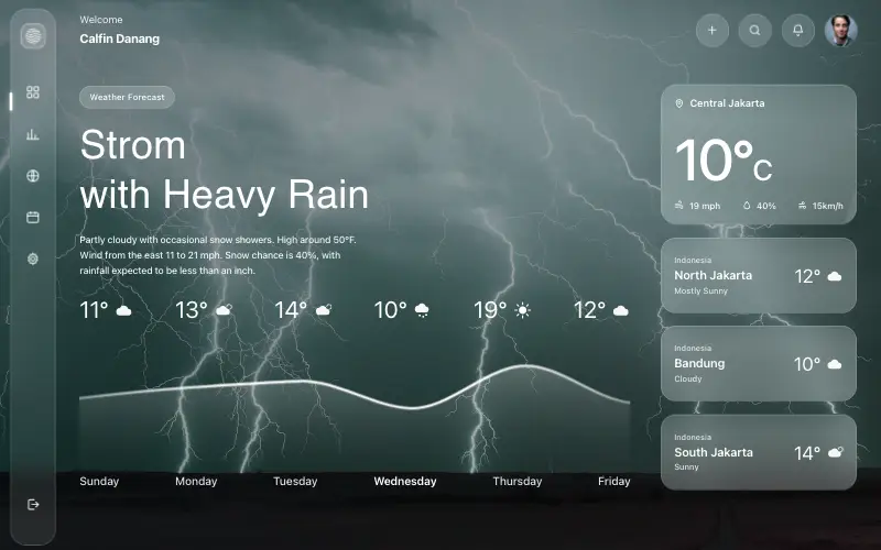
Aurora Weather Dashboard
📊 Dashboard
Liquid-glass weather dashboard on a 1357x871 unit grid: frosted panels over a storm photo and a chart that draws itself, then fills.
4.5k 527CursorClaude CodeLovable
Free
Featured
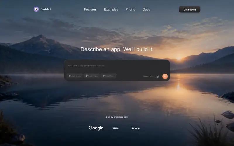
Fastshot Landing
🤖 AI
Single-screen AI app-builder landing: full-bleed dawn video, glass composer card and a pixel-specified absolute toolbar.
4.0k 639CursorClaude CodeLovable



